[UDK] Portfolio Environments (WIP)
Hi everyone. Here are two portfolio environments I've been working on and off during the past months. Well, they have to be done by mid June, as I'm finishing these up for University.
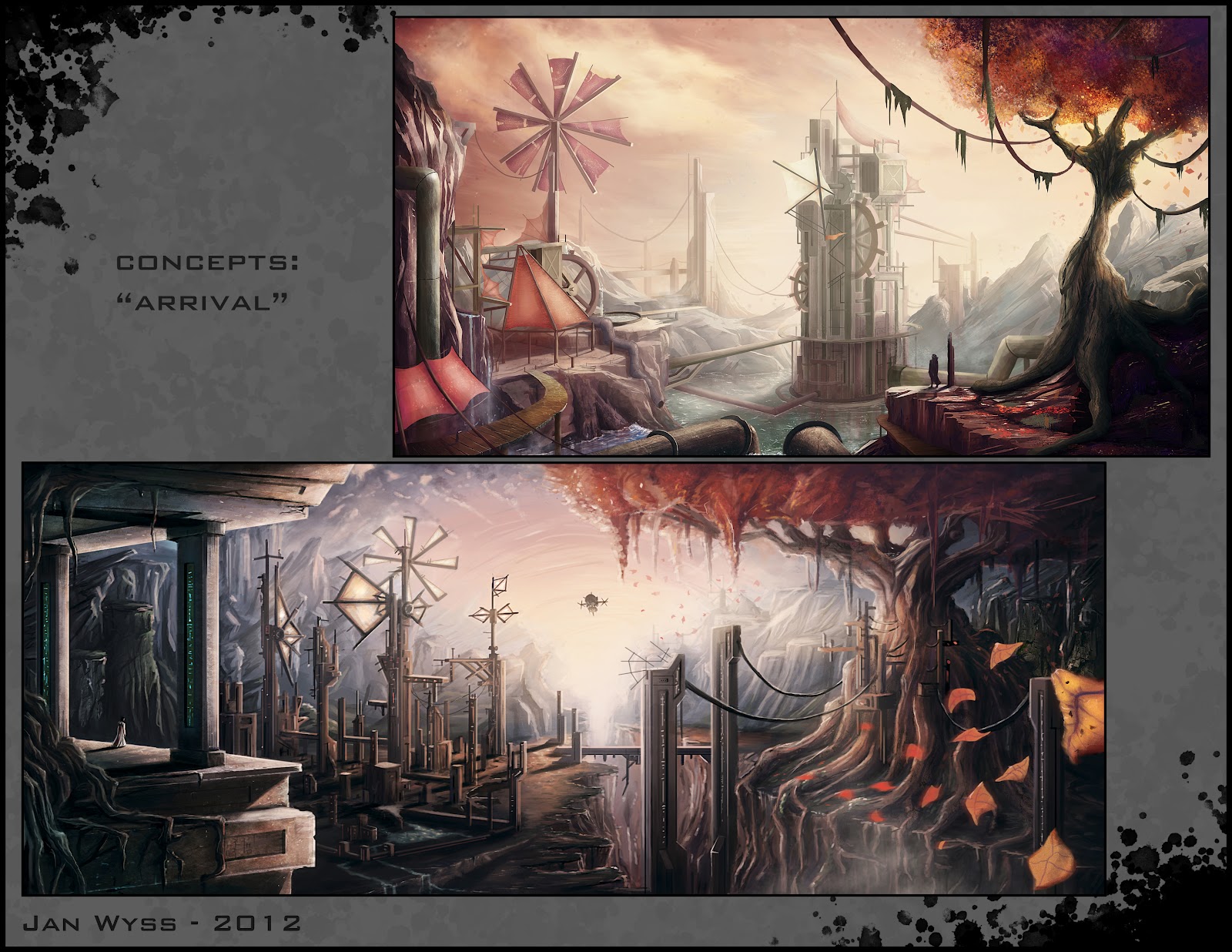
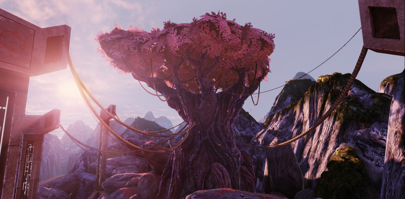
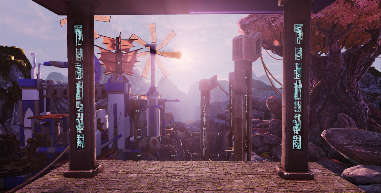
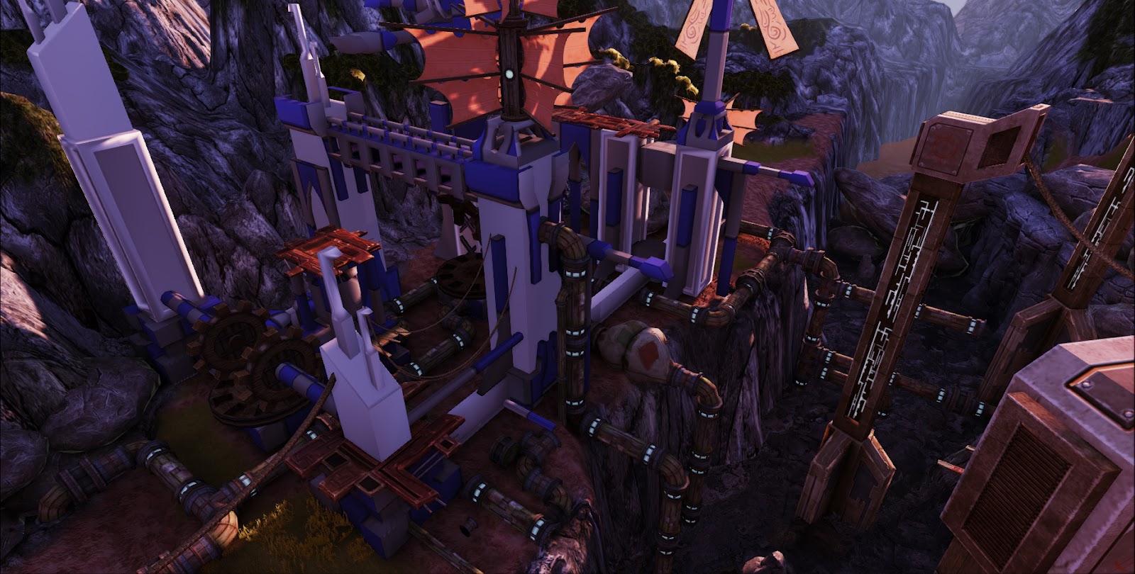
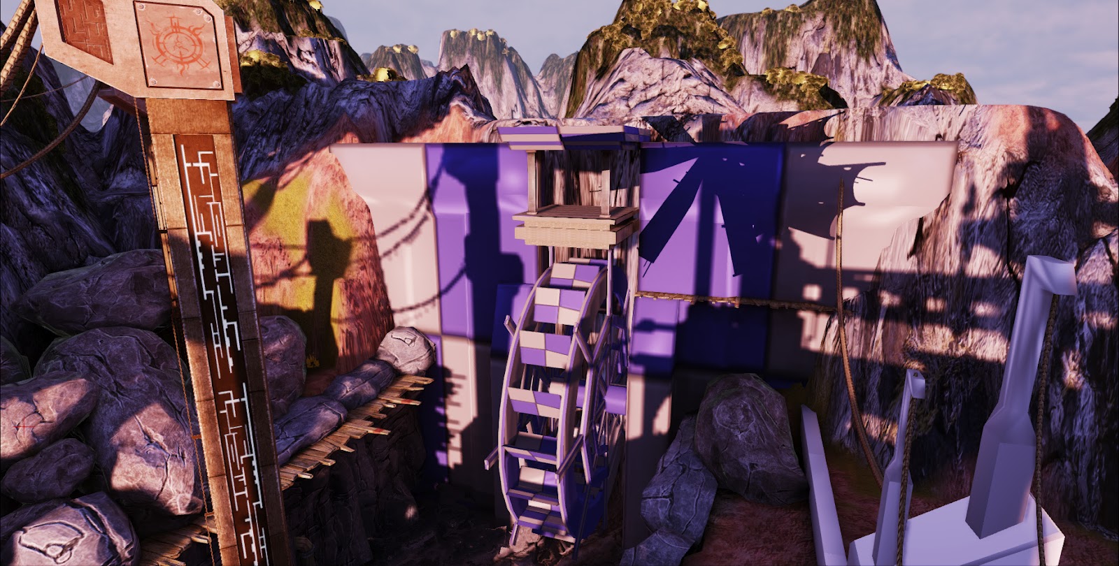
The first environment is this rather large Valley/Powerplant scene that's opting for a more painterly style (much inspired by the 2007 Prince of Persia game)
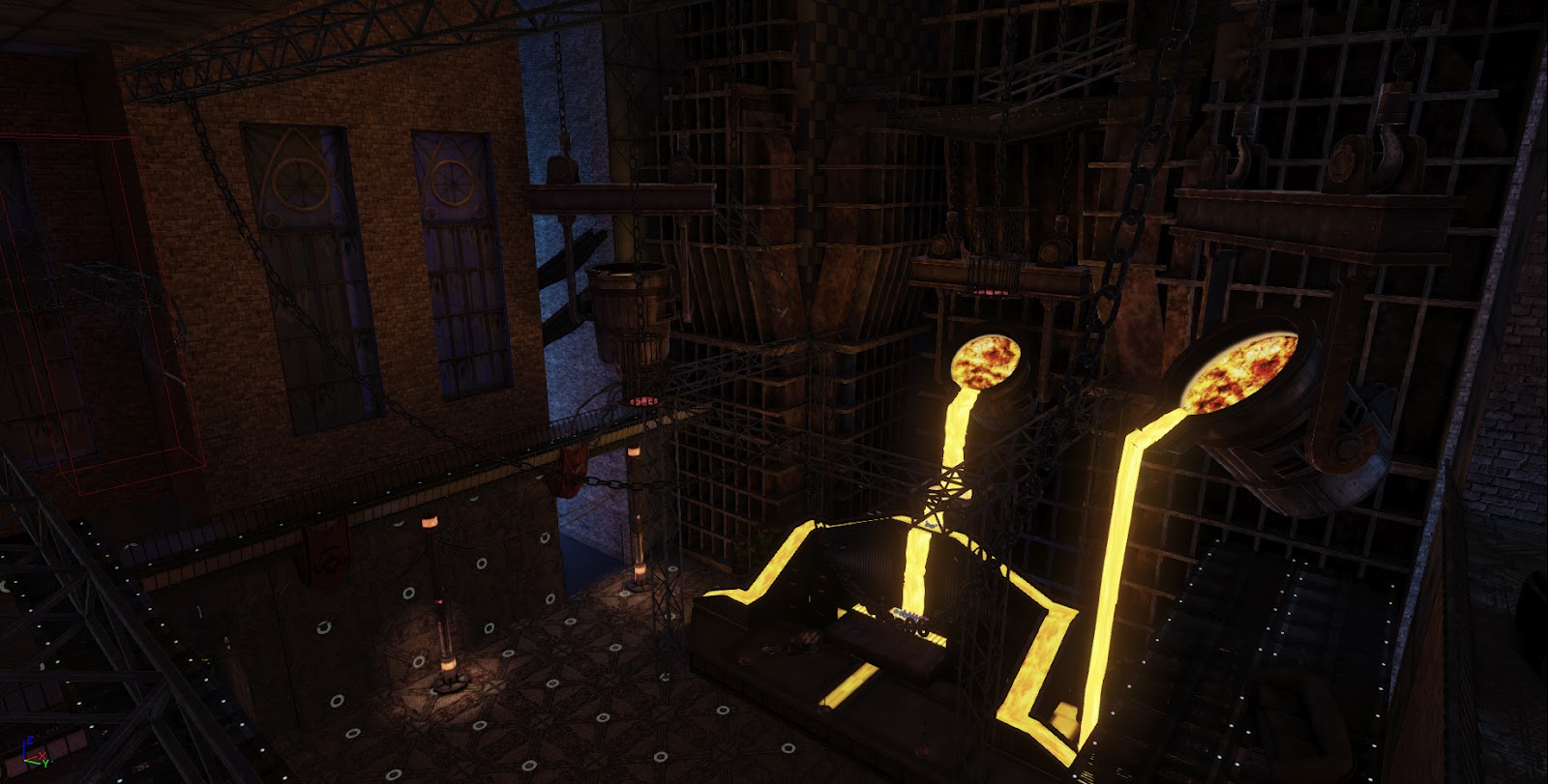
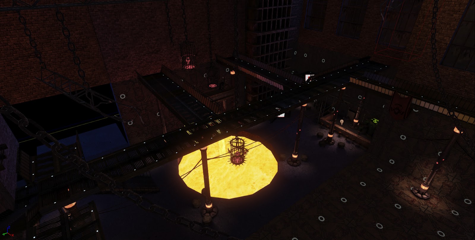
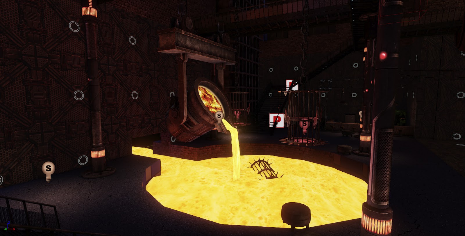
The second environment is a SciFi gothclub which is set in a foundry (still heavy WIP). I'm also being influenced by some soviet visual elements on this one.
Anyway, this is the current state of affairs:
Valley:
(based on these rather old concepts of mine)
GothClub:

Major To-DOs:
Valley:
-a strong painterly skydome
-finish texturing the remaining assets (...duh)
-water materials
-waterfalls for waterwheel
GothClub:
-more tiling textures for variety
-introduce more modualr assets
-fix lighting
-fix various current assets (...duh)
Anyway, as I'll be working on these like stupid in the comings weeks, I'm hoping to get as much feedback possible from you guys, since you're all awesome
Cheers!
The first environment is this rather large Valley/Powerplant scene that's opting for a more painterly style (much inspired by the 2007 Prince of Persia game)
The second environment is a SciFi gothclub which is set in a foundry (still heavy WIP). I'm also being influenced by some soviet visual elements on this one.
Anyway, this is the current state of affairs:
Valley:
(based on these rather old concepts of mine)


GothClub:


Major To-DOs:
Valley:
-a strong painterly skydome
-finish texturing the remaining assets (...duh)
-water materials
-waterfalls for waterwheel
GothClub:
-more tiling textures for variety
-introduce more modualr assets
-fix lighting
-fix various current assets (...duh)
Anyway, as I'll be working on these like stupid in the comings weeks, I'm hoping to get as much feedback possible from you guys, since you're all awesome
Cheers!

Replies
I posted some shots of a tiling texture I used for the landscape. It looks ok, but it definitely isn't there yet, and I'd love some feedback on it. Thank you!
Also, I finally made use of 3d projected textures (thanks the awesome help of Choco!!) on my landscape to reduce stretching.
I like the Borderlands type vibe I'm getting. I don't think you need too much more work on the landscape texture you did. Yea it's a big part of your scene, but not entirely your focus. The epic tree is obviously one focus and it looks good. However, the way it's sitting on the rocks reminds me of an octopus. The roots might benefit from being split into multiple pieces going different directions, or just make them less fat. If you have time, bring them down, hanging over the cliff like the concept. The tree itself is pretty massive, the amount of leaves could be increased. Might as well go all out and make it ridiculous!
The other focus is whatever cog/gear base you have in the middle. I'm not entirely sure what that is, and that's a problem. (Just read it's a power plant, but I didn't know by just looking at it) There is so much going on. You've got random cogs laying around, ropes going into some lights.. and the light blue accent lights you have are EVERYWHERE. I find it distracting. Looking back at your concept, the scene might come together better if it's simplified. Less objects in the middle, less lights etc. Right now, it's kind of just blending into the background.
With that said, I love the windmills and sails. Definitely stick with the Valley. Working on that until June will give you one hell of a strong piece. Good luck man!
Yeah, the whole powerplant structure is still a jumbled mess, but the plan is to completely rearrange it into something that makes more sense and is easier on the eyes. And I totally agree on the blue lights, definitely needs toning down and selective variation.
And thank you! Unfortunately, this isn't the only massive project that needs to be done by june hehe.
Also painted a new tiling texture for the walls. I'm a little on the fence about it, so any feedback is welcome as usual.
And the flat diffuse as requested (here at 1024, 2048 actual size):
*Subscriiiiiiiiibed*
Anyway, here's a little update. I added a new skybox. I opted to handpaint it; it still needs refinement but it's achieving the look I want. I also added some morph target animations to the sacs. Aside from that, I just did general world building and lightmap fixing.
Still a lot to do, so any feedback is more than welcome of course!
And although there are always things that can be tweaked, it definitely looks finished.
Great work!
The first thing that jumps out at me with this foundry area is that the lighting is fairly uniform. To me, the lights need to be brighter and the shadows darker.
I think that the molten material needs to be producing the vast majority of the area's illumination, with some nice harsh shadows in the environment to create spots of high and low contrast throughout.
I hope that helps
Also, I love the post-process in the first one, with the black edges. I think with your models/materials and the outlines, it really comes off as something from Borderlands, for me. Which is good, in my opinion, I love the style. Speaking of Borderlands, I think your second scene would also look interesting with the outlines. Not for a portfolio piece(I'm sure two images with the outlines is overkill for a portfolio) but just for kicks.