Deus EX- Street
polycounter lvl 7
hi Polycounters!!!
i have seen some great scenes created from the concept art for Deus EX- human evolution. so now i am going to step up to the plate. i am going to modeling out one of the street concept. I encourage you comment. the more critics the stronger artist i will became and more justice i can to the concept. i have some of the assets texture, so let me know what u think.
lets start with the concept:
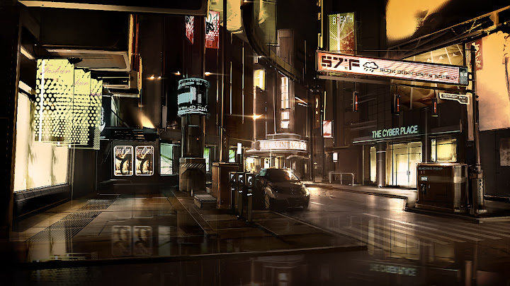
Concept art by Eidos Montreal
here what i get so far.
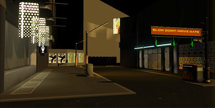
i am pumped.:poly142:
i have seen some great scenes created from the concept art for Deus EX- human evolution. so now i am going to step up to the plate. i am going to modeling out one of the street concept. I encourage you comment. the more critics the stronger artist i will became and more justice i can to the concept. i have some of the assets texture, so let me know what u think.
lets start with the concept:
Concept art by Eidos Montreal
here what i get so far.
i am pumped.:poly142:
Replies
Here's one of my favourite concept artists brush pack, which includes a brush that'll get the job done real easy.
Link is at the bottom of his page:
http://www.artoflevi.com/?page_id=1674
or here:
http://www.2shared.com/file/Zrglbika/LeviBrushSet.html
Cant wait to see this stuff with a cube map on it. Will be following.
Anyway, I like the idea of the "guy fox/anon" graffiti posters, but they seem too organized for that kind of thing.
I been busy working on my scene, but I have not posted as offer as I wanted but I really need any critique from you guys. So let me have them. Thanks for viewing my WIP.
I worked on the billboards.
please critique polycounters!!!
I'm no pro, so my opinion might not be worth a lot,
i honestly think that the car doesn't fit as well as it should, it as a cartoonish look with it's silhouete.
the rest is going along nicely for the moment even if it doesn't seem " wet enough " yet (you will probably work around that in the future)
As for the tonality of the original picture, it his pretty " desaturated " with a golden filtre on the whole picture, we can hardly see any " red " color in the picture since everything is toned down to something close to a golden yellow. try creating a post process chain and add a uberpostprocesseffect module.
Link it in view> world properties > world post proces chain and then play with your uberpostprecesseffect module to achieve this kind of look, i would say to try using the " desaturate " a bit and play with the colorize mainly with the X,Y ( X = red, Y = green ) to manage to get a " yellowish look " to your scene.
once again, i'm no pro and someone might come and give you a beter tip than mines.
i am keep working away. i figure out the solution to normal map being waste out.check it out.
In Deus Ex HR a lot of the lighting is added to by having the area largely darkened, but with a large volume of glow and falloff light to bounce off anything reflective. Mostly in the shade of gold/orange, as is the games main colour palette for the cityscape and everything really. It made the world look more vibrant, even if every screenshot you look at was mostly golden/orange in look.
example: http://media.giantbomb.com/uploads/11/119398/2022836-deus_ex_human_revolution__hengsha_.jpg
Looking at your own interpretation, it feels much more bland in terms of colour and lighting. This will be your key element. That is probably what will bring this piece out of its shell fully. Look at your reference, everything that is lit has an ambient glow. Look into the lighting when you're happy with the scene to give it more life, in my opinion obviously.
e: an example, just photochopped your latest render in PS with some lighting addage and fog for the background and in the upper areas.
If this isn't meant to be game optimized, I would definitely push this a little further- at least with the post-process and lights.
please note that i did the WIP before i read the comments were post. i will continue to working on this scene with your advise in mind.
I agree that the car is one of the weak points in your environment. Personally, I would ditch it.
I think your scene would benefit from more "fill up" props and decals. Also, in what engine are you rendering this ?
For me the ground textures don't have enough detail. They look pretty flat. Take the sidewalk on the left side for example, the middle large portion of this is lacking details. There is one groove in the concrete running along the side walk but none going across as in the concept and the diffuse texture is very clean looking. Get some dirt spilling out from the cracks and grooves and around the bottom of the illuminated bollards. This will help sit them in the ground better. Also use the specular texture to differentiate between the areas that are dirty, and use this to mask the reflection on the ground too. This will bring much neede life to the foreground areas.