Jester's Cap for Scout
It's time this hat gets its own thread, cause people are cool and helping me out with it, so I don't want to hog up half a page on the main P&P thread anymore.
This is the current status of the hat:
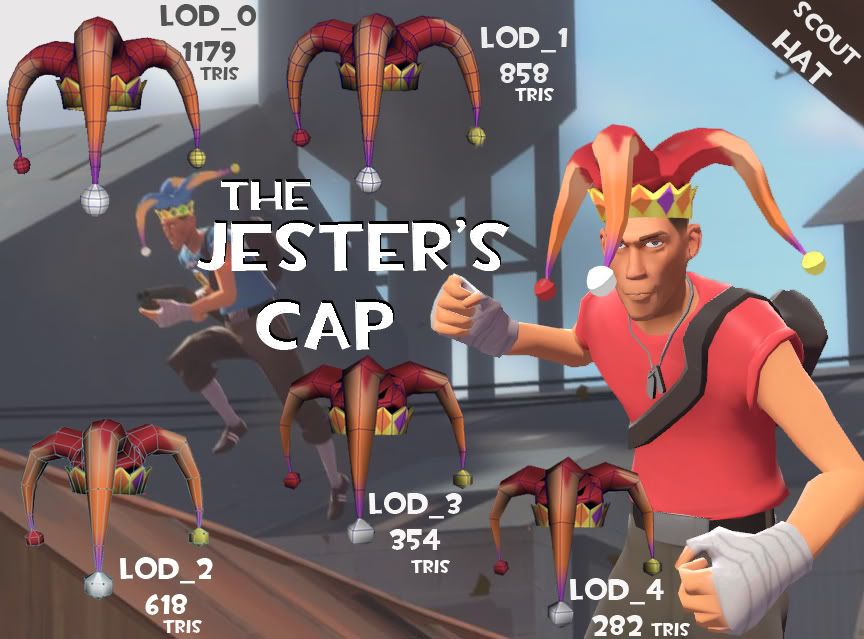
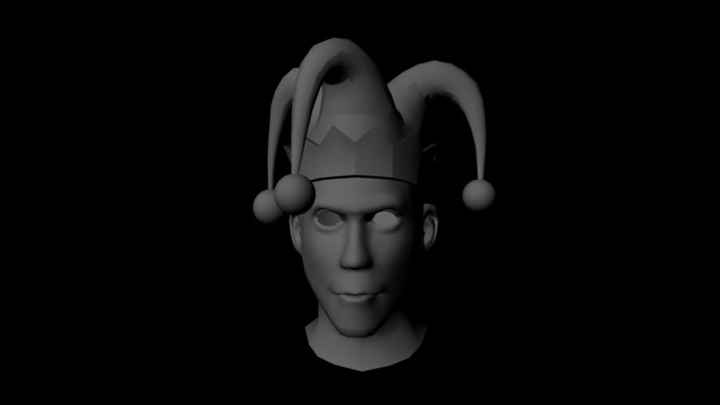
The original Model, untextured: This was too small and way too many tri's. I made it using the Head Reference art from the TF2 main page. When I put it on the body, it was TINY.. So I resized it with a focus on removing geometry.
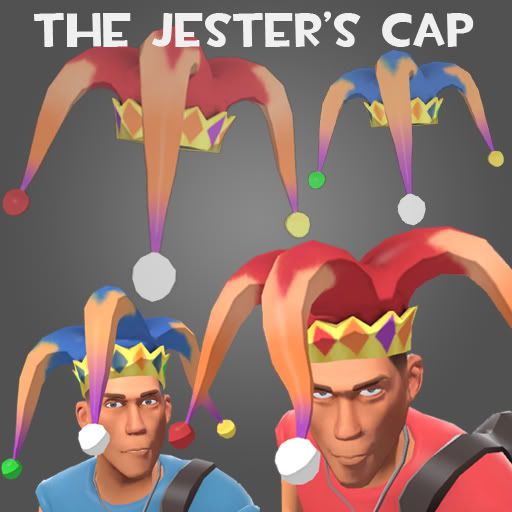
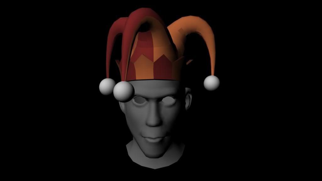
With the original Texture: I'd be happy with this pattern instead of the blended colors it has now. The only problem is that to make this, I didn't have a UV map. I just colored the faces what I wanted them.
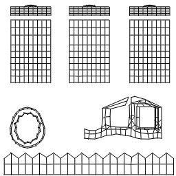
The current UV Map:
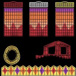
The shaded UV Map:
Here are some issues that I'm working out:
The Jigglebones and the nature of their flow:
I want it to move and flow, but there is a problem when the scout gets ultra bouncy, that the bones tangle with themselves, and it does some screwy stuff. I have been playing with the QC file over and over and am having a hard time fixing it entirely. It does tend to fix itself when it refreshes, but I'm not happy with it doing that at all. I am OK with the sleeves flying every which way, so long as they don't overlap each other, or go into the head itself. It should appear really loose and dangle about, but not sooo dangly that the textures twist on themselves.
I think once I make this hat for the other classes, a lot of this will not be a problem. The scout's speed is actually the worst thing for the bones.
The Texture is not right:
Issues I'm Having:
UVs and LODs:
When I remove edge loops to create the LOD's I've had a hell of a time getting the UVs on the edge of their group to behave. I'm thinking it's' because the edge loop that is best for the model to have removed isn't the best for the UV map, and it destroys some stitching or something. Check out the underside of the sleeve in this pic. The whole UV pattern repeats in the space between two edge loops. I'm pretty sure I understand how this happens, but I do hate it and loath having to redo that aspect of it. I'm willing to fix it since the texture itself isn't right yet. Hopefully the solution to one is the solution to the other.
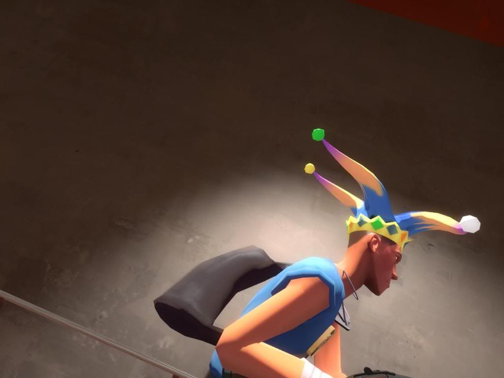
The Jiggle Action causes the texture to fold sometimes:
This is the occasional glitch, and I've been able to reduce it by changing the bone lengths and mass in the QC file, but it's still happening, and to me, it's unacceptable. I submitted the model in order to get more feedback, hoping I can revise it and fix it.
Sometimes, it actually looks natural and cool when it just happens to one sleeve and barely at all. But when you get a really active scout, it can get bad.
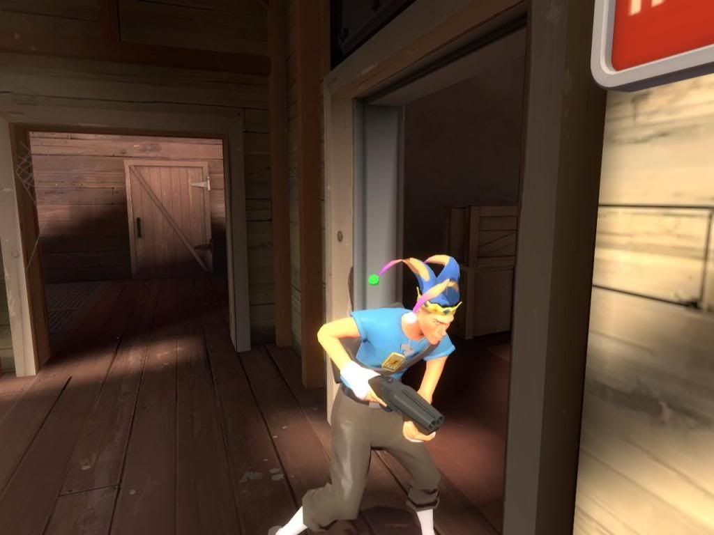
My Questions:
Any advice on textures is always welcome.
How big should my uploaded file be?
I see people with 4-6 MBs for a hat, and mine is .579 MB. I have 5 LODs and I know zipping reduces them, but man, I have it on the BEST settings, and it seems too small.
The bones never come to rest, is there a way to stop them from swinging?
When the scout is standing still, even in the model viewer, the ends move like snakes. I've changed the settings hundreds of times, and they always move. Shouldn't the gravity bring that to a rest?
One Sleeve's QC Jiggle Settings:
$jigglebone "jiggle_front1" {
is_rigid {
tip_mass 25
length 4
angle_constraint 30
}
}
$jigglebone "jiggle_front2" {
is_rigid {
tip_mass 25
length 4
angle_constraint 24
}
}
$jigglebone "jiggle_front3" {
is_rigid {
tip_mass 25
length 3
angle_constraint 24
}
}
$jigglebone "jiggle_front4" {
is_rigid {
tip_mass 25
length 3
angle_constraint 24
}
}
$jigglebone "jiggle_front5" {
is_rigid {
tip_mass 50
length 2
angle_constraint 24
}
}
$jigglebone "jiggle_front6" {
is_rigid {
tip_mass 100
length 1
angle_constraint 0
}
The Main portion of the QC:
$modelname "player/items/scout/0x006d273c/jestercap/jestercap.mdl"
$model "body" "JesterCap.smd"
$lod 10
{
replacemodel "JesterCap" "JesterCap_LOD_1"
}
$lod 18
{
replacemodel "JesterCap" "JesterCap_LOD_2"
}
$lod 28
{
replacemodel "JesterCap" "JesterCap_LOD_3"
}
$lod 36
{
replacemodel "JesterCap" "JesterCap_LOD_4"
}
$cdmaterials "models\player\items\scout\0x006d273c\jestercap\"
$texturegroup skinfamilies
{
{ "jestercap_red" }
{ "JesterCap_blue" }
}
// Model uses material "models/player/items/scout/0x006d273c/jestercap/jestercap_red.vmt"
// Model uses material "JesterCap_blue.vmt"
$surfaceprop "cloth"
$illumposition 2.582 0.420 5.102
$sequence idle "JesterCap_idle" fps 30.00
$collisionmodel "JesterCap_phy" {
$mass 5.0
$inertia 1.00
$damping 0.00
$rotdamping 0.00
}
{
JIGGLE FRONT (as above)
JIGGLE RIGHT (as above)
JIGGLE LEFT (as above)
}
This is a work in progress, and I am extremely grateful to everyone who has helped and will in the future.
One thing is for sure. I don't think I could have picked a more difficult first hat to work on. So once this hat is good, I should be able to make simple hats in my sleep.
This is the current status of the hat:


The original Model, untextured: This was too small and way too many tri's. I made it using the Head Reference art from the TF2 main page. When I put it on the body, it was TINY.. So I resized it with a focus on removing geometry.

With the original Texture: I'd be happy with this pattern instead of the blended colors it has now. The only problem is that to make this, I didn't have a UV map. I just colored the faces what I wanted them.

The current UV Map:

The shaded UV Map:

Here are some issues that I'm working out:
The Jigglebones and the nature of their flow:
SuperSoupy wrote: »Looking nice, I have a suggestion though:
Perhaps consider toning down the amount that this overlaps when moving in-game?
From what I've seen of it so far, it flows nicely but tends to lose its distinctive shape too much. I'm unsure as to whether you can tone down these settings in the engine, but if you can I would definitely suggest doing so.
I want it to move and flow, but there is a problem when the scout gets ultra bouncy, that the bones tangle with themselves, and it does some screwy stuff. I have been playing with the QC file over and over and am having a hard time fixing it entirely. It does tend to fix itself when it refreshes, but I'm not happy with it doing that at all. I am OK with the sleeves flying every which way, so long as they don't overlap each other, or go into the head itself. It should appear really loose and dangle about, but not sooo dangly that the textures twist on themselves.
I think once I make this hat for the other classes, a lot of this will not be a problem. The scout's speed is actually the worst thing for the bones.
The Texture is not right:
This is a great idea, and I didn't realize you could do this. I'm going to rebuild all the UVs this week. Which, I admit, I am not stoked about. I believe it's necessary though.Jackablade wrote: »You're wasting loads of space there. You could easily stack repeating parts and scale everything up to give yourself a lot more texel density to play with.
This is definitely a problem that needs addressed. Consistency was made very clear to be hugely important, and while this might make a nice hat for some hippies to wear at a festival, it's not the best texture for TF2. The reason I haven't been able to get a PATTERN, is because of the way the UVs blend, especially when you remove geometry for the LODs.@ pegee - I don't think it's just the palette which needs looking at. The way you have the colours blending into one another is something that I can't recall happening anywhere else in TF2.
Issues I'm Having:
UVs and LODs:
When I remove edge loops to create the LOD's I've had a hell of a time getting the UVs on the edge of their group to behave. I'm thinking it's' because the edge loop that is best for the model to have removed isn't the best for the UV map, and it destroys some stitching or something. Check out the underside of the sleeve in this pic. The whole UV pattern repeats in the space between two edge loops. I'm pretty sure I understand how this happens, but I do hate it and loath having to redo that aspect of it. I'm willing to fix it since the texture itself isn't right yet. Hopefully the solution to one is the solution to the other.

The Jiggle Action causes the texture to fold sometimes:
This is the occasional glitch, and I've been able to reduce it by changing the bone lengths and mass in the QC file, but it's still happening, and to me, it's unacceptable. I submitted the model in order to get more feedback, hoping I can revise it and fix it.
Sometimes, it actually looks natural and cool when it just happens to one sleeve and barely at all. But when you get a really active scout, it can get bad.

My Questions:
Any advice on textures is always welcome.
How big should my uploaded file be?
I see people with 4-6 MBs for a hat, and mine is .579 MB. I have 5 LODs and I know zipping reduces them, but man, I have it on the BEST settings, and it seems too small.
The bones never come to rest, is there a way to stop them from swinging?
When the scout is standing still, even in the model viewer, the ends move like snakes. I've changed the settings hundreds of times, and they always move. Shouldn't the gravity bring that to a rest?
One Sleeve's QC Jiggle Settings:
$jigglebone "jiggle_front1" {
is_rigid {
tip_mass 25
length 4
angle_constraint 30
}
}
$jigglebone "jiggle_front2" {
is_rigid {
tip_mass 25
length 4
angle_constraint 24
}
}
$jigglebone "jiggle_front3" {
is_rigid {
tip_mass 25
length 3
angle_constraint 24
}
}
$jigglebone "jiggle_front4" {
is_rigid {
tip_mass 25
length 3
angle_constraint 24
}
}
$jigglebone "jiggle_front5" {
is_rigid {
tip_mass 50
length 2
angle_constraint 24
}
}
$jigglebone "jiggle_front6" {
is_rigid {
tip_mass 100
length 1
angle_constraint 0
}
The Main portion of the QC:
$modelname "player/items/scout/0x006d273c/jestercap/jestercap.mdl"
$model "body" "JesterCap.smd"
$lod 10
{
replacemodel "JesterCap" "JesterCap_LOD_1"
}
$lod 18
{
replacemodel "JesterCap" "JesterCap_LOD_2"
}
$lod 28
{
replacemodel "JesterCap" "JesterCap_LOD_3"
}
$lod 36
{
replacemodel "JesterCap" "JesterCap_LOD_4"
}
$cdmaterials "models\player\items\scout\0x006d273c\jestercap\"
$texturegroup skinfamilies
{
{ "jestercap_red" }
{ "JesterCap_blue" }
}
// Model uses material "models/player/items/scout/0x006d273c/jestercap/jestercap_red.vmt"
// Model uses material "JesterCap_blue.vmt"
$surfaceprop "cloth"
$illumposition 2.582 0.420 5.102
$sequence idle "JesterCap_idle" fps 30.00
$collisionmodel "JesterCap_phy" {
$mass 5.0
$inertia 1.00
$damping 0.00
$rotdamping 0.00
}
{
JIGGLE FRONT (as above)
JIGGLE RIGHT (as above)
JIGGLE LEFT (as above)
}
This is a work in progress, and I am extremely grateful to everyone who has helped and will in the future.
One thing is for sure. I don't think I could have picked a more difficult first hat to work on. So once this hat is good, I should be able to make simple hats in my sleep.
Replies
That's help you control them some from just going crazy and twisty/collapsing/etc...
The main thing with overlap is it's harder to bake AO. But you can also paint it in or offset your uv's to bake.
But basically if the three 'sleeves' are the same texture you can just put them on top of each other. Use half the sheet for that so you get higher res.
The circular part could just be stretched out into one row and lined up below the crown to take less space. The crown uv's could be split in half and laid on top of each other to half the space and double the resolution.
Not sure what the figure 8 red part is...
Honestly I think LOD_0 is wasted, it really barely adds any detail and I think you'd be very hard pressed to notice it in game. And LOD-3 is low enough, I wouldn't even include #4 either.
I see what you're saying on the UVs now. I will have to do that in the next day or two and submit the revision.
The ugly "figure 8" part can't really be helped, it's a mess. That's the base of the hat, not the crown base, but the base of the sleeves, where they all come together. I didn't have a solution for it, so I made it all one color and organized them the best I could.
As for the stiffness settings, I think that's using a different type of bone. Mine is rigid, and based on the wiki for jigglebones, it looks like rigid only has three properties. Mixing rigid and flexible properties seems like it wouldn't be right. Although in an example, they have an example that looks like it does that.
From Valve Developer Community:
$jigglebone "FloppyAndBouncy" {
is_rigid {
tip_mass 100
length 20
angle_constraint 60
}
has_base_spring {
stiffness 100
damping 1
left_constraint -20 20
up_constraint -20 20
forward_constraint -20 20
}
}
Perhaps I'll play with that today. I'm pretty sure it's from them rotating around the axis that runs the length of the sleeve. One joint will rotate -22 and the one above it +22, then they twist all up, with normal rotation on the other two axes. So I'm pretty sure it would solve the texture flipping (don't know the correct term for that phenomenon). The stiffness might help with the whole snake-like dangling.
Tonight, I think I'm rebuilding UVs.
I'm just hoping it's not something I can only fix through removing a bone or two. Because I believe the bone structure to be important to get it to move the way I want. I just need to limit them from rotating on the Z axis, or the length of the sleeve's axis. I'm pretty sure it's Z in my model also.
rigid and base spring are two types of bones yes. Rigid only bends at the joint.
spring is like the christmas tree. It doesn't bend, it stretches. But i don't know, stiffness might not be what you want, but you can put damping on there for sure. And that will help, the higher it is (may be 0.1-1 range) the slow the bone will wiggle, thus less likely to twist/clip.
Unfortunately I'm dealing with HDD issues and can't find my hats folder, so all my qc's are missing, so I can't easily show you working settings I used on mine.
While I was at it, I needed to repair the UV seams, so I had to make all new LODs.
The UV Map
also, I am removing the weapon_lightwarp and replacing with pyro_lightwarp.
if there is a better lightwarp to be using, please let me know. I don't know.
I can't get no satisfaction on any forum.
Any help would be appreciated.