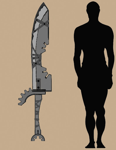
WIP Hand Painted Sword
Latest Update:

I just signed up with 3d Motive, and I want to give the Hand Painted Texture Tutorials a Try. Painting in Photoshop is really lacking for me right now. This is even the first time I've really even concepted something from scratch before too. So here is my design. I will model it out now, then play with color values later.


I just signed up with 3d Motive, and I want to give the Hand Painted Texture Tutorials a Try. Painting in Photoshop is really lacking for me right now. This is even the first time I've really even concepted something from scratch before too. So here is my design. I will model it out now, then play with color values later.

Replies
Blade Texture
Real Time Render of Blade
This is the first time I have ever painted anything in photoshop, so any comments, critiques, or tips are very appreciated.
Would love to see it finished
I was trying to get the stone effect, but I left out the most important aspect of stone...the chiseled, faceted effect. Soooo, I'm going to go back in and just make the blade metal. I'll tone down the cloudy texture, add specular highlights on the edges, and fix those random grey spots there were supposed to be chipped stone. Thanks!
gather some reference of stone blades, roll up your sleeves and get dirty with your paintbrush. get color in there - you can have so much fun with stone.
here's a quick paintover i slapped together to give you some ideas.
you've got leather wrapped around the blade for no reason, so i put a big ass crack in it, like maybe killing that last grumpkin just about did it in. but does that stop our hero? hell no, he grabs his belt, wraps up the sword and jumps into the next cave.
i tried to really sell that it was chipped out of living stone. imperfect and full of irregularities. and not one or two huge perfectly chiseled gashes, but lots of nicks and splits along the thin cutting edge.
too many words, here is picture:
Haha NICE! Yeah this is my first time really hand painting anything like this. I think I blended my values too much, and didn't experiment with my hue shifts enough. I will defiantly be going back to this studying your paint over to see if I can get similar results. What else do you want to see in the sword? Give me a theme or idea to see if I can take it further!
For sure. All my attention for the next week is focused on hand painted textures. After I finish this sword, I am going to make a spiky mace.
Update. Looks really flat on the model right now. Going to go back in and add more highlights and shadows. But I think its coming around.
So you think the Stone effect is fine? I've looked at it for so long I can't self critique anymore.
http://www.briandalessandro.com/blog/create-an-animated-gif-in-photoshop-cs5/
The tufts of grass was brilliant. Instead of painting them in, some alpha planes would probably look better when the sword is shown from different angles.
The straps look like a liquify was applied, so now they have lost their tighteness from holding the stone together. The paint over showed wear without that happening.
I'm not a big fan of the hex in the center of the upper straps, that would suggest a screw goes all the way through. Which we know it doesn't. Changing this to a larger rivet to hold the straps together might work better..or a grommet would break the predictable pattern.
I love your stone texture material, though the cuts weren't as severe as the paintover, you still gave it the twist without effectively copying it.
Excellent piece with a lot of potential. Put it to the size and work on another idea. When you are ready, come back to this one with fresh eyes and see what you see.