Home 3D Art Showcase & Critiques

[UDK] Apartment

polycounter lvl 13
Offline / Send Message
jordan.kocon polycounter lvl 13
Newest:

JL3IT.jpg

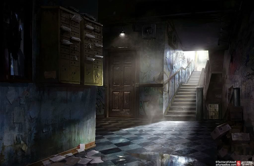
Concept:

image_1328128611.jpg

Replies

  • chrisradsby
    Offline / Send Message
    chrisradsby polycounter lvl 15
    Hmm maybe try to get the FOV right in UDK as well. The difference with the perspective is changing the overall composition here, it's a bit more stretched in UDK.

    But really nice blockout, can't wait til you get some textures slapped on :)
  • jordan.kocon
    Offline / Send Message
    jordan.kocon polycounter lvl 13
    Chrisradsby: Thanks :) The proportions are a little off, but I am going to worry about those a little later, and see how it looks when I get more props in it.

    Seeings as I no longer have a job, I will be able to go full steam aheard on this project. Here are two props I finished today. All the wood objects in the scene are done, but not too exciting, so I'll spare posting those. Here is a shot of the door, and the mailbox in UDK. My plan right now is to finish all the modeling and texturing within the next 8-10 days, then worry about lighting, post-processing, etc.

    C&C welcome!

    mailbox.jpg
    door-1.jpg
  • calen
    Offline / Send Message
    calen polycounter lvl 7
    mailbox - right now it looks just a bit weird that the sides (especially the side between the boxes, there really shouldn't be any scratches there) have a lot of scratch frequency as opposed to the front. Maybe some small scratches where the padlocks might scrape the metal and also the bottom lip of the box slots (the part where you have some drip stains) where someone might've tried to jam something bigger in?.

    Door- one thing i'd just point out is that that graffiti is intersecting the doorknob and the edge of the door, which is kinda strange. If i were to tag something i'd do it directly in the middle of the door like the lower one.
  • jordan.kocon
    Offline / Send Message
    jordan.kocon polycounter lvl 13
    Calen: Thanks for the crits on the two objects. I agree with both of them, and they are both fixed :)

    amile duan: The lighting in my level is temporary, but I plan to have an overall blue tint to the level, and having the light there can add a nice orange/red light to compliment the scene.

    Here is the current state of the level. I still need to finish the plaster and brick textures, and do the pipes, air coniditioners, then lighting.

    I have no idea how to approach realistically lighting this, so if anyone has any suggestions on that, that would be awesome.

    screen.jpg
  • ayoub44
    Offline / Send Message
    ayoub44 polycounter lvl 10
    look nice , but you sould work on color more . like fixing that desaturated floor .
    give it some colors :)
  • jordan.kocon
    Offline / Send Message
    jordan.kocon polycounter lvl 13
    ayoub44: I am going to work on the overall colour after everything is in place :)

    An updated image is at the top!
  • jordan.kocon
    Offline / Send Message
    jordan.kocon polycounter lvl 13
    Another update. I have most of the small detail props in now. I pretty much just have to do the wall textures, roof, and then move onto lighting. I should mention the roof texture right now is actually from Vahl's scene, as I was studying his when I started my level, and just stole it for a place holder at the time. C&C is welcome :)

    scene-2.jpg
  • jordan.kocon
    Offline / Send Message
    jordan.kocon polycounter lvl 13
    Here is where my scene is at. Does anyone have any suggestions on how to light this? I figured a dominant directional light should light 90% of the scene, but it only lights a square on the floor from where it pokes through the window. Otherwise my scene is a total jumble of spot lights and point lights, I'm sure there is a better way then how I have it setup...

    lTkHb.jpg
  • tristamus
    Offline / Send Message
    tristamus polycounter lvl 9
    Here is where my scene is at. Does anyone have any suggestions on how to light this? I figured a dominant directional light should light 90% of the scene, but it only lights a square on the floor from where it pokes through the window. Otherwise my scene is a total jumble of spot lights and point lights, I'm sure there is a better way then how I have it setup...

    lTkHb.jpg

    I see nothing wrong with the way it is currently lit. Good job man.
  • chrisradsby
    Offline / Send Message
    chrisradsby polycounter lvl 15
    Nice work, my only gripe is the light source at the door right now, it feels like the light beam should be wider to match the actual light output from the source. Without a proper light shader it wouldn't direct the light like that. :)

    Good work so far :)
  • jordan.kocon
    Offline / Send Message
    jordan.kocon polycounter lvl 13
    Thanks Chris :) I'll fix the light to make it look more realistic. Right now I am trying to add an animation so the fan blade in the air conditioner is slowly turning, and create a particle effect to simulate water leaking out of the pipes. I'll post that update later.
  • XXXTHECHAD
  • karatekodden
    Offline / Send Message
    karatekodden polycounter lvl 7
    Nice one dude, but i am a little bit unsure about the lamp in the front of the door. Seams like its floating in the air. Maybe try to add some kind of attachment to the roof. Would also be nice to see some reflections in the puddle, right now it looks more like dirt. And if its gonna be a "still" image, maybe try to lower and rotate the camera up a little bit for a more attractive composition, cuz right now i get the feeling that the door is very tiny. Keep up the good work! Cheers
  • jordan.kocon
    Offline / Send Message
    jordan.kocon polycounter lvl 13
    XXXTHECHAD: Thanks mate :)

    karatekodden: Cheers dude, the lamp right now just sticks straight into the roof, you can see there is a 'rod' coming out of it. The puddle currently has a cube map hooked up to, but the reflection isn't showing properly, but I will make sure to fix the reflection and get the angle right! As for the door I think you're right, I could probably scale it up a bit.
  • jordan.kocon
    Offline / Send Message
    jordan.kocon polycounter lvl 13
    Another update... with multiple angles! I really like the 2nd screenshot of the boxes, it's looking quite realistic I think (even though it is a super simple shot). Tomorrow is tweaking lighting and materials and post processing. I'm having issues with DOF, so hopefully I can wrap my head around all the settings. I was also able to get the fans animated and put in, so it looks a little more dynamic in real time, but I will post a video at a later date.
  • jordan.kocon
    Offline / Send Message
    jordan.kocon polycounter lvl 13
    Well I think I am going to call this finished, unless anyone can point anything out. It was to be a quick exercise to create a completed space in a short amount of time, and to get a stronger grasp on UDK. Here is a video and stills, C&C still welcome :)

    Video:

    [ame="http://www.youtube.com/watch?v=s0ibqEXtSYo&context=C47992e8ADvjVQa1PpcFNI3M873nTTSQCXwlwor7YYTHrU7YRCCeE="]UDK Apartment - YouTube[/ame]

    Stills:
    JL3IT.jpg
    216KO.jpg
    I7qvc.jpg
    sBAvR.jpg

    Lighting Only:
    3FurI.jpg
  • Limewax
    Offline / Send Message
    Limewax polycounter lvl 6
    For me, the DOF is a bit too distracting, but that just may be my personal taste. I think the lighting is quite appealing and you've extracted a lot of realistic aspects out of a nice small scope scene. If I could offer feedback for improvement, the best thing I could say is that the graffiti could be a bit more worn down... for instance it would be easy for me to understand that maybe someone tried to scrape away some of the graffiti, or paint over it... and it would be nice to have evidence to reinforce that.

    Overall, I find it very appealing and I am quite envious that I do not have a realistic piece up to this caliber in my own portfolio :)
  • Orangeknight
    Offline / Send Message
    Orangeknight polycounter lvl 5
    My only gripe is the graffiti it seems to new compared to the concept art. In yours it looks sharp while the concept it blends some more into the wall.
  • AlanSMitchell
    Offline / Send Message
    AlanSMitchell polycounter lvl 14
    - my crit
    The wood is too perfect!
    first age it add stains.
    Next paint drips would be on the wood where the would be artists would stand spray paint is mostly clean but the tip grabs some paint on the way out drips down the side and falls on the ground. the would be artist would probably step in the wet paint and leave some partial tracks. thats an idea to add interest also when the paint dips it would spash on the ground and if there was enough paint it would create a line of paint down one of the steps.
    Don't get me wrong I don't want to add more work and I love your work but I think the sene lacks a little something. Oooo also empty spray cans on the ground because honestly would they pick up after themselfs.
  • jordan.kocon
    Offline / Send Message
    jordan.kocon polycounter lvl 13
    Limewax: Cheers man, I think the DOF is pretty heavy, but I like it, I really wanted to only showcase certain areas (and hide others). As for the graffiti I agree, I will be grunging it up.

    Orangeknight: I'll be playing with the graffiti!

    dudealan2001: I think I meant to go back and dirty up the wood, and forgot... if so thanks for reminding me! I really dig the idea of spray paint cans being littered. Maybe I will setup a 'mini scene' in here, with evidence of an artist having recently painted the wall. I will be breaking up the graffiti, and perhaps add evident of it being painted over in certain spots.

    Keep the crits coming! :)

    Edit: As for the stairs being the way they are, they use the same texture as the door, I didnt give them unique texture space as I didn't plan on showing them close up. So I may have to re-UV and texture them, or figure something out.
  • DeadlyFreeze
    Offline / Send Message
    DeadlyFreeze polycounter lvl 17
    The scale is really getting thrown off by those mailboxes. Your average 6ft dude is going to be eclipsed by the size of them.

    scale.jpg
  • Orangeknight
    Offline / Send Message
    Orangeknight polycounter lvl 5
    Well one thing is dont put graffiti over each other, graffiti artists try not to do that and consider it deeply disrespectfull.
  • XXXTHECHAD
    In your vid-cap of the scene try not letting the camera stop at any point during each shot. Maybe slow down some of the shots. I also think the final shot of the stairs should be cut about half the current length, so it doesn't travel up as far as it does. Great work dude! Keep it up!
  • .morph3us
    Offline / Send Message
    .morph3us polycounter lvl 14
    maybe fading in your dof smoother than it is now would be better, just pointing out.

    on the original concept there is a small water pond on the floor, i think those refections could add a nice little detail?
  • haiddasalami
    Offline / Send Message
    haiddasalami polycounter lvl 14
    Hey Jordan, this is looking cool. The puddles imo feel off, feels like there's a weird hole in the ground right now, maybe its the size and intensity of the cubemaps. Also maybe just export the cubemap and blur in PS and bring it back in.\

    Quick question is that a decal or vertex paint?
  • jordan.kocon
    Offline / Send Message
    jordan.kocon polycounter lvl 13
    Orangeknight: I know that Graffitti Artists tend to not paint over each others work, but there are definitely examples of places where the same wall has been painted over time and time again. I wanted that really 'cluttered' look.

    XXXTHECHAD: Yea I have to extend the camera to keep moving past the cut. Just something I need to tweak in the matinee :)

    xXm0RpH3usXx: I will be trying to get the DOF looking smoother and more film-like. I currently have the reflection on the floor, but in the first shot it is quite bright and blown out.

    haiddasalami: I agree about the reflection, I really need to fix it. I plan to add some distortion to it, and possible a... clamp...? to keep it from getting so blown out in the first shot. The puddle is vertex paint :)

    On a side note, how do you achieve Bokeh DOF? I know this is a very heard thing to achieve (if it is even currently achievable), but are there any tutorials or basic things to keep in mind? I can't seem to find anything on it.
  • AlanSMitchell
    Offline / Send Message
    AlanSMitchell polycounter lvl 14
    http://vimeo.com/38542834
    I don't remember how to embed the video.
    I recently saw this on someone elses post this is flipping amazing.
  • AlanSMitchell
    Offline / Send Message
    AlanSMitchell polycounter lvl 14
    @jordan.kocon make sure to go into the UDK preferences to turn on DX11 before hand
    go into photoshop make a apeture shape White apeture shape Black Backround.
    256*256 or 128*128 texture size.
    make a post process volume and there should be a slot inside of blur for brokeh texture sample. I think there is also a roll out for you to click as well but thats pretty much it.
  • jordan.kocon
    Offline / Send Message
    jordan.kocon polycounter lvl 13
    dudealan2001: Thanks for the replies man! The video is awesome, I have seen it before :) And thanks a lot for the bokeh explanation, I'll give it a try!!
Sign In or Register to comment.