Hi,
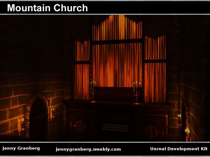
I'm currently working on two projects simultaneously and I feel the need to put this one to rest soon. It feels almost finished, but there's just something more that needs to be done... Apart from fixing a couple of tiling issues and some annoying lighting problems I'm not sure what else to do. Feedback and suggestions would be much appreciated
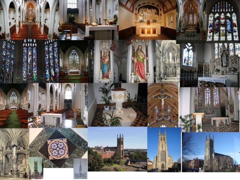
The church in the scene is mainly based on victorian gothic revival churches, the moodboard below only contains some of my references.
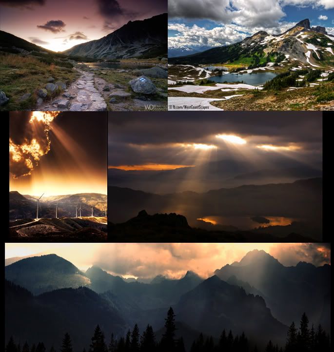
Moodboard for mountains and outdoors lighting below.
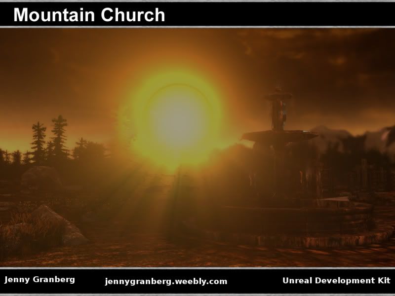
Your lighting is killing this and some of your choices to show this off are perplexing. Why would you use a shot of the sun blowing out all details in your scene?
The whole point is to show off your environment and that does the exact opposite. The lighting is your biggest issue, it's just too dark.
The lighting is also a bit too red\orange. There can be that color lighting, but everything is so blown out. If you look in real life when the sun is setting there are many within shadows.
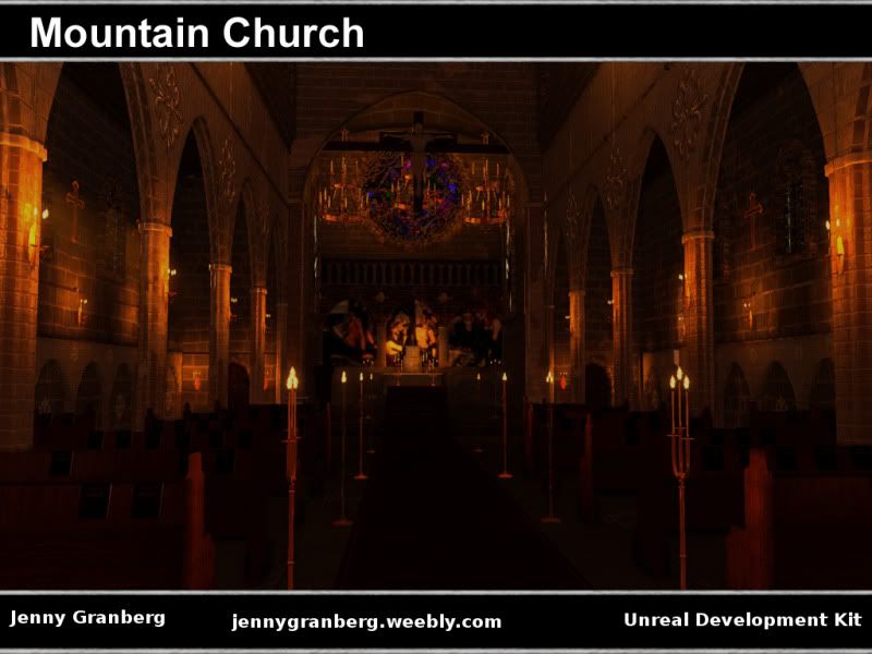
There needs more thought put into ambient light and the fall off between it and key lights. The candles in the last image for example seem too dim and clearly giving off the wrong colour.
If your in a dark room surrounded by candle light, everything isn't orange. The colour is of course easy to fix but try get some references of this kind of lighting and look at the kind of fall off you get from real lighting, for example more glow around a flame and how light would reflect off surfaces such as the brass on the organ.
Lastly I'd make the candle sticks a bit more visible, possibly thicker. You could do a lot of things with them in terms of dripped wax. Keep at it, its got a lot of potential.
Thanks everyone, as suggested I have tried changing the outdoors lighting and it looks better now, but now I can see that I need to do some work on the ground and tree textures and I may need to add some more foliage.
I'm going to spend Thursday working on the inside of the church, sorting out some weird lighting issues that popped up and get the candles right Annoying thing is that different churches seem to look completely different from each other in candle light, might depend on size and material etc.
After a lot of fiddling with settings I've run into a problem I can't seem to solve or understand. I have no clue what causes it, it's just weird... Weirdest thing is it only happens when I build the full level, not when I only build selected Really confused...
If your mesh has overlapping UVs and you're using lightmaps this WILL happen. Either make sure your UVs don't overlap and fit in the 1:1 tile or set the lightmap resolution to 0 in the mesh editor which'll fall back to vertex lighting (not so great)
If you want repeating textures but to keep the UVs in the 1:1 tile, do that by multiplying the UVs in the material editor.
Just a thought, wouldn't it only be the lightmap UVs that matter? Since I've got two sets of UVs the set for texturing shouldn't be able to cause this, should it?
Right, so I've had a look at the UVs, made sure that none of them are overlapping, but the lighting is still spazzing out, it does seem to change if I build lighting for selected assets and then rebuild lighting for the whole level. It's really confusing, but with time and patience I should be able to sort bout all the little issues.
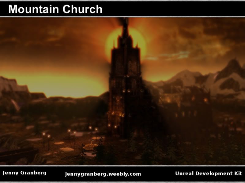
I have been told off for continuously just stressing myself out over my work, this level especially. Apparently I just keep on changing it and adding to it a bit too much, therefore I'm now considering the lighting done... maybe... I have also been told that adding a broom an bucket is unnecessary and so is throwing posters on the ground, therefore I kind of need some input on what I actually should add/change. I'm already thinking of making the candles all dribbly and perhaps som wax drops on the floor. Any tips/criticism/opinions?
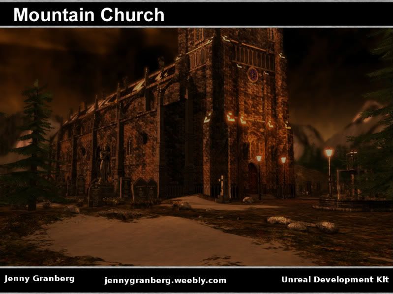
This is a couple of shots of what I've got right now:
I would have included a picture of the broom and bucket, but UDK is taking ages to rebuild lighting...
I'd say firstly the DOF is too high in the first image, kinda makes the church look like a toy as it's too strong, just be more subtle with it. Also you need more shadows in general, I don't mean make the lighting darker necessarily but your ambient looks really high over the whole scene.
Check out this for some inspiration for the inside of the church:
See how the ambient light is really quite dark even though there's quite a lot of candle light going on? I'd aim for something like that. For the exterior the ambient is again too bright, when the sky is that orange the sun is normally really low or already going over the horizon, leaving only low level ambient light. If you're worried about darkening up the scene too much I'd go back to the daytime lighting you had previously which worked well with the mountains but again had too high ambient/not enough contrast.
Cheers, I've been tweaking the ambient occlusion a bit, this may be more like it. I've also made the candles a bit nicer.
Somehow some meshes aren't showing up in gameplay mode and neither are my toggleable lights. oh, and some lights aren't rendering properly. I may have to reinstall UDK, going to check my scene on a different somputer tomorrow and see if that sorts stuff out.
Make sure you save the level and package when bringing in new content otherwise it won't show up in a play test.
I can't really add anything else but the lighting needs work. Artistically I don't like the imitation of a poorly exposed photograph. I think you should go more for what it would look like to the natural eye. Only other suggestion would be to solve the rampant tiling on the exterior brick. It looks like every other tile is the same. Try a diffuse texture with fewer features and then create a feature texture at the same res, but higher tiling within the image. You can store three different details within each color channel and use mask blending to bring out different features to break it up.
You may also want to try some vertex painting as well. Chris Albeluhn has a great tutorial on this approach. http://www.chrisalbeluhn.com/UDK_Advanced_Vertex_Painting.html
Yeah, problem with lighting is that candles can actually look pretty much like in that pictures, at least at Lucia celebrations in Sweden, but that's probably because there's usually hundreds of candles in a pitch black church or school an early December morning... I can see what you mean though, usually candle lighting isn't quite so red and the dark perhaps not quite as black.
I am actually using vertex painting, but I need to add more vertices to really use it, as it is it's kind of uniform... I'll definitely look into improving the brick textures, just started going on into a texture improvement stage
Replies
The whole point is to show off your environment and that does the exact opposite. The lighting is your biggest issue, it's just too dark.
If your in a dark room surrounded by candle light, everything isn't orange. The colour is of course easy to fix but try get some references of this kind of lighting and look at the kind of fall off you get from real lighting, for example more glow around a flame and how light would reflect off surfaces such as the brass on the organ.
Lastly I'd make the candle sticks a bit more visible, possibly thicker. You could do a lot of things with them in terms of dripped wax. Keep at it, its got a lot of potential.
I'm going to spend Thursday working on the inside of the church, sorting out some weird lighting issues that popped up and get the candles right Annoying thing is that different churches seem to look completely different from each other in candle light, might depend on size and material etc.
If you want repeating textures but to keep the UVs in the 1:1 tile, do that by multiplying the UVs in the material editor.
This is a couple of shots of what I've got right now:
I would have included a picture of the broom and bucket, but UDK is taking ages to rebuild lighting...
Check out this for some inspiration for the inside of the church:
See how the ambient light is really quite dark even though there's quite a lot of candle light going on? I'd aim for something like that. For the exterior the ambient is again too bright, when the sky is that orange the sun is normally really low or already going over the horizon, leaving only low level ambient light. If you're worried about darkening up the scene too much I'd go back to the daytime lighting you had previously which worked well with the mountains but again had too high ambient/not enough contrast.
My two cents anyway, keep going with it!
Somehow some meshes aren't showing up in gameplay mode and neither are my toggleable lights. oh, and some lights aren't rendering properly. I may have to reinstall UDK, going to check my scene on a different somputer tomorrow and see if that sorts stuff out.
I can't really add anything else but the lighting needs work. Artistically I don't like the imitation of a poorly exposed photograph. I think you should go more for what it would look like to the natural eye. Only other suggestion would be to solve the rampant tiling on the exterior brick. It looks like every other tile is the same. Try a diffuse texture with fewer features and then create a feature texture at the same res, but higher tiling within the image. You can store three different details within each color channel and use mask blending to bring out different features to break it up.
You may also want to try some vertex painting as well. Chris Albeluhn has a great tutorial on this approach.
http://www.chrisalbeluhn.com/UDK_Advanced_Vertex_Painting.html
I am actually using vertex painting, but I need to add more vertices to really use it, as it is it's kind of uniform... I'll definitely look into improving the brick textures, just started going on into a texture improvement stage