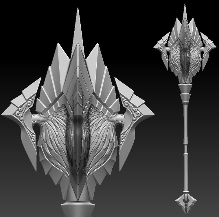
[DS2] Mace, Originlinear
Hello again. I did an axe, and now I figured I would try a mace.
Sort of concepting as I go. I would love some input.
It is supposed to be an angelic mace. I wanted to try to incorporate something a bit more organic so I went with a griffon. :S

Sort of concepting as I go. I would love some input.
It is supposed to be an angelic mace. I wanted to try to incorporate something a bit more organic so I went with a griffon. :S

Replies
Sort of went my own direction with the color scheme, since it doesn't really matter anymore haha. Critiques are cool.
Anyway looking forward to the next contest. Good luck everybody.
Very pleasing to look at though overall.
I agree about the beak. It was based on some concept I found on the net ( http://www.autodestruct.com/ds_angelic.htm ) at the bottom of this page. Sort of like the "beak armor" I suppose, but I wanted it to be less "sci-fi" looking. Perhaps I should just extend the beak into the blades center area.
Not so sure about the spike. When I was concepting (in 3d) I took it out and it just didn't look right to me.
@ChaosEidolon
Thanks. I did finish an axe on time, so that is good, but I like this one a lot better, oh well.
I agree the red is definitely not Darksiders. I went with my own colors because the contest is over, and I have the freedom to do what I like without losing points for not following the style exactly.