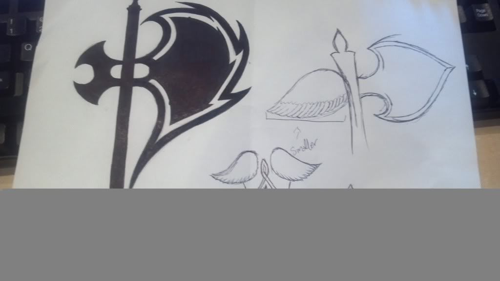
[DS2] Axe, zomgitsgwen
I am entering this as a class project, and I also dont really play video games so any constructive criticism would be greatly appreciated.
these are a couple of concept designs that I am playing around with for a basic shape, obviously details havent been added yet but deciding which concept would be best would be very helpful.
also, i am not really sure why it cut the bottom off of the image...:poly122:

these are a couple of concept designs that I am playing around with for a basic shape, obviously details havent been added yet but deciding which concept would be best would be very helpful.
also, i am not really sure why it cut the bottom off of the image...:poly122:

Replies
again, not much detail yet.
I'd also push the angles of the axe further. Maybe give the lower section of the blade a more jagged look and opposite of the smooth blade on the upper section. It could be a little play on good vs evil.
Also the Pommel need to be redesign. Maybe a mirror of the centre of the axe if you choose to redesign it.