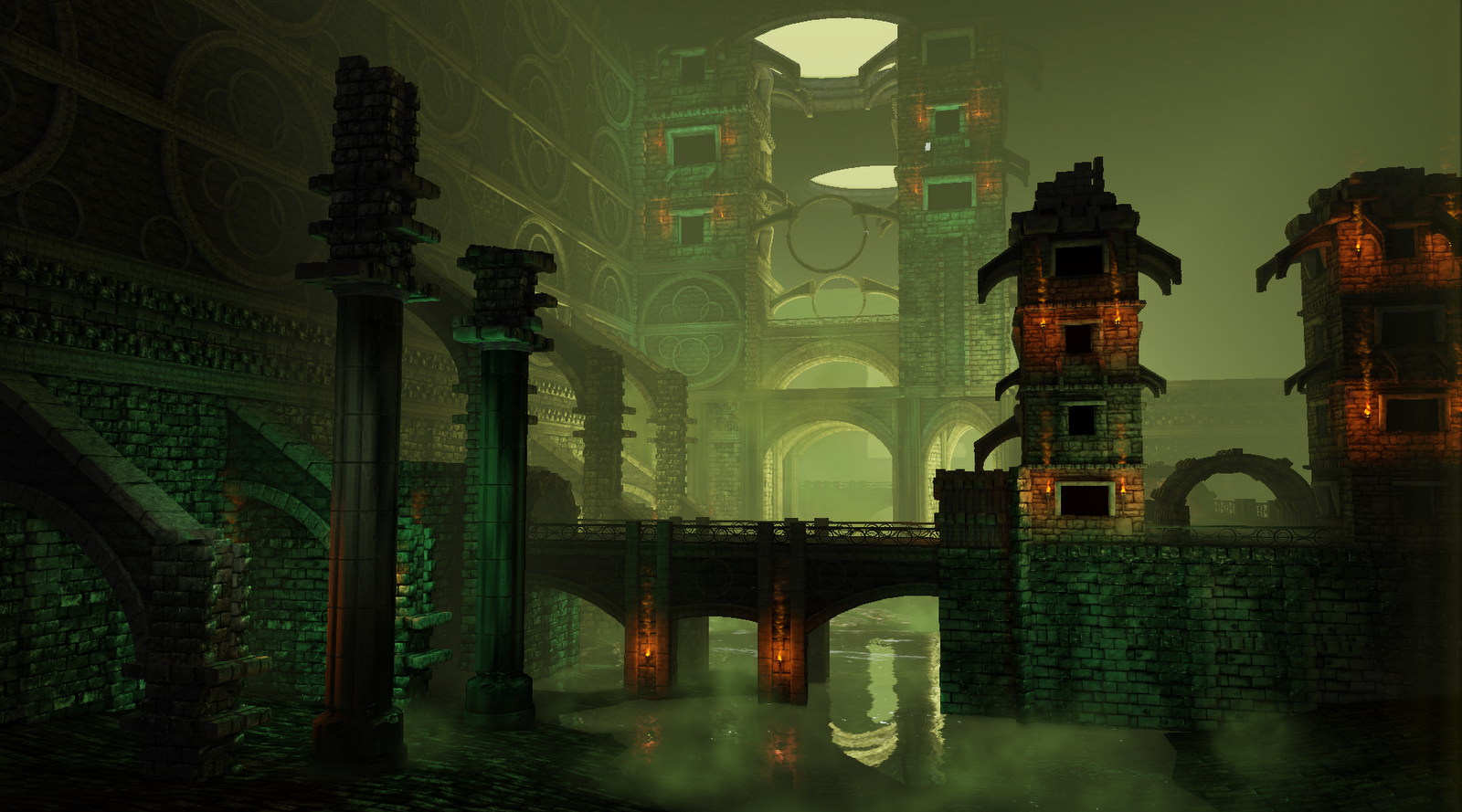
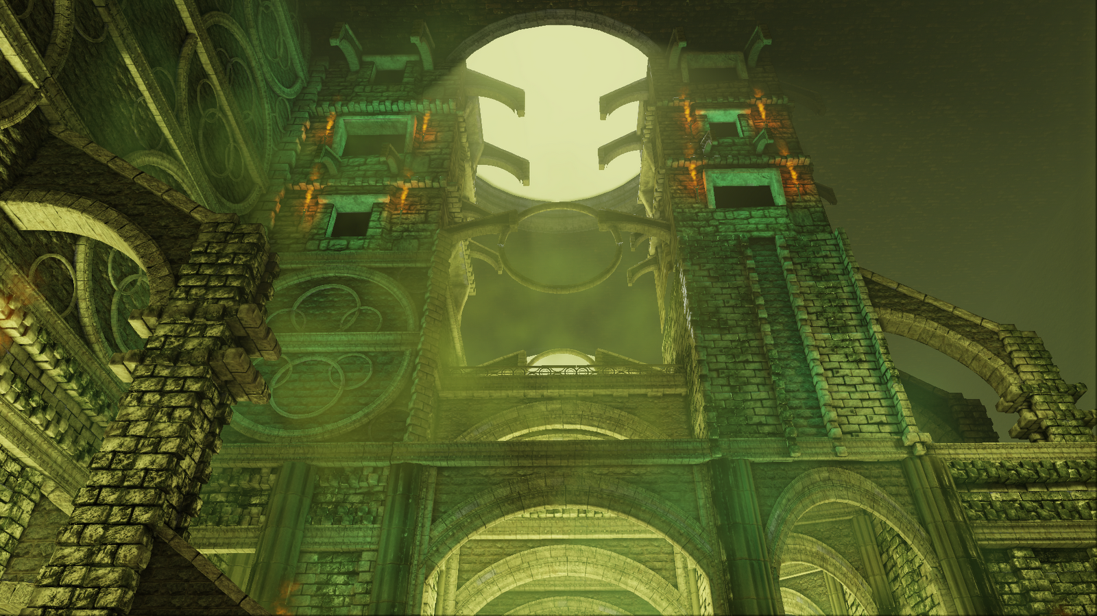
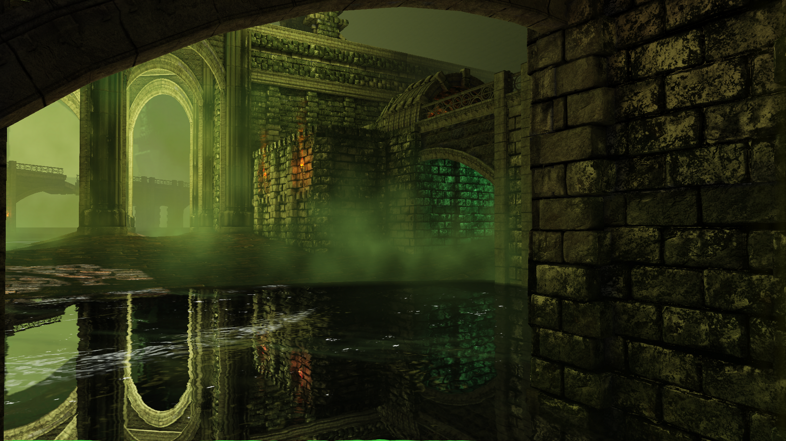
Ravnica Inspired Undercity - environment
Hey all,
For my first senior studio project I undertook an environment based fairly closely on concept art from Wizards of the Coast's Magic the Gathering TCG. For reference, here it is:

On it thus far, I've used a combination of Maya, Zbrush, Xnormal, Photoshop, ND02, and UDK. All assets seen are my own with the exception of the fire and fog emitters.
My plans for the project include getting some of the sewer grates/openings with running water pouring out into the scene as well as an overall addition of "stuff" and detail. While I learned an absolute ton this quarter on the project at times it was at the cost of efficiency and optimization. That said, one of the biggest goals would be to cut down on geometry. In particular, the stone block asset I used for a large portion of the buildings would be a great start. I was unable to get a normal and AO bake that i was happy with from a high poly model to a 6 sided-rectangle and instead opted to model in some of the crevices which upped the geometry immensely. So I will be looking into methods for baking onto a flat surface (suggestions welcome!)
Without further delay, here is where it's at!
For my first senior studio project I undertook an environment based fairly closely on concept art from Wizards of the Coast's Magic the Gathering TCG. For reference, here it is:
On it thus far, I've used a combination of Maya, Zbrush, Xnormal, Photoshop, ND02, and UDK. All assets seen are my own with the exception of the fire and fog emitters.
My plans for the project include getting some of the sewer grates/openings with running water pouring out into the scene as well as an overall addition of "stuff" and detail. While I learned an absolute ton this quarter on the project at times it was at the cost of efficiency and optimization. That said, one of the biggest goals would be to cut down on geometry. In particular, the stone block asset I used for a large portion of the buildings would be a great start. I was unable to get a normal and AO bake that i was happy with from a high poly model to a 6 sided-rectangle and instead opted to model in some of the crevices which upped the geometry immensely. So I will be looking into methods for baking onto a flat surface (suggestions welcome!)
Without further delay, here is where it's at!
Replies
Would you mind posting pics of some of the individual assets you made for this level?
Also what engine are you using?
keep it up though man, i love the green of it all
@ PVJ : Thanks! The above represent the "majority" of the major assets. I grouped some of the ones that were similar and that shared similar diffuse maps for the sake of avoiding redundancy. I am still trying to get wireframes that I am excited about
@ Darkleopard : Thank you very much! This project was begun at the beginning of the year. The class is a 10 week class and this was done start to finish within that time frame. I had a lot of learning on the front end so much so that around mid terms ( 4.5 weeks back ) I actually opted to scrap the UDK scene I had, make the stone blocks/bricks from the first image above, and start rebuilding my environment. So that said the bulk of the work has happened in the last 5 weeks after I got my feet under me! Also, this was put together within the Unreal Development Kit.
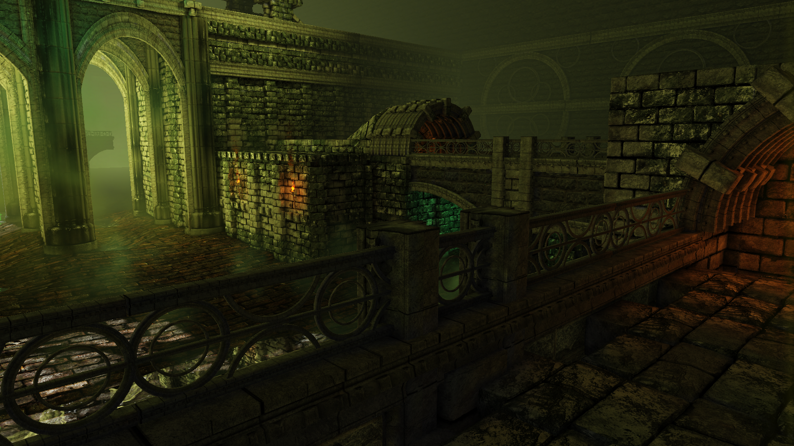
@ Mr Smo : Thanks! Are you talking about all of the bricks and blocks in the scene overall? Or the ones on the left, middle, or ceiling? I can definitely agree with you as far as the ceiling since it really is just tiled at the moment. the gray-er bricks on the left-most wall are also fairly redundant. Though if you are referring more to the middle, what is standing out to you that you are picking up on repeatedly? As far as the "bleach" There's a whole lot of yellow light in that shot which they are definitely picking up quite heavily.
The bricks on the lower left column seams to have a bleached look to me - the contrast from light to dark, the tiling on the tower is the midground are the ones i was referring to. It's not majorly but the brick pattern is standing out for me, maybe a few smaller/split blocks in place of some of the blocks might help abit.
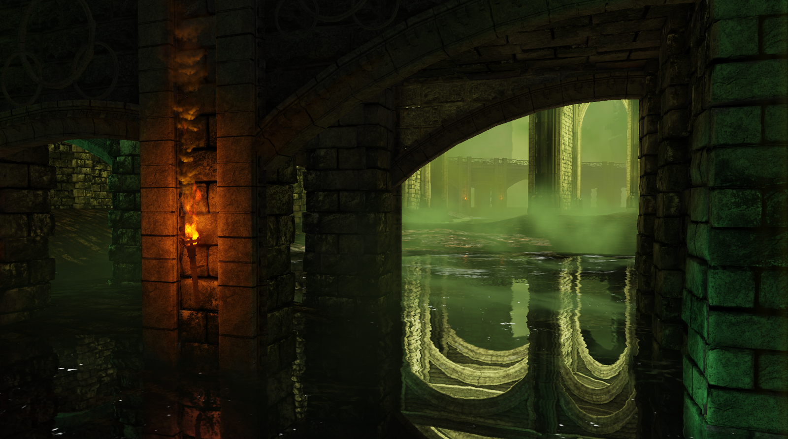
Love the water in the last shot by the way.
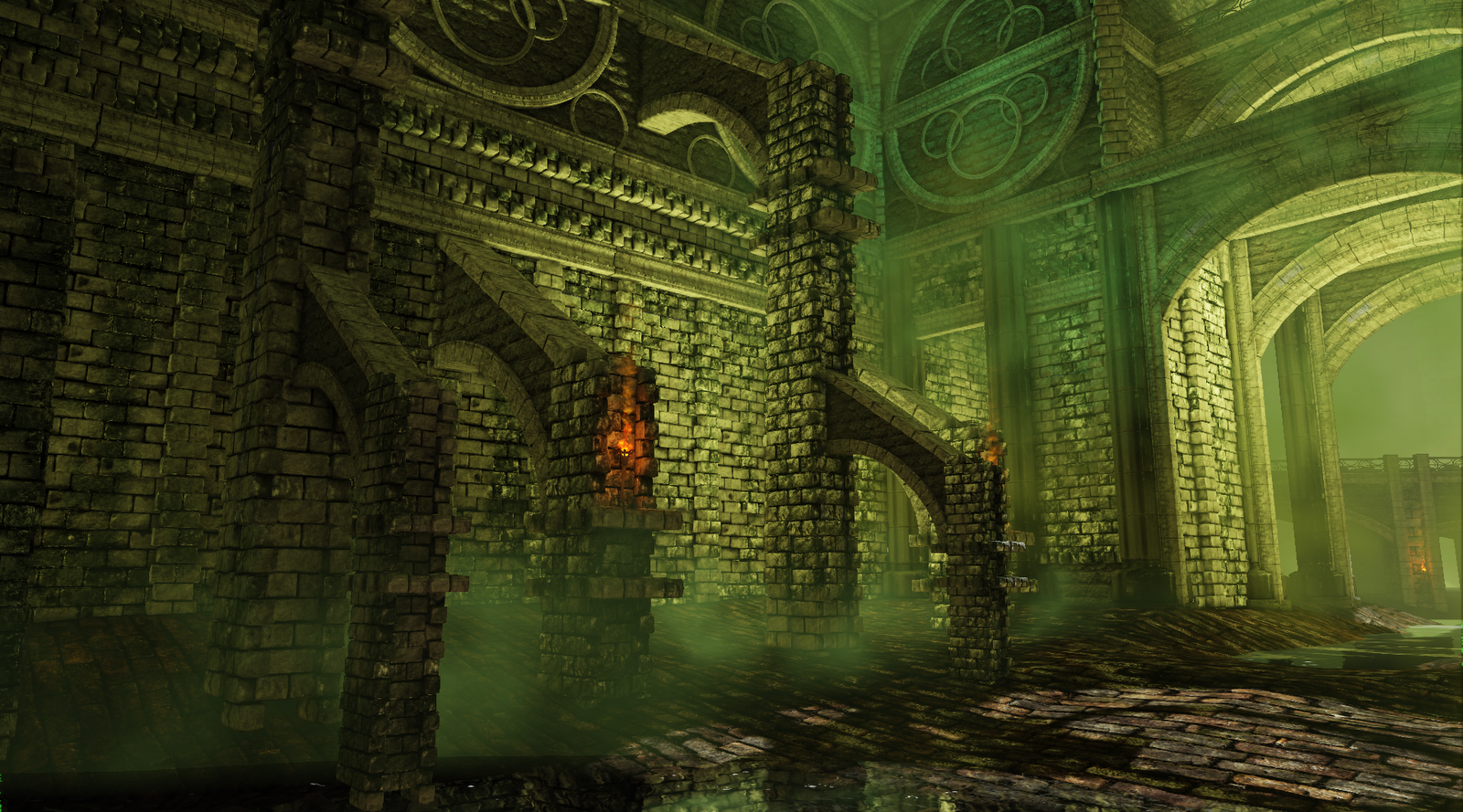
The question I need to go back to tackling is the one i was struggling with a bit at the beginning of the project, being, when should an object be a single object and when should it be broken down into pieces. For example, for a flying buttress, should it be all one item? Or would it be better to tackle it by making the lower arch one piece, the capstone on top a separate asset, and the building material between the two a third object?
@ samcole : Sounds like a good plan, and one that is inevitable once i start changing out some assets. Once things start moving the lighting will need to be adjusted to accent accordingly and that will be a perfect time to adjust it overall
@ Mr Smo : The bleaching, totally agree in that area. I had added a bounce spot light in that area pointed up to highlight the bottom of the decor and trim on that wall. It is on its own lighting channel so as to only catch those things. However i also put the bricks we're talking about on that channel and i was back and forth on whether they should actually be lit like that since the light is technically coming from behind them. I think they should be more of a silhouette here instead of bathed in yellow. Once i figure out a handful of assets i want to replace with stone i'll see what that does to my actual construction and perhaps it will address the tiling.
As for the water thanks! I started with Chris Albeluhn's reflective water tutorial. However it was for a fairly large, deep body of water so I altered a good amount of it. I disliked the way his distortions were working for me here so i made a separate network to handle the distortions than was being used for the surface panning and wave normals. also the depth and coloring all had to change since this wasn't nearly as deep. Finally, He left the tutorial with a single variable for specular and I went ahead and came up with a network that used some masks to outline some of the tops of the waves specifically.
@ jonas-144 : Thanks