Home Contests & Challenges Archives

[DS2] Mace, Bionic_Hound

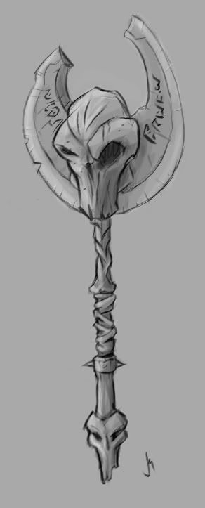
Hey all, getting in a little late, but I just couldn't resist trying my hand at this. So many good ideas are floating around and I couldn't stay away.

After many, many thumbnail tests, I'm kinda liking this design. Now this is a first draft quick sketch, so details might change (and perspective fixes needed :p). Lemme know what you guys think! :)

mace_sketch_cropped.jpg

seriously awesome talent that's going through this contest! This is gonna be a blast :)

Replies

  • Bionic_Hound
    Some of the feedback I've been getting (that isn't at all wrong) is that it's much more an axe, than a mace. Anybody have any clever ideas of how to make this guy into more of a mace, while keeping the skull, or should I just switch over to an axe. Thoughts?

    Any feedback would be tremendously helpful. :D
  • Pixeldemon
    Great looking concept! I agree it looks like an axe. I think the main idea behind maces is that they can strike from any side, and don't really have a "safe" plane.

    You could try turning the blade into an "X" type configuration, while leaving the skull visible.
  • SgtNasty
    I agree with Pixeldemon's suggestion. Ya that's definitely an axe, not a mace in the current form.
  • Bionic_Hound
    Pixeldemon wrote: »
    Great looking concept! I agree it looks like an axe. I think the main idea behind maces is that they can strike from any side, and don't really have a "safe" plane.

    You could try turning the blade into an "X" type configuration, while leaving the skull visible.

    Thanks Pixeldemon, that's an awesome suggestion. I was thinking of probably downplaying the blades a little bit, and putting them in an x-configuration, or possibly making 4 skulls around the handle to give it a heavier, bludgeon-y feel. I'll get some other quick sketches up soon :)

    SgtNasty: totally right.
  • Bionic_Hound
    Thanks for the feedback so far, guys :) it's been pretty helpful. So I did a few more sketches really quick to try to "mace-up" this.. well, mace. Let me know what you all think. I'm definitely liking the last sketch out of all of them so far. To me, it feels like it mixes the properties of the original sketch well into a mace format. Also, I lengthened the handle a bit to accommodate the larger blades.

    more_mace_Studies.jpg

    Any suggestions? I'm a fan of chains, and was thinking of incorporating that feature in here somewhere, but I'm concerned it'll get too noisy. I may try that tomorrow, we'll see.
  • madyak
    Offline / Send Message
    madyak polycounter lvl 17
    diggin' the overall change in silhouette to the one on the far right... I'd consider swapping the blades out for dull "fins" or something of the sort. You don't want the mace to get stuck in whatever you're hitting... :)
Sign In or Register to comment.