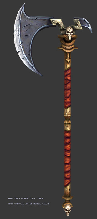
[DS2] Axe, Valerien
Last update :

Hi everyone,
I'm entering here mostly for learning purpose, to get connected with the community a bit etc. As an animation and music student, I don't have that much time for it so the thread may not be updated like on a daily basis.
The chosen theme is Maker. Feel free to criticize !
Preliminary drawings :


And the actual concept, which is going to be changed on the go as the proportions don't really fit the template :


Hi everyone,
I'm entering here mostly for learning purpose, to get connected with the community a bit etc. As an animation and music student, I don't have that much time for it so the thread may not be updated like on a daily basis.
The chosen theme is Maker. Feel free to criticize !
Preliminary drawings :


And the actual concept, which is going to be changed on the go as the proportions don't really fit the template :

Replies
Other than that i like it
- BoBo
I'm not really happy with it right now, mostly compared to the original game's assets quality, but well, I lack the time to go back to the beginning of the process, and overall skills to make something suitable for this contest :
So it's pretty unfinished, in fact I've got to create brushes right now in order to add details fast, but may some of you guys have feedback on it ?
I'll add normal map details with ndo, because obviously I don't have enough zbrush skills right now.
It still lacks color variation, details, the cloth doesn't work well... so if you have any ideas, insights or examples to help on that, I'd be glad to read it. Thank you for your time.
It's too late now but personally I think the weapon is too small. This is meant to be a weapon for the heavy class set and I don't get that "UMPH" feeling when I look at it. Anyway as for advice that helps you, I think the orange wrap is too in your face and I would go for a purple / blue colour. Maybe even red.
Another thing that bugs me is the holes on the blade. I can understand scratches but what made those holes?
Other than that I think the overall design makes it difficult for you to make it stand out. If you can what about scaling the skull and remaking the bit that connects the handle to the blade and making it HUGE.
Well those are my thoughts, I hope you can pull through.
And about the sculpt : probably, but I'd still need some more training on that.
Here's an update. A friend just told me the scratches didn't work : too regular etc., so I'm gonna try to fix it.
Thank you all for your comments.