Home Contests & Challenges Archives

[DS2] Axe, 011010

EDIT: New Stuff At top :)

ComboEntry.jpg
AngelDualBladedAxeOfAwesome.jpg
5cc9df1f8775e8ed694976f4be493dd4.gif

- - - - - - - - - - - - - - - - - - - - - - - - - - - - - - - - - - - - - - - - - - - - - - - - - - - - - - - - -

Hey All! First time here on this forum and First time Modelling a Game asset so this is definitely going to be an uphill battle!

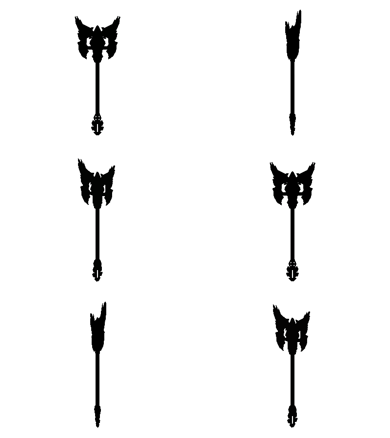
Ive decided to go with an Axe because Axes are AWESOME and they chop stuff, so heres my first few really rough ideas that floated round the cavity in my skull. Will probably narrow down which race/type i will go ahead with and then hopefully make some more pretty pictures and a model :poly142:

05.jpg

Replies

  • afisher
    Offline / Send Message
    afisher polycounter lvl 6
    Nice concepts. I like the middle one, it's got some cool potential!
  • SgtNasty
    Bottom left and middle for me.
  • 011010
    Cheers guys, so Middle middle and bottom left? they were the ones i was liking aswell so i might test them out a bit more. Cheers alfisher and SgtNasty :)
  • 011010
    Hey Yall! So i did some more development silhouettes on the two eeerbody liked. The Bottom few were some 'maker' ideas i had when i was all juiced up from doing the others.

    06-1.jpg

    Anywho toodles.

    Sam
  • 011010
    Bumped^ Any opinions guys?
  • irritated1
    Offline / Send Message
    irritated1 polycounter lvl 12
    2-d and 3-d are the stand outs for me, they just popped off the page
  • Vonklaus
    2b and 2g look sick!
  • Pixelatedkiwi
    Offline / Send Message
    Pixelatedkiwi polycounter
    I agree 2b and 2g look nice, the nice strong lines on 3d look really interesting too.
  • 011010
    Alright so this update took longer than i expected due to a few very busy days, but i still couldn't fully decide which one to go for so i worked a few more up a little bit. i think i will have to nail one down out of these though so any feedback is more than welcome :)
    07-1.jpg
  • Piflik
    Offline / Send Message
    Piflik polycounter lvl 12
    I really like the bottom two. Especially the hammer.
  • Grampz
    I think the top left with a the tall hat of 1-G would be pretty boss. They all look amazing as is though.

    The top middle is right up my alley, but I think the details might be too small in this situation to fit the style.
  • 011010
    Cheers for that Piflik and Grampz. Bottom right and the angel and mechanical one are my favs. Sorry for not numbering them it slipped my mind :/
    I have no game modelling experience so i am finding it a bit hard to judge what i will be able to fit in detail wise with the poly budget. So if any of them seem too much do feel free to mention that.
  • Grampz
    Also, make sure you put your thread link into your signature so its easier to get to it. Your work is amazing, gotta let others get to it quickly!
  • 011010
    Cheers Grampz, will have to get round to it :)

    Here's another step along the concept process, was planning on doing the same for at least another one but ran out of time tonight. Figuring i should get on to modelling seeing as time is running out so might just stick with this one but still shall see. What do you all think?

    09-1.jpg

    Anywho night night.
  • Grampz
    Yessss go with that one! Great silhouette and wonderful detail without being too heavy. Lets see what ya got!
  • 011010
    Cheers Grampz!

    Ok just realised there isn't much time left so will have to get to blocking it out asap. Also just watched the great little livestream from Avery and realised my axe wasn't very Darksidery. So as much as i would like to start again i just modified what i had and will try to push the shapes away from straight lines and sharp edges in my model and sculpt.

    i do have a question though, as ive never really modeled for games before and had a limited resolutions for my maps am i going for too much detail with this one? I thought a glowing stain glass prisim in the center was cooler than what i had before but if the resolution wont allow for it i might have to change again. Any input would be very welcome :)

    11.jpg
  • TehSplatt
    Offline / Send Message
    TehSplatt polycounter lvl 11
    based on what ive seen bobo say about alot of peoples designs is due to the chunkyness of darksiders and the 512 map small details dont read well and dont fit the style alot of the time. then again these are going to be huge haha. But i do think the patterns on the top wings are a bit much or maby the ones on the top part of the handle are a bit much. Looks cool though :D
  • jackrabbit82
    Offline / Send Message
    jackrabbit82 polycounter lvl 6
    Really bad-ass concept man ! You may have difficulties for packing your UV correctly, but with proper UV repetition you should get the right amount of details you want ;) Good luck with it can't wait to see it progress !
  • 011010
    Cheers Luka and jackrabbit82, I think i will have to knock back the fine detail although i could possibly mirror horizontally as well as front to back but that might get a bit too obvious with damage and stuff. Maybe once ive got the base modeled up ill do a texture test.
  • Stinkhorse
    Offline / Send Message
    Stinkhorse polycounter lvl 12
    I'm loving that stained glass window, please tell me there's going to be a glow of some kind out of it.
  • 011010
    Yea man you know it :D Am a bit scared about it being too pixelated though :/
  • jackrabbit82
    Offline / Send Message
    jackrabbit82 polycounter lvl 6
    For you're texture you don't have to worry too much i guess. You could make ,for exemple, 2 differents textured metal wings and play with the uv shell at the end. You may have to place a lot of the UV shell by hands on your canvas to get it done. I thinks its the big difference in dealing with the game industry standard.

    Only by seeing your drawing skills I can already say that you'll be just fine !
  • Stinkhorse
    Offline / Send Message
    Stinkhorse polycounter lvl 12
    If pixelization is a worry why not bump the window up in size and extend the angel's arms to compensate? You could extend it all the way down to the haft if need be.
  • Miodnre
    No crits about this awesome concept. Loving the stained glass.
    Just need moar.
  • 011010
    Cheers jackrabbit82 and Stinkhorse! Did a quick edit in photoshop so would no.1 now be more likely to achieve a better result? Im figuring ill mirror allot of the minor pieces and some of the central symetrical stuff and areas that wouldn't have heaps of damage and then see how i go. And the only real detail in the stain glass bit will be the lines between glass panels so as long as they arn't too pixelated we should be sweet. Thanks again for the feedback guys!! 112.jpg
  • 011010
    More Stained glass eh... hrrrm... not sure if i could add to much more without it looking ornamental and fragile..
  • Stinkhorse
    Offline / Send Message
    Stinkhorse polycounter lvl 12
    Yeah I think number one definitely focuses your main element and reduces the overall visual noise. The wings even feel stronger now that their shapes are standing on their own.

    My suggestion now would be to put a bit more kink in that axe blade. You have a hint of curve to it, so why not take it the rest of the way? I dont know if my paint over will work for you or what you want to accomplish here, but as my understanding of the art style goes, stronger angles = better.

    suggestionaxe.png

    Again, redesign number 1 is really strong and you should totally run with it!
  • BlvdNights
    Offline / Send Message
    BlvdNights polycounter lvl 8
    I gotta say, while the stained glass piece would look really cool, I don't think it would read well from a distance as well as the elements you had in that spot before. That bit with the dot felt more in tune with the overall shapes
  • 011010
    Great Idea Stinkhorse, at first i was like hrrrrrmmmmmm but played around with it and seems like your on the money again :)
    BlvdNights, you could very well be right but i think ill just stick with the stain glass as its going to make it a bit more interesting and provide a nice contrast.

    ok now for noob hour, Ive used the Harden edge tool in maya before and as far as i can recall it worked just fine. But now i cant get it to work for the life of me. ive tried to reset all my normals and my maya wont even do it on a default cube. All im doing is clicking on an edge and then clicking 'harden edge' .. any help or a workaround would be greatly appreciated, otherwise i might just try do it all in Zbrush..
  • Stinkhorse
    Offline / Send Message
    Stinkhorse polycounter lvl 12
    Haha thanks. I love Madureira's style, it has all these really specific quirks.

    I'd love to help you out with the hard edge thing, but I'm still trying to learn how to do the basics myself. Zbrush might be your option.
  • 011010
    Yea its very weird, all my other Normal tools work fine but the harden and soften edge do nothing. i mean they select the edge like as if they have done something but nothing changes in my smooth preview :/

    Oh well onward and upward, Here is a wire frame of my base and a 3D app thingy so erbody can turn it around and stuff. i apologies for any glaring errors as i didn't get much sleep last night.

    http://p3d.in/vesRX/smooth

    Wire01.jpg
  • Stinkhorse
    Offline / Send Message
    Stinkhorse polycounter lvl 12
    Looking solid! You've officially accelerated outside of my knowledge range, but I can keep providing my opinion as long as you want it.
  • 011010
    Cheers Stinkhorse, and an extra eye is always handy :)

    Well what i did was smooth all my meshes in maya using the retain hard edge option so that i didnt lose all my hard edges and form but its still meant allot of correction sculpting. Although i have opted to leave some of the blocky-ness in because i liked it. Just about to get into detailing and taking chunks out of it, better get my act together theres only a few days left! dark02.jpg
  • Stinkhorse
    Offline / Send Message
    Stinkhorse polycounter lvl 12
    Hotness! I wasnt to sure about all the wings piled up like they are but it's growing on me. That blade kink came out great too!

    And speaking of extra eyes, if I could get yours on my design too that would be awesome, if you have the time.
  • 011010
    Cheers Stinkhorse, have done :)

    Dominic i can't seem to see your attached images.

    Trying to kick my ass into shape to get this done before the deadline, still the hard part to go with the whole 'Normals baking' which should be fun! :/
  • Di$array
    Offline / Send Message
    Di$array polycounter lvl 5
    i think you could play around with the shield a bit more. Maybe have a large width at the top and a smaller width at the bottom. Plus that may pay off when you come to painting the angel on the shield by give it larger wings.

    Good work so far. keep it up.
  • 011010
    Good points Di$array, i might skip them for now as im not quite sure how i could change the shape that drastically without remaking the base mesh and re sculpting which im not sure i have time for. Might give it a got later tonight.Thanks :)

    Here is the update of my sculpt, im planning on mucking around with the stain glass window tonight and hopefully will figure out how to do this whole 'normal baking' thing quickly and with no issues....haha.. oh well untill later or tommorow. by the way the deadline is sunday right? AngelDualBladedAxeOfAwesome.jpg
  • 011010
    Alright sculpting is all done and im just making the low res mesh now, one question; Does it all have to be one mesh? Or is it acceptable to combine meshes together?

    Any help would be greatly appreciated :)
  • 011010
    Alright sculpting is all done and im just making the low res mesh now, one question; Does it all have to be one mesh? Or is it acceptable to combine meshes together?

    Any help would be greatly appreciated :)
  • 011010
    Alright So ive just stuck with one mesh but ive started to hit the wall after reducing my original build of 2300ish tris to 1600ish. When they said we could go over a little how little did that mean?
  • Stinkhorse
    Offline / Send Message
    Stinkhorse polycounter lvl 12
    As I understand it you need a solid low res mesh (based on what I've seen) and the 'little over' is a breathing room of about 200 polys absolute maximum.
  • Stinkhorse
    Offline / Send Message
    Stinkhorse polycounter lvl 12
    Oh and good luck dude it's looking pretty damn great!
  • 011010
    Ok Well then im sitting at 1620 and i think ill have to leave it there. heres a Budget Gif i made. Thanks for the support Stinkhorse! Its appreciated :)
    5cc9df1f8775e8ed694976f4be493dd4.gif
  • Stinkhorse
    Offline / Send Message
    Stinkhorse polycounter lvl 12
    Hey I know how much it sucks to fire updates into a void.

    The shape is looking pretty solid. Now get a bake and start texturing!
  • 011010
    Haha yea, well im used to it.. one day we shall have someone else to talk to :P

    Well after hours of pain and suffering i finally have a half decent normal map going on. here is a screen grab atm and hopefully textures will be on the way soon, Another question: Ive been scratching my head with this whole time zone thing, im living in Auckland, New Zealand. What time would that make the end of the competition here?

    Pain.jpg
  • Stinkhorse
    Offline / Send Message
    Stinkhorse polycounter lvl 12
    11:00am CST is when the contest ends so that would mean... uhh it looks like maybe 5am your time? I have no idea if that's right...
  • 011010
    Ok due to a massive error in time difference calculation of mine which Stinkhorse just corrected im pulling an all nighter to get this bad boy done. here is progress atm. Still really raw ... ANY CRITS??
    Untitled-1-1.jpg
  • 011010
    Well. Considering i have work tomorrow and its currently 4am i will have to leave it here. Not 100% happy but i guess itl have to do. All in all this was a great experience and i will be sure to make some more game models now that i know how :) Many thanks to all who gave me a hand on here.. umm what else... i tend to get overly dramatic when im half awake so i might just leave this for now.

    Cheers,

    Sam

    ComboEntry.jpg
  • Di$array
    Offline / Send Message
    Di$array polycounter lvl 5
    You've done a damn fine job bud. You should be happy with it. The only crit that i have got is the stain glass window feature. I would of liked to of seen more colour used. such as these.

    images?q=tbn:ANd9GcSMWPF-Hrw8ytTFuZf1ZKH6gPBSIJW9IFBSrlWr2E6euLhWh3xQ-g


    Other than that. great job and well done.
  • 011010
    Hey Di$array! Cheers for that image link, yea i was feeling the same but i was going in circles at 2am with it last night so i just de-saturated it but this morning after i read your comment i realized that the competition was actually ending today haha. I have the conversion the wrong way around lol

    But yea heres the new submission with a few other changes as well. Now to sleep.
    ComboEntry2.jpg
Sign In or Register to comment.