Home Contests & Challenges Archives

[DS2] Hammer, TypicalDan

Hello everybody! First thread here on Polycount, and what better way to start than jumping into a contest? Hoping to get some suggestions on what I can do to
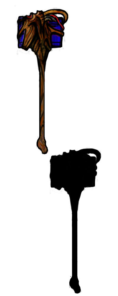
concept1.jpg

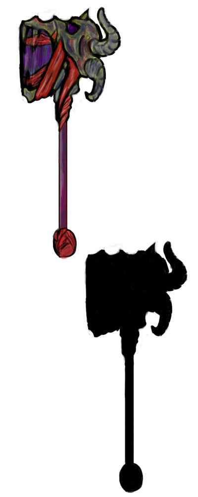
concept2.jpg
I'm leaning toward the first first one, varying the tendril-like parts to make it more interesting. Also making the front less flat in either case. All suggestions are appreciated!

Replies

  • specsowl
    Offline / Send Message
    specsowl polycounter lvl 6
    I like them, but the first one I'm unclear of the style. I'm guessing Kingdom of the Dead? Anyways, I prefer the second one. Just curious as to what the purple area is made of.
  • TypicalDan
    I was going for demonic on both of them, so if that's unclear I'll need to find a way to make it stand out more as such. I was trying to make it look like a skull form on top growing into the hammer. Any suggestions?

    For the purple I was going for a tainted metal, though I really think the colors in that one may need to be changed.
  • specsowl
    Offline / Send Message
    specsowl polycounter lvl 6
    I see it now that you mention it. Maybe a top view so I can see it clearer?
  • TypicalDan
    Specsowl, I was thinking something like this on the top, but while making it I figured it would be better to vary up the hammer part as well. I also added another demonic face to the side to hopefully make it a bit clearer. Not too set on the color though, and distorting the eyes made them look a little funny. Also, tried cracking away at a few parts, like at the skull's nose and hammer. Any thoughts?

    front.jpg
  • DownUnder
    Both of these look really sick. I can't wait to see the final versions. I think I'm leaning more towards the second one but the face on the top of the first one. Props man
  • TypicalDan
    Thanks DownUnder!

    I remade the upper part, trying to get a bit of both in there, so now it's got more of the face from the first, but eating the hammer like the second. Also a few more demon skulls thrown in to make it look meaner. It could still use a bit of tweaking, especially with the colors, but I'd prefer to get something going with high res and make changes along the way.

    combined.jpg
  • specsowl
    Offline / Send Message
    specsowl polycounter lvl 6
    Hey TypicalDan this is looking really great. Colors look MUCH more Darksider-ish. Nice use of color theory and skull has greatly improved.
  • TypicalDan
    I'm not too sure that the colors are any better, actually. The colors in Darksiders feel much less saturated, and I should have realized this earlier but the colors have very few compliments. Mostly similar hues. Still, have to get the the model done first, make it more angular. Any suggestions on spicing it up? It currently fits withing the proxy but I think the shapes need to be more noticeable on their own and whole could be more interesting.

    fulls.jpg

    special.jpg
Sign In or Register to comment.