Home Contests & Challenges Archives

[DS2] Hammer, Varsh

Would like to say this is indeed an honor to be able to participate in this contest and I am looking forward to seeing what the community comes up with over the following weeks :) That being said heres what I have come up with for my designs. Some of these I feel that the handle's could be a bit more interesting as well as the bottom's of them. So going to see how I can still modify of few of these. This is also my first time doing a contest here on ploycount so heh bit overwhelmed but looking forward to any and all comments and feedback!
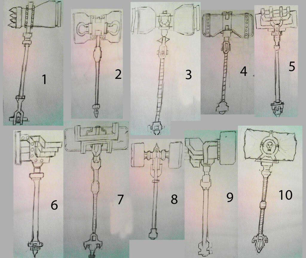
10_Ideas.jpg

Replies

  • Di$array
    Offline / Send Message
    Di$array polycounter lvl 5
    8 and 10 for me. Simple yet deadly.
  • irritated1
    Offline / Send Message
    irritated1 polycounter lvl 12
    I'm diggin 2,7 and 10
  • TypicalDan
    2, 6, and 10. Most dangerous looking.
  • Varsh
    Thanks for the feedback thus far on which one to go for. Looks like number 10 is the popular one so far :D. Came up with a different version of it as well as the handle for it. On the side view the extra elements added are carved into the stone but if it doesn't work well I don't have any issues dropping it and just leaving it like the first pic. As for the handle I felt this was a bit more intricate and a bit more interesting to look at.

    Number10_revision.jpg
  • Varsh
    did a quick paint over of the altered number 10 here to get a better idea of how its constructed.Still debating if I should show any gaps between the cloth wrapping around the handle or not and maybe even extended it up a bit more to cover some of the top to where the handle meets the hammer's head.

    PainteOver_01.jpg
  • Anuxinamoon
    Offline / Send Message
    Anuxinamoon polycounter lvl 14
    Looking good! I'm thinking the skull is looking a bit small. You should really make it a central part of the design by making it a bit bigger (or changing it from a skull to something more makerish?) Remember big shapes enhanced by clever details.
  • Varsh
    So I had revised the hammerhead part. I am going to take out the extra engravings I had made in the previous one as after reviewing them they didnt sit right with me

    I will adjust the length and somewhat the width of the hammerhead to be a bit bigger

    I will change out the skull for a more detailed one so as to have a focus for the hammer(threw together a few to choose from)

    and will have relic symbols on the metal working that goes around the hammerhead part.

    Revisions.jpg
    Relics_skulls.jpg
  • Varsh
    started the blocking out tonight of the hammer after work. Feel like I could possibly drop the center dividing element on that handle but not quite sure will see how that goes. Also started to make the skull a bit, decided to go with choice number one from my last selection that was posted. But will also do 6 as a backup if number one doesnt seem to fit well. But will need to add a bit more to 6 as right now its pretty simplistic heh :) The hammerhead is a bit flat at some views so will round it out a bit so its not just flat.

    Low_Poly_01.jpg
    Low_Poly_01_NoLight.jpg
  • Varsh
    Not the biggest update due to some over time at work on my end but heres currently where I am at.

    Base proxy is done and has been taken into zbrush. Started the sculpting as you can see in the hammer's head. Also chose a skull from what was posted last that will go inside of the circle of the hammer. Should have some more to show by end of tomorrow as the weekend is all dedicated time towards this :)

    Current_01.jpg
  • Varsh
    Current progress on the hammer head section. Still in the process of adding some nicks and scratches to the metal. Also some touching up on the stone section still before moving onto the staff and skull parts.

    Side_Top_HHProgress01.jpg

    Perspective_progress01.jpg
  • Daven
    Offline / Send Message
    Daven greentooth
    I'd take a second look at the stone block. Right now it's reading more like a sponge than stone lol.

    Remember that the texture is broken down into large and small details. Right now you just have a bunch of muddled small details and lumpy edges. Using the trim, pinch, and clay polish brushes might help you get a better result.

    shbogabtha.jpg
  • Varsh
    Thanks for the feedback suburbbum.My first time doing some of this so it's good to get some perspective from others. Also glad to know that I wasn't the only one who felt the sculpt of it thus far looked a bit off :).
  • Varsh
    Current progress on the rock/stone section. Still needs a bit more work but is less bloby and sponge like and some more defined features.

    Rock_N_Rune_Progress_01.jpg
  • Varsh
    Current Progress as of today. Just a few pieces left to subdivide and scuff up a bit along with a few that are already subdivided and are just needing some scuffing up done to them. Skull will be done by night's end.

    Progress_01.jpg
    Progress_02.jpg
    Progress_03.jpg
  • Habboi
    Offline / Send Message
    Habboi sublime tool
    The only issue I have is that the cracks seem randomly placed for the sake of it. You'd think that a crack in the grooves would mean the parts that stick out are even more damaged. I'd go back and really think about how the weapon is used and where damage would appear after long use.
Sign In or Register to comment.