The BRAWL² Tournament Challenge has been announced!
It starts May 12, and ends Oct 17. Let's see what you got!
https://polycount.com/discussion/237047/the-brawl²-tournament
It starts May 12, and ends Oct 17. Let's see what you got!
https://polycount.com/discussion/237047/the-brawl²-tournament
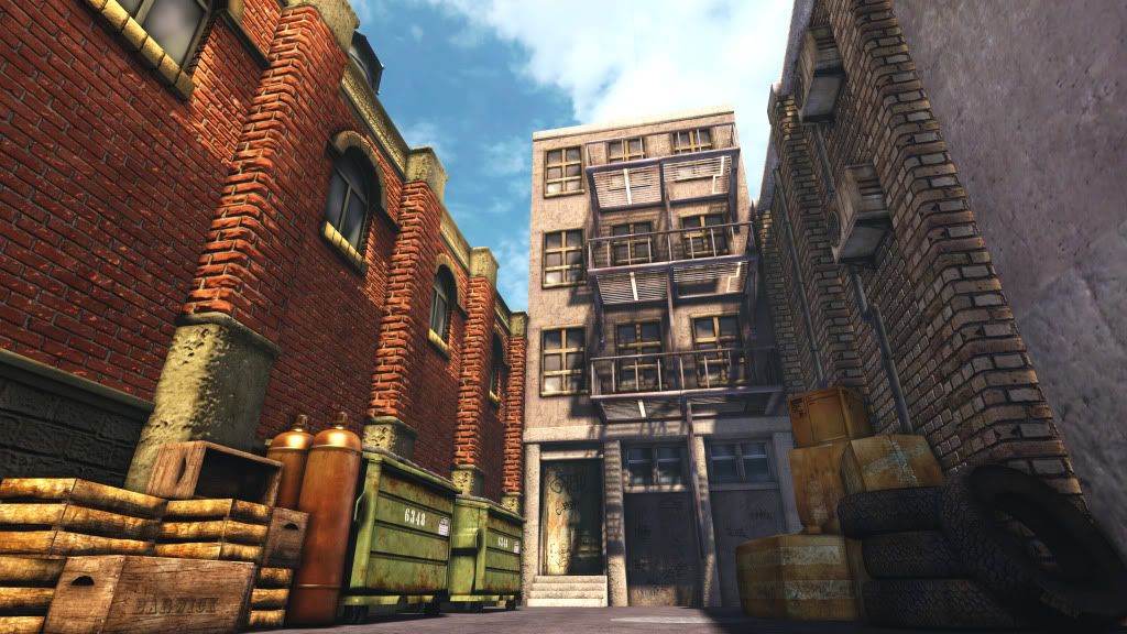
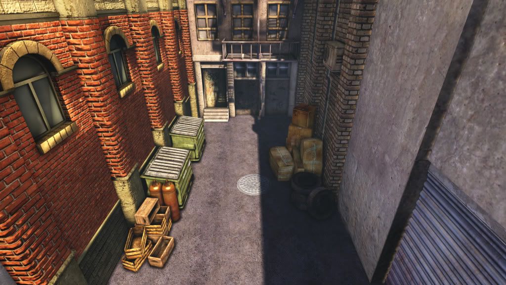
My first post UDK scene old alley
Hello everyone , this is my very first post in Polycount , being checking the site for a while now and finally decide to man up and start posting myself, so here is, this a practice scene in UDK I have been working on , right now I'm doing graffiti so I can add them to walls later,all critics, comments and advice are welcome.
I will like to mention Two issues I been having with the scene.
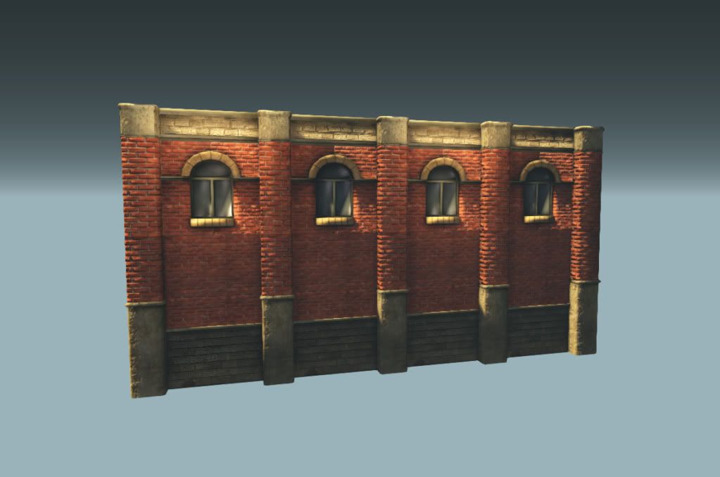
Number one is the lower brick wall of the building in the left ,the shadow and lighting doesn't work right , I tried reloading the mesh, resetting the lights , override light mass , the basic stuff, but no results.
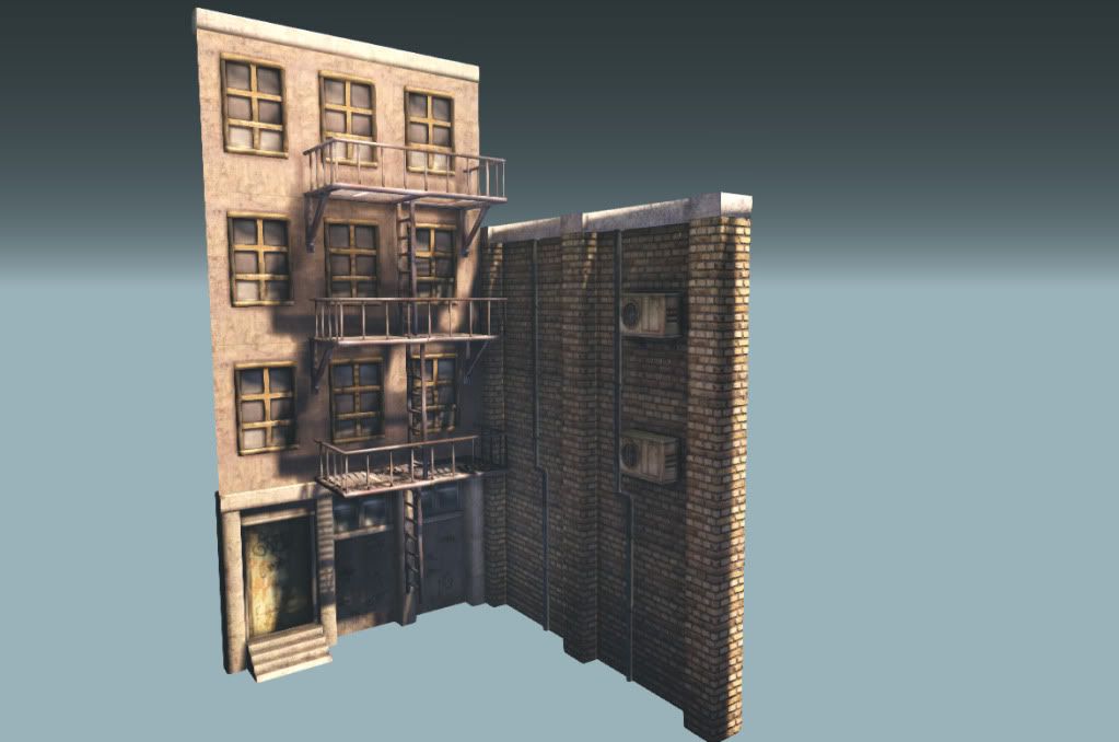
Number two has to do with the alphas, one part looks brighter than the other one, as you can see in the fire escape, tried everything.
Thanks for your time.


Replies
I notice a lot of smoothing errors around the scene. Mainly on the red brick pieces (center above window arch, horizontal line below window, roundness of the vertical columns)
There also a noticeable difference in the UV scaling between the bricks of the wall and the columns.
Scene itself is sterile and dry. Grudge decals, puddles, etc.
Scene has potential, I see that you have a good variation of material types. Such as metals, concrete, brick, rubber, etc..
At the same time, there some things that stand out that could be improved.
- Main thing for me is the composition, having the alley closed looks like your playing it safe. Having it open is more difficult but at the same time more interesting, it creates wonder and makes us want to know what is in the background...
See this example:
Example Image
Example Image 02
- From that same example you see more interesting lighting, lower angle, longer shadows, and brighter specular.
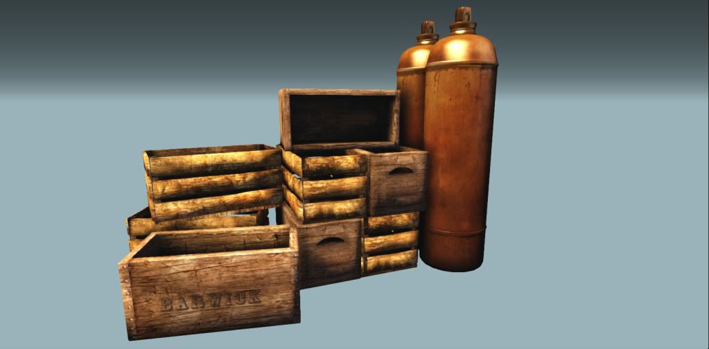
- Wooden crates have smoothing group that makes them look round.
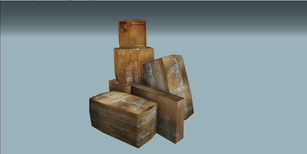
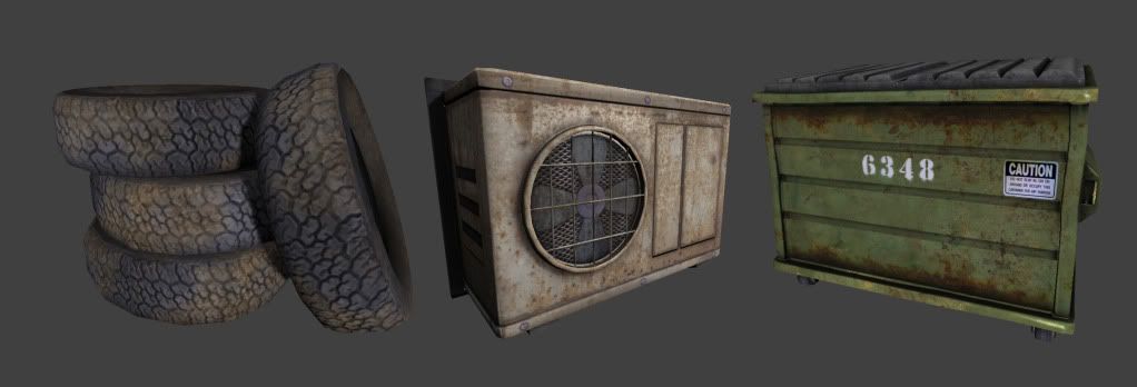
- Several things are almost perfectly aligned such as buildings, most boxes, crates, and trash bins. Grid alignment contributes to the 'cg' look.
- Left side is saturated, while the right side of the picture looks more monochromatic. I would suggest looking for a balance.
Best of luck with the project
thanks for the feed back man ,I really need it.
Anyway I agree with riddlaz about the color shift. Try to balance that out but at the same time make it more interesting. Something you could play around with is strategically placing higher values and or levels of saturation to draw the eye towards the subject of the scene. Try to tell a story with your work. I would suggest taking time to just open up ms word and just brainstorm some things about this alley. For example:
What are these buildings used for?
What year is it?
Does crime take place in this alley?
Who was the last person here and what were they doing?
Has an alien been killed hear? Or maybe a detective?
Once you figure out your story you will have a clearer idea of what your goal is for the scene and it will be easier for you to make the place interesting. Also you will probably have more fun with it and won't be worried about "taking the safe route". You will just want to make a kick ass scene that represents your story.
Good luck and I look forward to seeing what you come up with!
I never thought of giving some sort of visual story like back ground but it does make it clearer the direction of the project as you said before.
thanks.