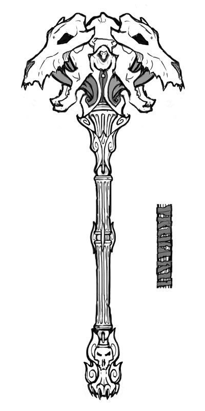
Current stage of the concept:

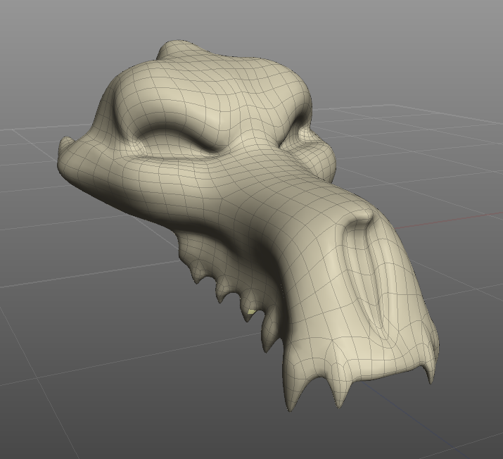
Some polygons:

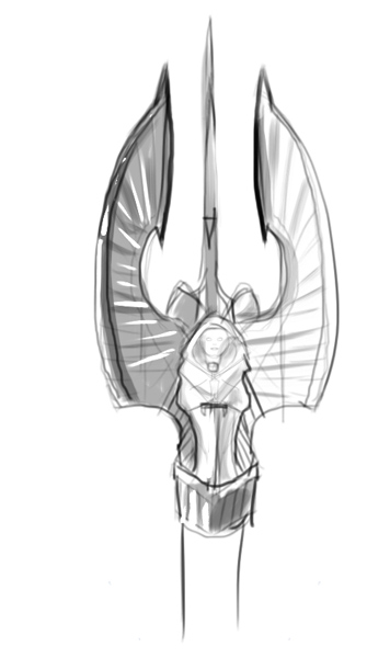
Not sure if I or my laptop are up to the task, but I'm going to work on a concept anyways. Here is the first that came out, though i'm not sure if it might be too understated for the game's style.

More to come
- Vin
Replies
Those blades could be bigger etc.
Feedback is very appreciated. Im just kinda shooting into the dark here hoping something jumps out at me.
http://www.venardhi.com/sketches/darksidersrandomaxes.jpg
while 'demonic face' is a common cliche in this contest, this take seems slightly more original.
the weapon looks like a mix of mace and axe though.
crow hammer looks nice as well.
Handle might be a bit thick too, not sure though, mines way too thin so it might be just that throwing me off.
Maybe make the wolf/monster head thingies a little more demony, and maybe see how wraps look on that handle.
although Cerberus is greek myth,
don't know if they would like that since the theme is more christianic with angels and demons,
ask BoBo?
As far as Cerberus being Greco-Roman rather than Abrahamic, Meh. It doesn't have to be Cerberus literally, Odin had "Hell Hounds" too, and such things are pretty common in Hellish iconography. Plus. I rather like it being being something other than a spiky demon head considering their prevalence in these threads so far. Doesn't seem to me they're hewing too closely to the actual Biblical text anyways. More of a creative reinterpretation of specific aspects of Revelation in particular. At least that is the impression I get.
Honestly though, I'm sick and tired of looking at horns, skulls, and angel wings. So thanks for coming up with something different to look at!
- BoBo
Right now I have the "smoke" coming up through the lower jaw to make it a bit more solid but I'm not sold on it yet, Thoughts?
First off, on the skull I think you need to exaggerate it a lot more. More angry brow, bigger teeth, harsher lines.
Also thought that removing the mandible might clean up the design a lot and make it feel a little more solid.
Just Ideas.
*edit* not sure if this really helps it look more solid. Starting to like the jaw version better now. Meh. I'm no help. :P