[DS2] Axe, Piflik
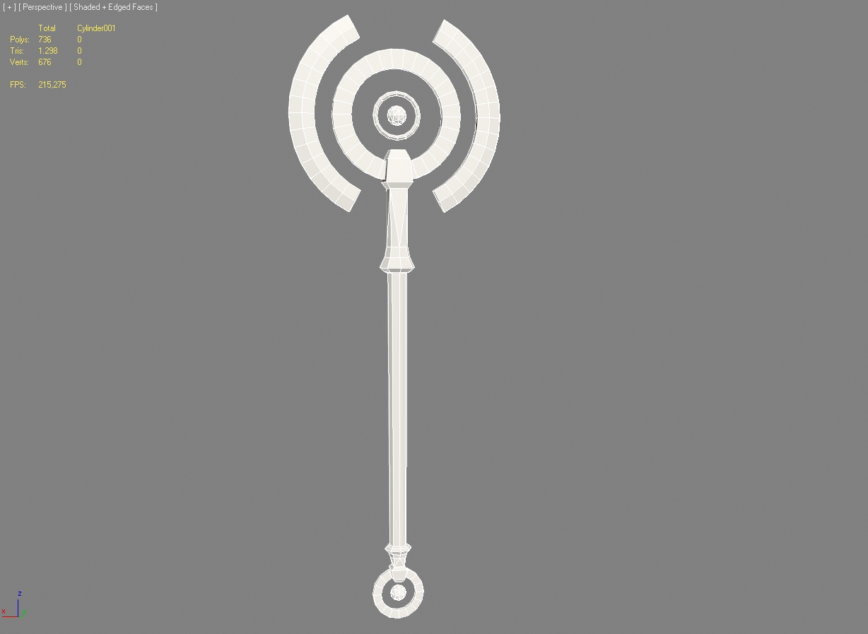
I really liked the first game and I am looking forward to the sequel. Also I am always eager for a reason to create something, so here is the first impression of my take on an angelic axe.

Pretty basic shapes, but I like circles
I'll have to play a bit with the proportions to fit it into the tamplate.
The blades will stay unconnected to the rest and just float there by magic.
Texture will be gold and blue, maybe wood for the shaft. Some engravings on the circles.
I also have an idea for a more evil looking mace, I hope I'll have enough time/energy to do both.
Replies
Very interesting design, I'll definetly keep an eye on this one.
Damn...why couldn't I see that...a gem instead of the spheres...that would make a good eye-catcher...thanks. :thumbup:
kinda reminds me of the staff of Ra, and hey its got wings in it for angelic :P
I will add the angelic runes in Photoshop, once I found a good reference...
- BoBo
Jokes aside. I think the "closed" blade^ is looking less "dangerous", you know, than the rest of the open top axes . My favorite still is the "B" variant. It's very elegant and is, together with A, the strongest. Looking forward to seeing your progress, good luck
Using existing work as an inspiration for your own stuff is fine, but actually taking the concept art and slapping it together with some extra brush strokes isn't going to get you very far.
It seems like you need time to get comfortable with the style instead of just rushing into another model. Pulling 2d concepts like cross-hatching into your 3d scope is one way that Darksiders emulates it's comic inspiration. If you can pull from the shapes and colors and be patient with your design, I think you'd be much happier with yourself as an artist than just ripping existing concept art and trying to model it. I know there's a deadline, but take your time.
Your last model wasn't bad, I just didn't match the style of the game. I'd say scrap this and give it another shot.
Still needs a pommel.