SketchBook: Alexis Bogue
Hey folks! Thanks for stopping by.
Quick info:
Long Info (ie, I like to ramble):
Been struggling with trying to figure out where I fit in for a while. College preached generalism, every professional I talked to told me to specialize. My two favorite trades are character/creature modeling and animation. I'm fortunate enough to be working with an indie developer right now where I get to do a great many things. In between the work I do for him I am working on honing my character skills.
That means learning how to use ZBrush. I've come to realize that ZBrush strikes people one of two ways: It is either the most amazingly intuitive and easy thing in the world, or it is a sadistic torture device designed solely to make a beginning user feel like an idiot. I am, unfortunately, in that second camp.
I have never let frustration and feeling like an idiot discourage me for long, however, and I'm determined to break this beast of a program. (I come from cattle ranchers, please excuse the metaphor)
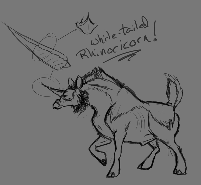
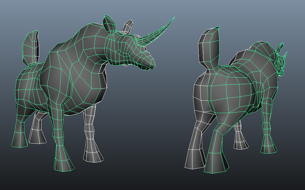
SO! I was shown this tutorial today and I had to stop after the first page. I had to stop not because I was confused, but because suddenly I was starting to GET IT. So I went and drew myself a beastie and blocked it out in Maya.


He's 1,500 tris, but I don't think that really matters because I'm just taking him into zbrush then I'll retopo later with a budget of 5,000.
Thanks for looking!
Quick info:
- Character art, drawing & 3D
- Critique is ALWAYS welcome
- Portfolio: http://alexis3d.com/
- Blog: http://secretagentcat.com/
- Livestream: http://www.livestream.com/secretagentcat
- G+: Alexis Bogue
- Twitter: @SACTigerfeet
Long Info (ie, I like to ramble):
Been struggling with trying to figure out where I fit in for a while. College preached generalism, every professional I talked to told me to specialize. My two favorite trades are character/creature modeling and animation. I'm fortunate enough to be working with an indie developer right now where I get to do a great many things. In between the work I do for him I am working on honing my character skills.
That means learning how to use ZBrush. I've come to realize that ZBrush strikes people one of two ways: It is either the most amazingly intuitive and easy thing in the world, or it is a sadistic torture device designed solely to make a beginning user feel like an idiot. I am, unfortunately, in that second camp.
I have never let frustration and feeling like an idiot discourage me for long, however, and I'm determined to break this beast of a program. (I come from cattle ranchers, please excuse the metaphor)
SO! I was shown this tutorial today and I had to stop after the first page. I had to stop not because I was confused, but because suddenly I was starting to GET IT. So I went and drew myself a beastie and blocked it out in Maya.


He's 1,500 tris, but I don't think that really matters because I'm just taking him into zbrush then I'll retopo later with a budget of 5,000.
Thanks for looking!
Replies
Zbrush, I will make you howl for mercy yet!
???
Profit.
dont stress too much on zbrush man, u need 3 brushes tops. the rest is just how good you can conceive 3d form and bringing it to life.
Go forth and Sculpt!
and pick up some anatomy books too itll help the 'conceiving' bit =3
Working to get more comfortable with the program before I come back to the Rhinocicorn.
Goal is to get this lady done over the summer so I'll have shiny pics of her to show off at PAX
Over my breaks at work today I did a bit of a paintover to figure out what I wanted to do for the texture. I'm really not sure how I'm going to handle the helmet yet. Have to go back in and kick some n-gons in the arse when I get home too.
As a sushi:
Turned inside out, it becomes a fish!
When in sushi-mode, it's about the size of the large maki sushi, I can't remember exactly what they're called.
Here's a succubus:
and like... fifty more that are just like this
And a couple of quick 'n dirty character portraits:
Skintones are my new favorite things
Most of the paintover was in the face, eyes and below. Liquify changed (changed...not perfectly fixed) several proportion issues that stood out to me. Tried to keep certain features but still make it more believable/realistic. Also, darker skinned folk tend to have higher contrast in their skin.
If you haven't seen it (it's pretty popular), this tutorial is awesome - the first section on lighting might help you get some better shapes and more confident looking end results: http://androidarts.com/art_tut.htm
Additionally, are you by any chance squinting while you paint at all? I've seen people say it a lot, the whole "squint at your painting" thing, but I'd really recommend against it. Nobody who's looking at it is going to be squinting at it, you need to see what's actually there. The whole squinting thing usually comes from trying to get the overall picture, something you should be focusing on mainly in the real early stages of an image. Better than squinting is looking at a small version of it (or the navigator thumbnail in the corner, in photoshop), which accomplishes the same thing as squinting without getting you in to that bad habit. (I'm not going to say I never blur my vision a bit while painting, but be wary of it and its downsides, is all I'm saying).
It's possible you're not squinting or blurring your vision at all while you work. I only mention it because your visible brush strokes look a lot like mine a few years ago, pretty visible but sort of like a pencil sketch that uses 20 strokes for one short line - a little feathery and lacking confidence. Maybe try to use brushes without any pressure-sensitive opacity on occasion. Using a 100% opacity brush can force you to make sure your strokes are there with purpose, and can be a good exercise from time to time. Also, remember you can often times let shrinking your image help you out a lot in the end. If you're able to paint at 2,000 pixels plus in any given direction, feel free to shrink that shit down to <800-1000 pixels. Easier to see the whole image at once on most monitors anyway, and will help blend some things together for you by hiding brush strokes and the like.
Mostly I've just wanted to say for awhile that I like your rhinocicorn design a lot. But didn't just want to say that.
Keep posting!
I think once I'm done with Nabooru and after PAX I might revisit mister rhinocicorn, try to bring him to the finish.
Thanks again for the crits, they're MUCH appreciated
Photoshop and After Effects. Sorry for the halos.
In the meantime, here's a thing I did. c&c welcome.
Then I had this neat idea to draw a dragon like a quetzelcoatlus, 'cause seriously, giant flying terror dragons, right? The macaw coloring just amused me.
And most recently, the other day I was in a really bad mood and took it out on the canvas.
(about 1.5 hours of work)
(3 hours for the sketch because Tom Hardy's face is hard)