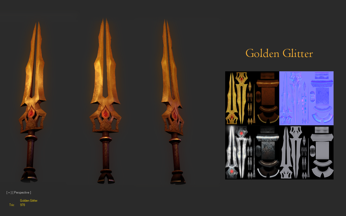
what materials are you using exactly? my first impression is that you need to diversify your materials
not sure if I'm using the correct terminology here, but in the concept it appears that the plate with the logo on it is not just brighter, but also reflects light differently.
also, i don't like orthographic 3/4 views. some might disagree, but i think they do more harm than good.
@almighty_gir: How do you mean? Most of it is photosourced and then worked upon, I used bits of the logo as base refs to get it as close to the concept.
@suspectlogic: I'm using diffuse, spec and normals in Xoliul's so far. Now I know that the normals aren't spectacular, but I intend to work on them. Anything more specific you think I should change?
I don't have the maps on my laptop, shall update the post later.
Photosourced doesn't mean I have taken the reference photo itself and just added few things over it of my own, that would be utterly offensive to assume in the first place and similarly degrading as an artist for me.
Anyhow, just because it looks similar to the concept doesn't mean its a copy paste. I rendered the whole thing in photoshop, worked on base layers, added multiple layers of scratches, and at the end, just to give it the feel of the concept, I replicated bits of the original center logo to achieve those highlights and shadows.
Please look at it for what it is. Its a learning assignment for school, and although it may seem like a stretch to argue, I am still trying to get better. I am not going to defend this idea anymore.
I'll probably scrap the griffin and paint it all over again as suggested once I get the hold of the files tomorrow morning.
Thank you for the feedback. Keep'em coming
Edit: Ahh, also, hold off the accusations until I post the textures tomorrow.
You should NEVER photosource from any art that you do not have rights to, you don't learn anything from it, and you could get a studio you work for sued.
Uhm, photosource over here, in this context didn't mean from the concept art. I meant it in 'working with various textures' kind of a way. I am aware of what you mean, and well, I don't know what else to say.
this is bullshit. my avatar isn't a lamp post either.
Okay then, I am not claiming it my own and taking it down.
Thank you, can I get feedback on 'other' things please?
I don't know can you? Yes you can.
The blades yeah sure it is cool. They're not unique they've been done before. I don't see anything that stands out to me. I am not sure if that is what you were going for. Maybe you were just going to copy the idea of someone else and make them again. That is cool and it happens a lot. Double bladed daggers were so prevalent during the medieval times. Their weight, easy storage, and extra damage, due to the second blade, were highly regarded.
To be honest though. I don't see anything wrong with them.. maybe a wireframe so we can bitch about polies. I don't see a purpose for a normal map. That is just me though.
It does remind me of a weapon from a PS3/xbox360 game like Demon's souls or Dark Souls
The chick with the hat. It's a chick with a hat. What do you want specifically? That is all I see.. no wireframes.. how the heck am or anyone supposed to give you crits about it.. WE ONLY see A CHICK in a HAT.
Be thankful, griff. People are taking time out of their day to give you feedback.
PhotoSOURCING means copy-pasting from a photo. PhotoREFERENCING means copying by hand, while looking at a photo. You used the wrong word and got people confused.
I don't think tRens is flaming you. His post seems legit. Your sword isn't really making much of its normal map that couldn't be done with just diffuse+spec. Your chick in a hat looks alright? I guess? I don't see anything bad about her, in particular, but I don't see anything great either. Show us more, maybe, like high poly / closeup / wire-frame.
What is happening in this thread? Not really sure why you people are flaming griffinax. He has been nothing but honest, has been answering questions and its obvious that he only used the original concept to know where things went, as he stated. Isn't that what a concept is for?
In regards to the other stuff: Its important to let us know what your intentions are. Where you are heading, what you are aiming for, in order for us to guide you there. The sword doesnt really look finished to me, and the normal map is hurting it more than it is helping it.
Yeah, the normal map doesn't look good. Can you show a screen with just normal map applied? And other with just diffuse? I think this will help us to see better what to improve.
Replies
not sure if I'm using the correct terminology here, but in the concept it appears that the plate with the logo on it is not just brighter, but also reflects light differently.
also, i don't like orthographic 3/4 views. some might disagree, but i think they do more harm than good.
@suspectlogic: I'm using diffuse, spec and normals in Xoliul's so far. Now I know that the normals aren't spectacular, but I intend to work on them. Anything more specific you think I should change?
I don't have the maps on my laptop, shall update the post later.
it would be far more interesting if you'd tried painting it by hand.
Photosourced doesn't mean I have taken the reference photo itself and just added few things over it of my own, that would be utterly offensive to assume in the first place and similarly degrading as an artist for me.
Anyhow, just because it looks similar to the concept doesn't mean its a copy paste. I rendered the whole thing in photoshop, worked on base layers, added multiple layers of scratches, and at the end, just to give it the feel of the concept, I replicated bits of the original center logo to achieve those highlights and shadows.
Please look at it for what it is. Its a learning assignment for school, and although it may seem like a stretch to argue, I am still trying to get better. I am not going to defend this idea anymore.
I'll probably scrap the griffin and paint it all over again as suggested once I get the hold of the files tomorrow morning.
Thank you for the feedback. Keep'em coming
Edit: Ahh, also, hold off the accusations until I post the textures tomorrow.
Did I say otherwise? I fail to understand. Please read what I said!
Anyway, a low poly character I am working on:
Uhm, photosource over here, in this context didn't mean from the concept art. I meant it in 'working with various textures' kind of a way. I am aware of what you mean, and well, I don't know what else to say.
this is bullshit. my avatar isn't a lamp post either.
Okay then, I am not claiming it my own and taking it down.
Thank you, can I get feedback on 'other' things please?
I don't know can you? Yes you can.
The blades yeah sure it is cool. They're not unique they've been done before. I don't see anything that stands out to me. I am not sure if that is what you were going for. Maybe you were just going to copy the idea of someone else and make them again. That is cool and it happens a lot. Double bladed daggers were so prevalent during the medieval times. Their weight, easy storage, and extra damage, due to the second blade, were highly regarded.
To be honest though. I don't see anything wrong with them.. maybe a wireframe so we can bitch about polies. I don't see a purpose for a normal map. That is just me though.
It does remind me of a weapon from a PS3/xbox360 game like Demon's souls or Dark Souls
The chick with the hat. It's a chick with a hat. What do you want specifically? That is all I see.. no wireframes.. how the heck am or anyone supposed to give you crits about it.. WE ONLY see A CHICK in a HAT.
Your flame is supposed to tickle me? Find something else to do.
PhotoSOURCING means copy-pasting from a photo. PhotoREFERENCING means copying by hand, while looking at a photo. You used the wrong word and got people confused.
I don't think tRens is flaming you. His post seems legit. Your sword isn't really making much of its normal map that couldn't be done with just diffuse+spec. Your chick in a hat looks alright? I guess? I don't see anything bad about her, in particular, but I don't see anything great either. Show us more, maybe, like high poly / closeup / wire-frame.
In regards to the other stuff: Its important to let us know what your intentions are. Where you are heading, what you are aiming for, in order for us to guide you there. The sword doesnt really look finished to me, and the normal map is hurting it more than it is helping it.