Tavern Interior
Hi everyone,
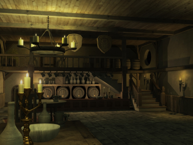
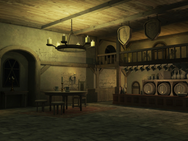
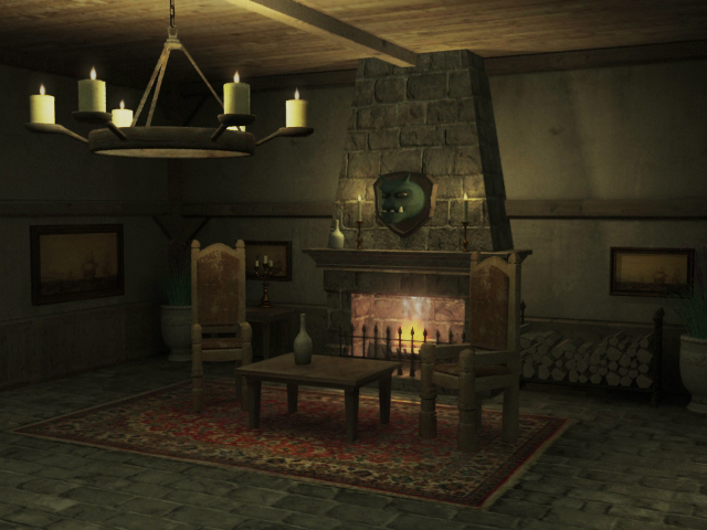
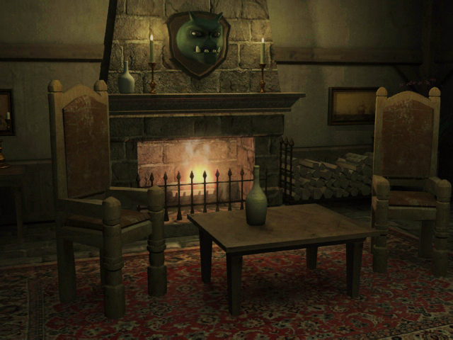
I am looking to add some additional polish to a tavern project that I worked on last semester in school. I'm hoping to add use this piece in my upcoming midpoint review at AAU and want to get it looking as good as possible. Could use some additional feedback- it was turned in as a final project at school and all I received was the grade (A-). Thanks polycount!
Modeled in 3ds Max, rendered with Mental Ray. AO and beauty renders composited in PS.


Replies
The chairs and table in picture 2 looks to big in comparison to the counter and the second floor.
Picture 3, again to big chairs. When i stand my head hit the chandelier and the chairs look really bulky.
The pictures are to low i must looking down.
The scene is nice but little offscale.
everything is so flatly lit. there is no real glow coming out of the fire place, there is a point light above the chandeller with its settings or range too high, you have a candle that some how lights the entire bar area. just look up a tavern in a concept and try to mimic that lighting
I think your materials could do with some tweaking, especially in the spec, the majority of items look like lamberts.
I feel it should be more moody and dark, personally. I added a lightsourse from the outside, which i think helps out in the moon light i would add some sort of object maybe? Something for the viewer to be drawn too.
Anyway image below.
Also all the objects look perfectly placed rotate them a bit of a bottle on its side and maybe some wax drooping of that holder at the front, i think its near but with some fine tweaking to the lighting and that extra puch in your models and textures and that A- will be an A+
About the materials- I really did err of the side of little to no spec, now that I am looking at it. I used the architectural shader in max, and I probably should have just stuck with blinn and phong. I was told that the architectural materials worked the same as MIA_X in maya, which I am familiar with. But I found it a lot more difficult for some reason, in terms of adjusting both bump and spec. It's probably really simple, but I need to read a bit on that particular shader to understand it, then go back in and start tweaking.
Thanks for pointing out the uneven lighting Ack Master. Definitely need to fix that.
Sharva- the paintover is lovely. It's so funny- I did have these grand plans of twinkling stars and moonlight (I was thinking of the lighting in the tavern from Dungeon Defenders), but time got the best of me. Your sketch inspires me to get back in there and get to work! The melting candles is a great idea, and it adds a lot to the atmosphere. I also like the blur that you added to the close objects- a little depth of field to increase interest. The additional darkness works with the moonlight.
Thanks everyone for the feedback. I'll post the progress here later, after I get done with the fixes and add moonlight.