Sketchbook - Nork
Yo everyone, this will be my first post. I am the Nork, and I am a 21 year old woman currently studying game design and graphics.
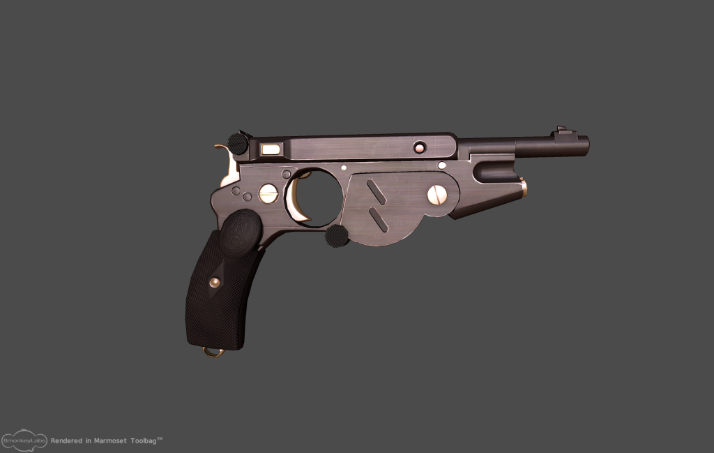
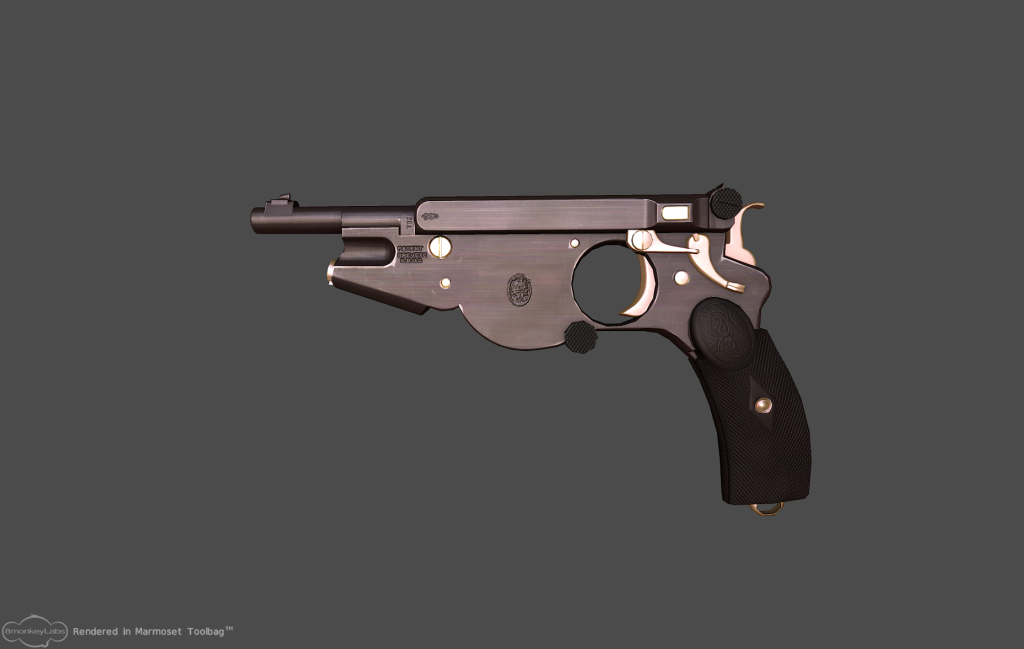
For the past few weeks I have been working on a modell of a gun called Bergmann 1896. I have made a highpoly, a low poly and baked normals, ambient occlusion and so on. Now I am finishing up my textures, but I am not quite satisfied with the results just yet, I was hoping you people could give me some tips and tricks of how I can make it better! This is perhaps my 10:th model ever, so I don't know all the secrets yet
Here are a few pictures of what the gun looks like at the moment. I have rendered the gun using marmoset toolbag.


Replies
Others can help you out in more detail than I can, but I know that racer is a beast and he has a good tutorial on material definition and texturing here: http://www.nextgenhardsurface.com/index.php?pageid=racer445
I recommend taking his "pay attention to reference" and so on things to heart and I'm sure your model will look great, it looks nicely modeled
First thing I'd suggest is showing a view that lets people see the thickness and overall shapes.
Posting up reference is always important too, especially when modeling a real object.
First thoughts:
1)Inconstant wear. You've got a couple spots of wear marks, but it's missing from most spots where it should exist - See the wikipedia pics for a good example.
2)The round grip on the slide is of a different poly density than the one below the trigger guard/magazine. I think I'd keep them consistent.
3)The blurred noise looking texture is a tad extreme. It would look more like a brushed texture the streaks weren't so long, I think.
4)The embossed logo portion of the grip looks separate and higher than the crosshatched part of grip in these views. It should follow the surface curve of the lower part of the grip from what I can see looking at refs.
5)I think you might need a bit more of a rounded bevel below the trigger guard. . .a fatter bevel on the trigger guard hole itself would probably help.
Now I am going to bake my new normals using xnormals. I hope I can reuse some of the work that I did on my previous normal. I'm also gonna show you some reference that I have used. I have used loads of pictures, and I am not sure I want to copy every last detail into my diffuse from my references. I am thinking of building up a small story about this gun in particular. Who used the gun, and for what.
anyways, here are some pics
i think there was no need to create geometry for those 2 diagonal holes, they could've been easily made with normal map.
there's also polies that don't add anything, and grip looks pretty blocky compared to barrel.
I have been working on a model of the GM Futurliner for a while now and I am now in the process of unwrapping and texturing it. I have never built and textured a vehicle before and I was hoping you guys could help me out. The vehicle is quite big and it has a modelled inside in addition to the outside. I imagine that in a game, this car would be a dynamic object that the player can interact with (drive). The model should be appropriate for a realistic game.
I am not sure on how I should use my texture maps, should I use tiling textures? How many materials should a vehicle like this have? Are there any neat tricks one can use to make the texture maps as efficient as possible?
Note that there are a few modeling kinks left to work out, I have got that covered, what I need help with is the texturing
Thanks for all the help
I need your help guys! I am unwrapping this bus and I am not sure of how to do it. Should I use tiling textures, should I use individual textures? How would you guys unwrap it? Would you divide the textures into a few different maps, or is that too expensive in a game.
All ideas and tips and tricks are welcome.