FF Tactics A2 Viera Elementalist
Hi everyone, I been wanting to do fan art for this job class since August. I had to commute 2 hours to get to work and Tactics A2 kept me entertained. I always thought that the Viera race were cool and my elementalist was a key member of my party. Now that I know how to model characters and my portfolio is at a presentable state I decided its time for me to have some fun, (while still adding to my folio).
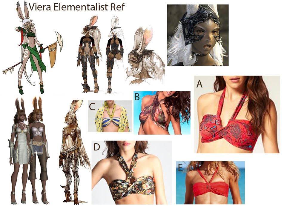
Here is a sample of the reference I've collected. The top left is the design of the Elementalist class and the style I'm going for is the more along the lines of the bottom left (FF12). I`m having a hard time choosing which style of top is the most interesting/would look the best. Can you help my choose please

I'm currently blocking in the anatomy and will post it in bit, to get a second opinion on it.
Later Dayz
Here is a sample of the reference I've collected. The top left is the design of the Elementalist class and the style I'm going for is the more along the lines of the bottom left (FF12). I`m having a hard time choosing which style of top is the most interesting/would look the best. Can you help my choose please

I'm currently blocking in the anatomy and will post it in bit, to get a second opinion on it.
Later Dayz
Replies
Anyway I've managed to do it all again, only faster and actually better than my first attempt. It feels so weird to do the figure of a Viera. My eyes are saying dude that's not right, people aren't built like that but that's how they are, with their super long arms and so on.
I still gotta add the finger nails but I have yet to decided if I'm gonna follow the design and cover them with that white material. I want to redesign because I've seen a number of cosplayers do their own take and well... I have artistic license.
Personally, I think you've done a good job. Some tweaks here and there possibly, but overall it reads as a female.
As what RJBonner is saying, some parts of the character look like they were sculpted straight from a higher subdiv. This is where a lot of waviness can occur, mainly when your defining the larger forms. In either case, the clothing has this going on the most, but some defining lines for the anatomy have this as well.
Also, there's a random bugle in her right arm.
Its not a bad start, you just need to slow down a bit on the subdividing.
Good luck mate.