The BRAWL² Tournament Challenge has been announced!
It starts May 12, and ends Oct 17. Let's see what you got!
https://polycount.com/discussion/237047/the-brawl²-tournament
It starts May 12, and ends Oct 17. Let's see what you got!
https://polycount.com/discussion/237047/the-brawl²-tournament
Some characters I've been working on lately(image heavy)
Hello, everyone
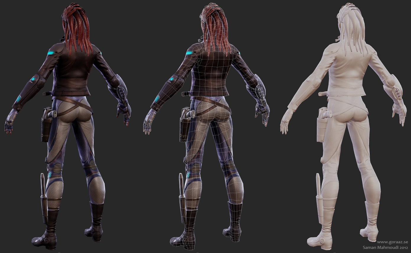
I haven't been posting my work in a while and I figured now would be the time. Here are some of the characters I've been working on since the summer of 2011. I used Xoliul's excellent shader for these two. Hope you like them.
The first one is my entry to cgfeedback's mass effect contest which I never finished in time. Her name is Dorri Raha which roughly translates as 'free star';
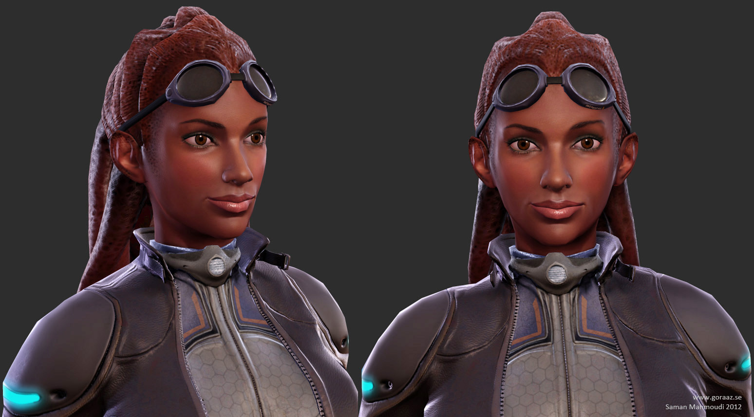
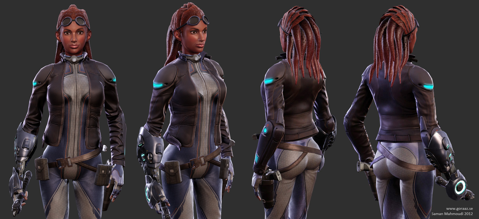

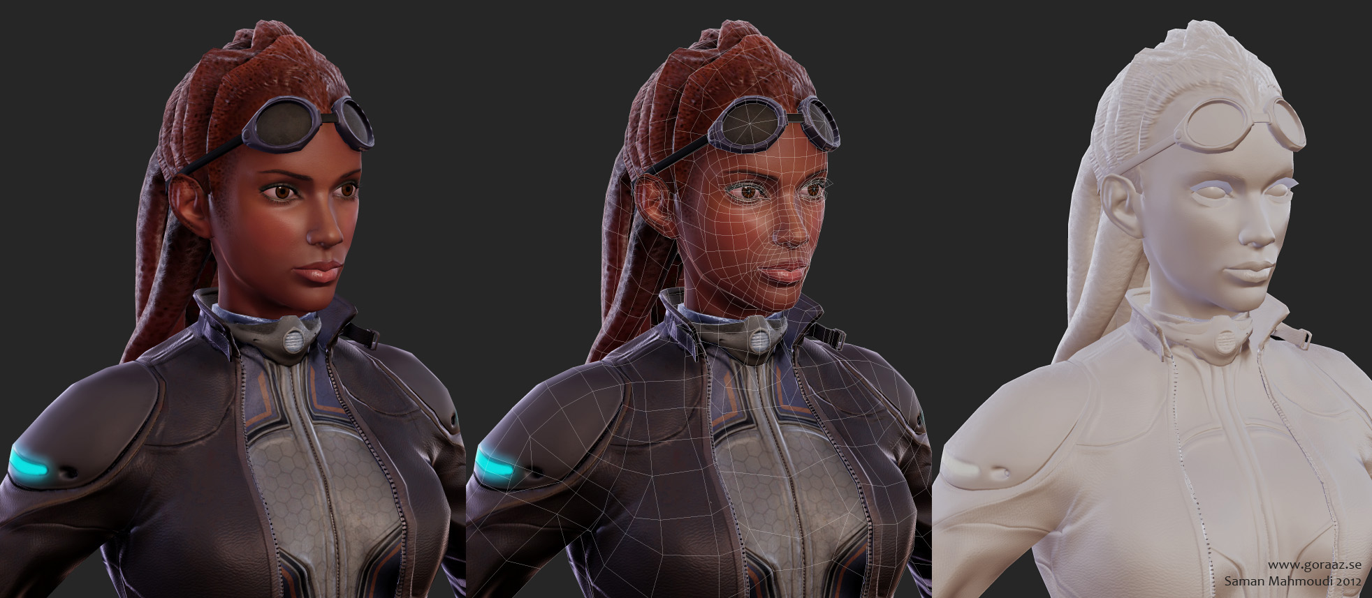
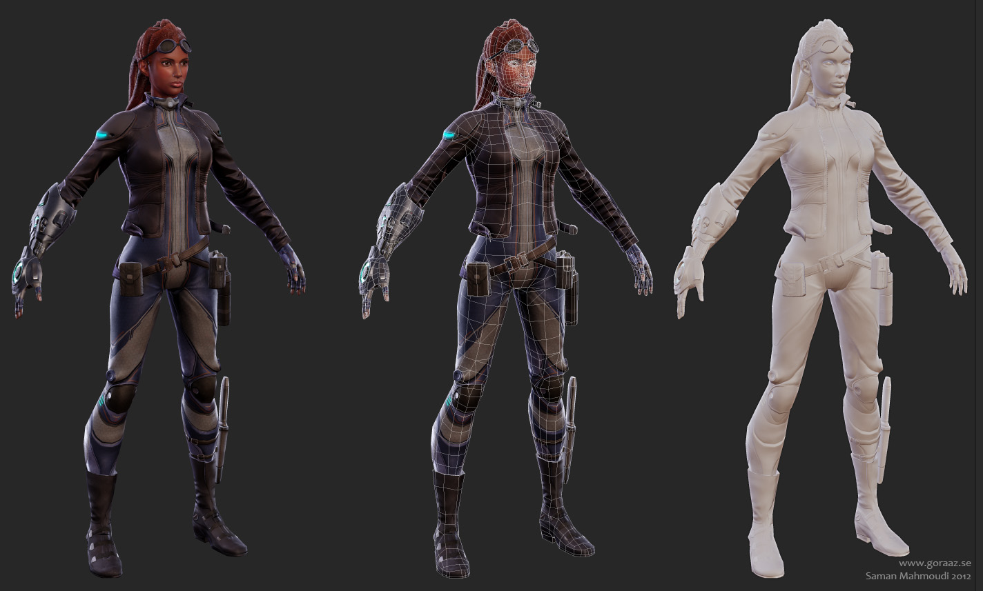
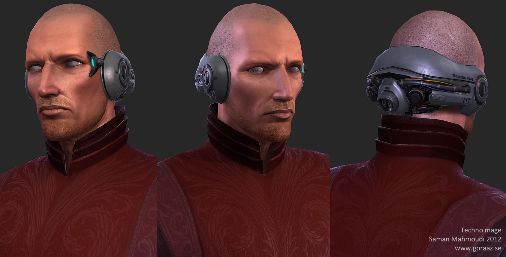
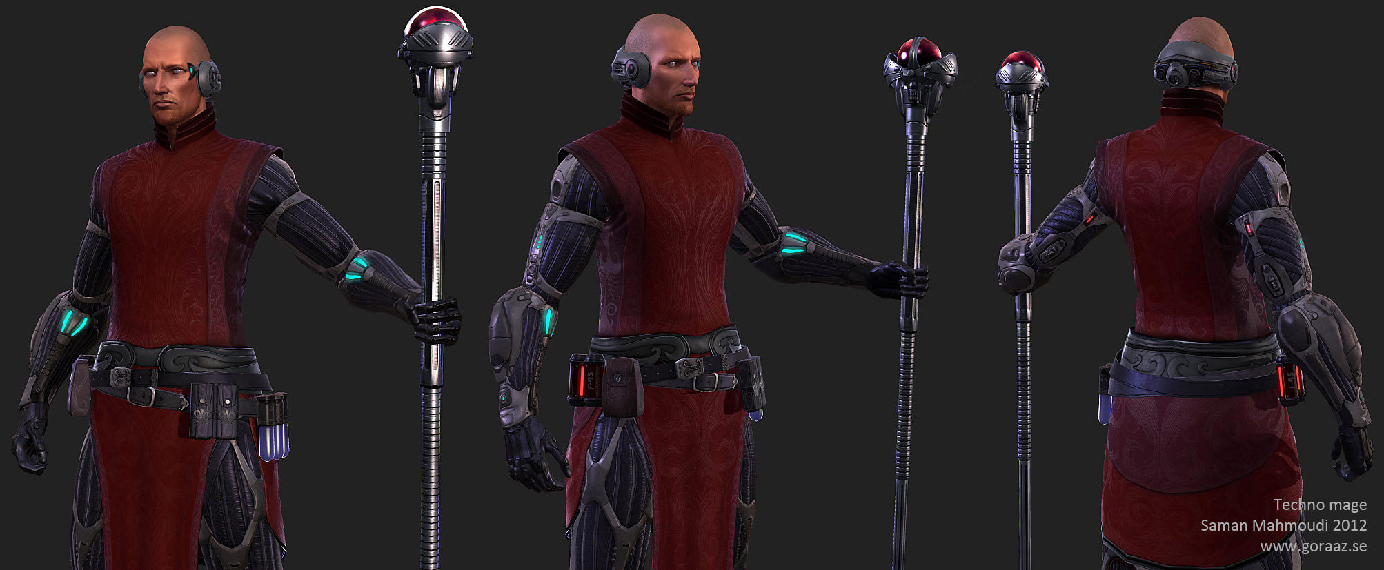
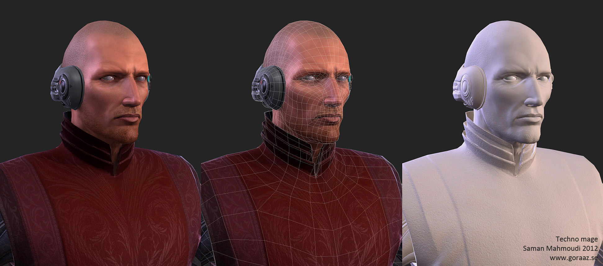
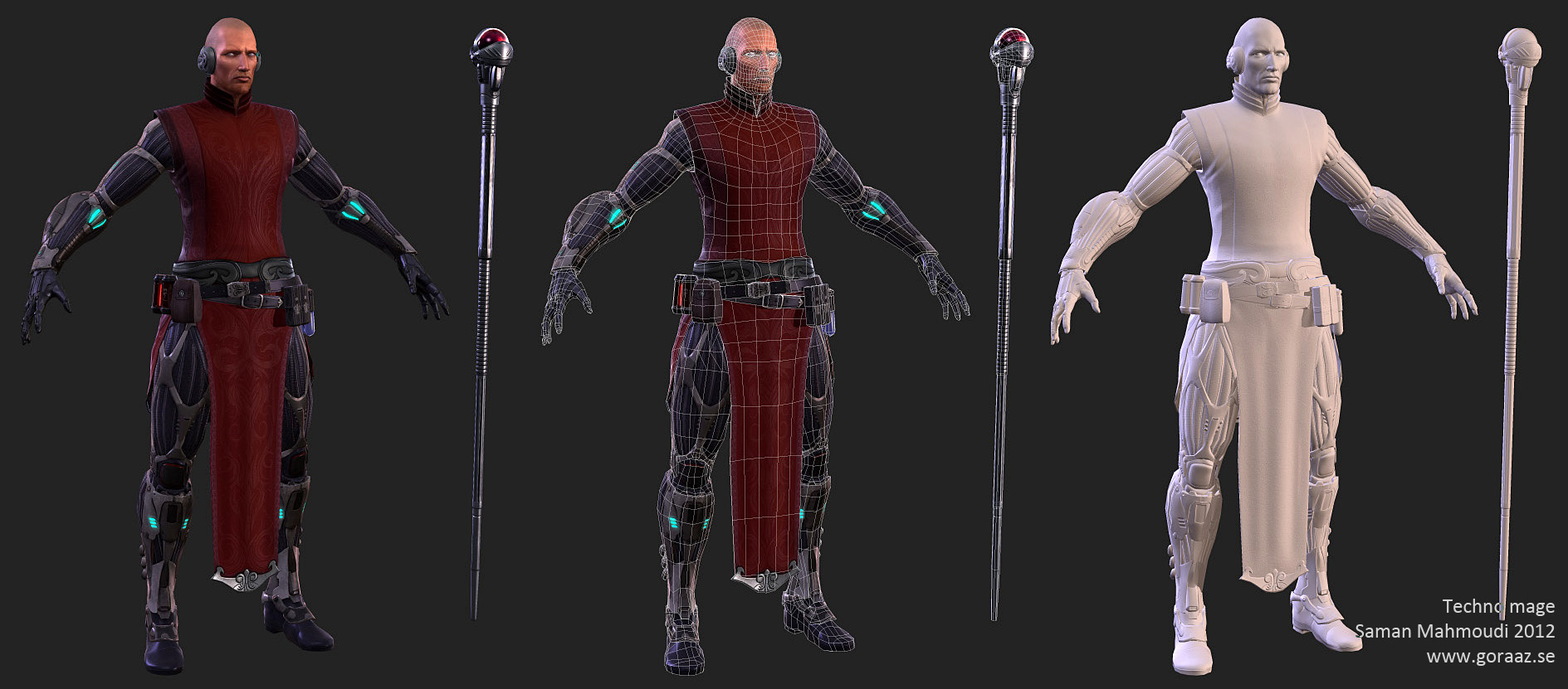
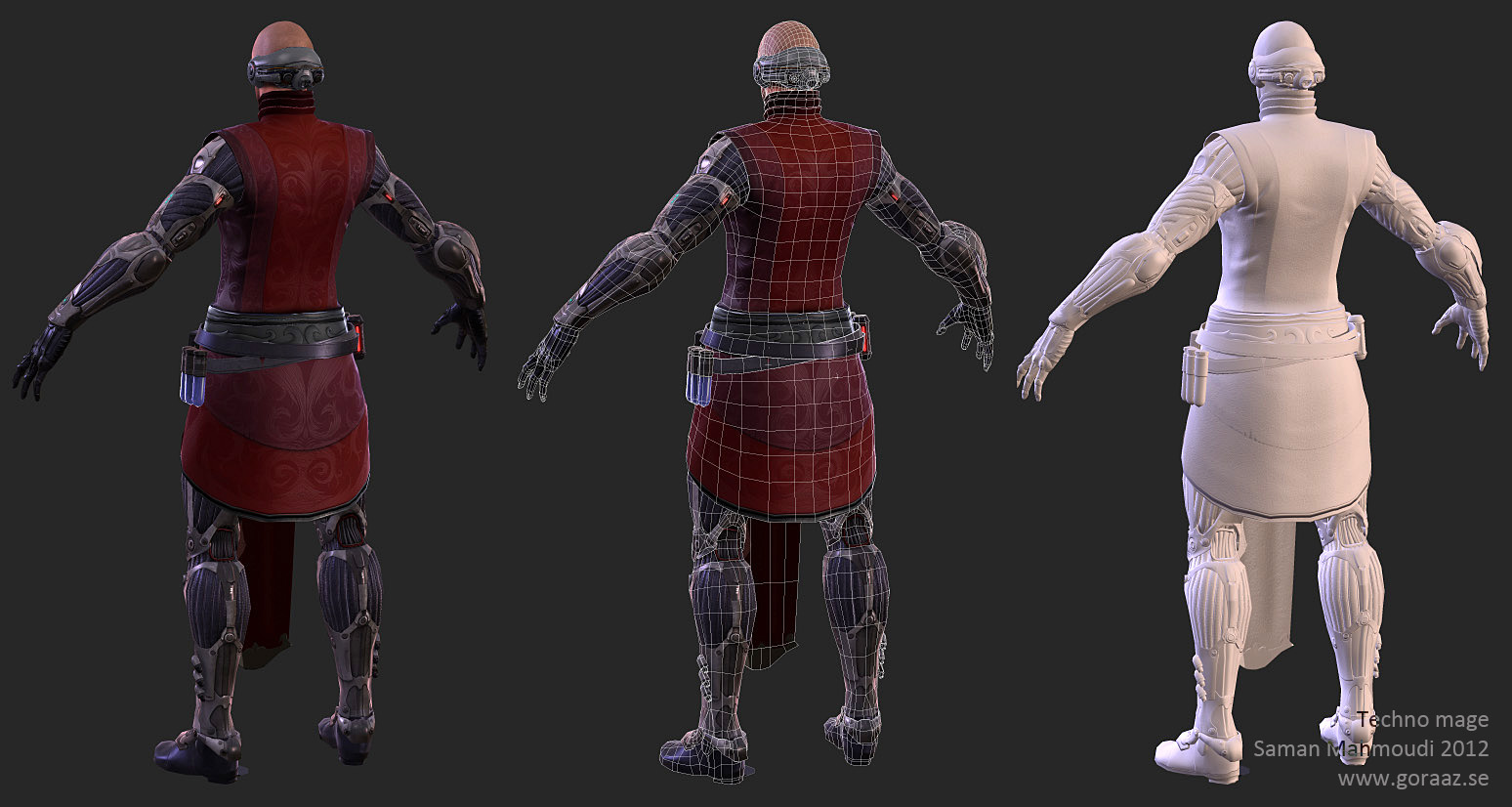
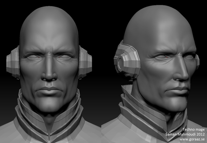
The next one is something I sketched up for Dominance war V but never used. I used one of the pre-domwar themes for this one. His name is Oleg Gennadiev and he's a techno-mage;

[vv]36854149[/vv]
[vv]36864560[/vv]
Big thanks to Haikai for being a great help as usual. Comments and critique are welcome!
I haven't been posting my work in a while and I figured now would be the time. Here are some of the characters I've been working on since the summer of 2011. I used Xoliul's excellent shader for these two. Hope you like them.
The first one is my entry to cgfeedback's mass effect contest which I never finished in time. Her name is Dorri Raha which roughly translates as 'free star';


The next one is something I sketched up for Dominance war V but never used. I used one of the pre-domwar themes for this one. His name is Oleg Gennadiev and he's a techno-mage;


[vv]36854149[/vv]
[vv]36864560[/vv]
Big thanks to Haikai for being a great help as usual. Comments and critique are welcome!
Replies
Woman:
- Lips need a little bit of work I'd say, can't put my finger on exactly what it is.
- I think The line going down her crotch needs to be less wide when it reaches her crotch. To me it looks a little bit weird.
- She looks a little bit stiff and need a bit more emotion on her eyebrows I'd say. I know you raised it, but it just looks like the eyebrows is higher up, not as if the muscles moved with it.
If you know what I mean
-Shouldpads material needs to be more defined , spec/reflection.
Absolutely love the guy, great work on him. Don't really have any obvious crits regarding him, give me some more time on that ^^
Great work! Really inspirational!
My only crit is that the texture for the tech mage must be huge, in order to get the detail you have on the face. That wouldn't be so bad, except that you don't mirror the uvs on his torso clothing even though it looks like the texture IS mirrored. Probably would have let you bump the texture size down, or at least get better resolution on everything else.
I guess also the top of his head is kind of chunky. I probably would have put in more edge loops to smooth out the silhouette.
@Chrisradsby: That's some great feedback. I'll fix those things but I think I'll wait for some more feedback before I present the changes. Not sure about the lips and eyebrows though, a bit more explanation might help.
@dirigible: Yeah, the nose was cartoonishly long at first and I was having problems relaxing it properly. As for the cloth, I have a habit of never making clothes symmetrical. Even though the diffuse looks the same on both sides to you, the folds aren't. I would probably get a pretty nasty seam in the middle too. There are a lot of things I would have done differently though, but it's too late for that.
Here are a couple of animations I did for the weapon unfolds;
[vv]36854149[/vv]
[vv]36864560[/vv]
I'll post some more stuff soon.
You should totally edit the first post to include those links to the animations as well, or maybe post them on youtube so they can be embedded in the thread.
:thumbup::thumbup:
totally agree on uploading the animations
i think chris radsby just means the lips are pulled up and out but not pulled back to support her smirk, it looks sorta unnatural. realistic smiles are tough
@Conrad: Thanks, glad you like it.
@Haikai: Yeah, I forgot to show the wireframe to you :S... I'm not too happy with it myself and I've had to do lots of fixes while texturing and what not. I'll upload the animations to Vimeo soon..
@Sputch: Thanks, man. I'll try to find some way to relax her a bit, not sure how at the moment.
@Funky: Ah, cool. Yes, I'll try and fix that.
@Fomori: Thanks, I actually resized his head a lot back and forth. This was the one that seemed more correct. But now that you mention it it makes me doubt it a little.
@BarnabyJones: yes, Lobot was one of the inspirations for the mage. Call it a homage or something...
Here are a couple of other characters I'm currently working on. One of them is a female fantasy knight and the other is Ormon, a character from the comic 'Superior';
Don't mind the hair on the knight, it's very WIP.
I made some changes to the ME lady, rebaked the lips and the eyebrows as well as adding some more bones to the mouth so I could create a better smile. Still not sure about this so I'm asking what you guys think. I tilted her head a bit too like Sputch suggested. I also added more loops to the technomage's head.
Oh yeah, I've been working on a sword for the knight as well. It's pretty WIP but I've got the main shapes done;
the tilt adds a bit of playfulness. not sure about the smile tho, looks like she hasnt seen many a battle, kinda naive look
keep the characters coming! im stil learning much from threads like these
I put together a small making of for the suit's muscle parts;
1. Start with just building up a plane shape for the muscle-suit surface. Make sure the topology is evened out, at least for the muscle rows. Use oarelaxverts for instance.
2. Select every other row, extrude. If you want to define it even further, like I've done, you can extrude it once again to get a nice border.
3. Select the non-extruded rows and do the same thing again.
I also think it's awesome what you did with the animations in presentation video.
Here is an update of the knight. I'm done with the normal map bake. Let me know if you have any critique or something;
The ape needs some refining but the sculpt is more or less ready. I'm aiming for a maximum of 5k tris for this character's lowpoly.
Here are some updates;
I made a render of the high poly with Vray just for fun. I've finished the normal map though. I managed to get it to about 5000 tris;
Here is another things I've been working on as well. I really loved the Diablo 3 art they showed at GDC and I wanted to make something new. Here is Leonardo in his more traditional gear;
These are all still WIP so feedback is welcome as usual.
Can you elaborate that, please?
/Rant Part/
Her chest-piece is really going to hurt, since it looks like it's 'digging' into her ribs and sides, not mention, it looks layer-plated on the top, right at the edge of where her breasts are coming into her chest/clavicle , so it doesn't look a 'single' unit which would be able to take a hit without some serious force-feedback movement in those areas.
While chesticles are really fun, soft, fuzzy and nice to play around with because they remind us of kittens and puppies, they really hurt when punched/hit on...I mean they REALLY hurt, not as much as getting kicked in the balls, but in some cases, they can be a partial KO.
Generally speaking, armor plates for both male and female users were (or should have been) flat diagonal pieces or curved pieces, this was to help angular deflection of anything hitting them, kinda like tanks, so having an armor piece which has several 'valley' waves in it's design wasn't going to help much.
Which brings me to my second point, her breasts look like they're being also 'held' by the chesticle piece, which is a big no-no, since it looks like it's floating, gives them a squashed look, and would be extremely uncomfortable.
They currently look like a combination of a heart, and hershey's kiss, with a bell like top.
Breast in this case would need to have a more natural 'flow' of the body and gravity, more like a sports-bra kind of deal if you can imagine such a thing, to avoid 'direct' exposition to the environment.
/Rant Part/
TL;DR Summary: Chest Piece looks like it's digging in, they're too exposed and 'held' by the plate (floaty), and aren't packed enough to make sense to follow body form function.
Again, you don't have to do anything I just said, it's your piece, you decide, it's just that I really liked the way it's non 'fan-service-with-skin-exposed-every-inch-and-slutty-high-heels' model, and I think you could make her more 'functional' for a lack of better terms, in her knight-yness.
@Crazyfingers: I painted two new variations for the breast-layer of the chest-piece(They're pretty crappy but I hope it gets the point through) The details are supposed to look like the ones on the inner thighs;
@Daphz: Thanks, man. I'm not really sure where to put this hard edge. Any suggestions?
@Ace-Angel: Good, you should have just written that stuff from the start.
Yeah, I agree. The chest-piece isn't exactly fit for a real-world fight. Neither are the shoes for that matter or most of the rest of the armor. However, I wasn't going for realism on this piece, I was actually inspired by the work of Shunya Yamashita ( http://animeartbooks.net/artbook/220-wild-flower/page-1/ ). It's not for everyone which I can understand. But you can't really pick those designs to death for being unreal when it isn't the point. Thanks for the input however.
I joined a contest at GA for the 1 of 8 paths. I'm making a spy, he's wearing a cat-suit he's made himself to trick his enemies;
Out of curiosity, what is the tri count and texture res on Oleg?
I'm gonna call these two done unless you have any more suggestions.
i think you oversaturated the turtle, especially the breast plate thing.
the back side of carapace could use more scales/plates instead of just having 5 big ones. at the moment it looks simply less detailed and defined than the rest of texture.
i love the material definition on your characters though.
@Blaisoid: Great feedback, man. I agree, I toned down the saturation on the chest area slightly and I'll show you the update later. As for the shell, I was going for the 80s cartoon version anatomy;
http://www.beyondhollywood.com/uploads/2010/07/TurtlesForeverPic2.jpg
HOWEVER, I'm gonna make those bumps on each "island" more defined though so that it looks more detailed. Thanks for the heads up!
Keep them feedbacks coming, guys!
I reduced the saturation so it's not glowing as much anymore. I also refined the shell a bit. Still needs more work I think but let me know what you think.
I'm a bit unsure of what hairstyle I should pick for the knight. Which do you guys prefer?
Both are WIP so it's a bit sloppy made.
Here is an update of my ninja turtle;
I'm pretty much finished but feel free to give me critique. The spy is finished as well;
And also the current progrss of the knight's hair;
Feedback is welcome as usual.