[wip] goblin character process
Latest:

Original Post:
My new portfolio piece wip thread: goblin
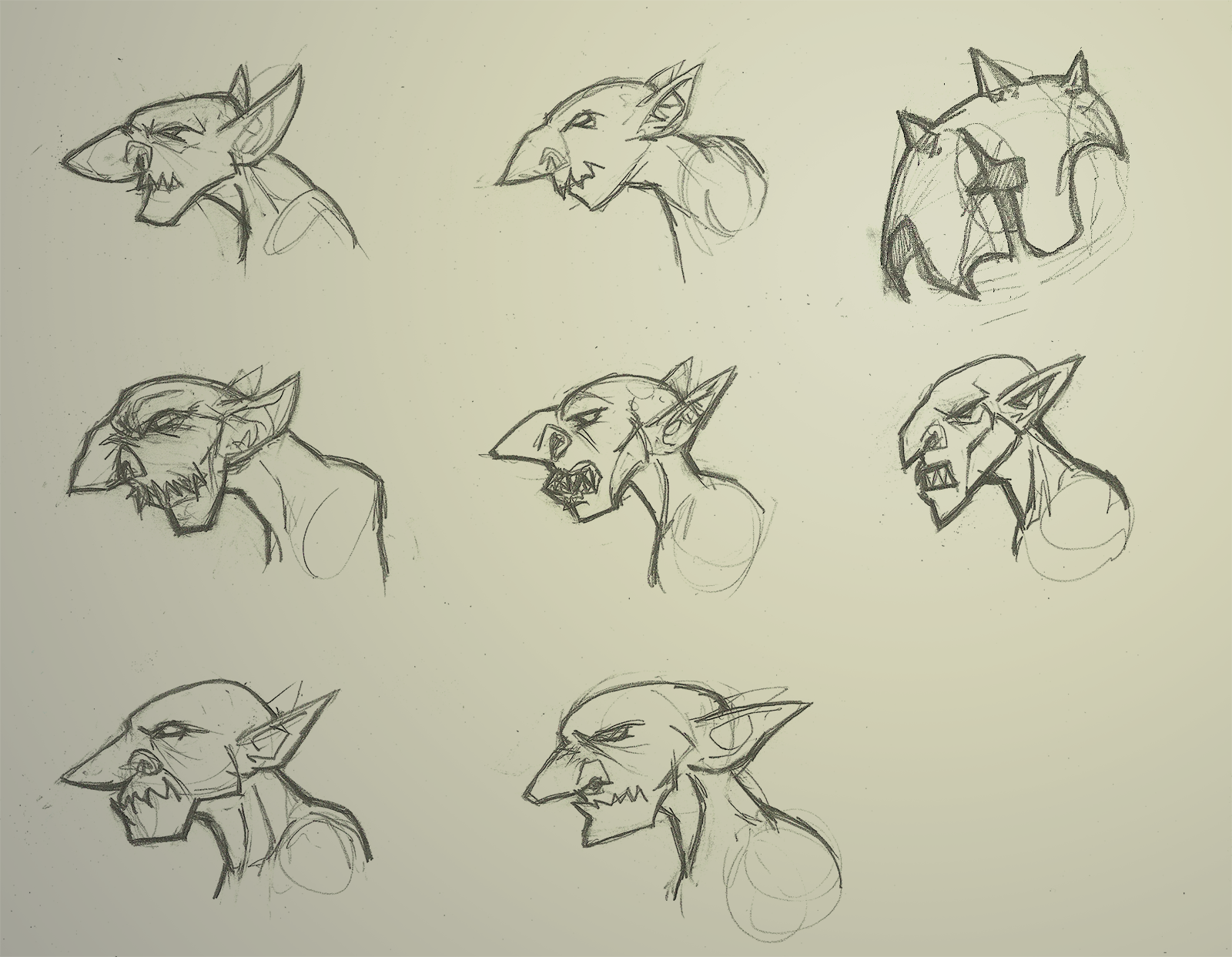
I'm going to try and make him as unique and interesting as possible, but with so many different interpretations on the Tolkien trope, I might be attempting the impossible. Anyways, here's sketches so that I stop typing.

Thoughts on the coolest looking ones? My plan is to work on a simple goblin model, do some basic armor, and one weapon.

Original Post:
My new portfolio piece wip thread: goblin
I'm going to try and make him as unique and interesting as possible, but with so many different interpretations on the Tolkien trope, I might be attempting the impossible. Anyways, here's sketches so that I stop typing.

Thoughts on the coolest looking ones? My plan is to work on a simple goblin model, do some basic armor, and one weapon.
Replies
5th is the most classical thus most boring.
I like the the 1st and 2nd where the 2nd has the most "realistic style". The 4th is also cool - 'goblin with shark teeth' and with the 6th you have 'goblin with metal jaw or part metal/flesh jaw'.
the thing in the top right is a rough idea for what his helmet will look like, with spaces for his giant nose and ears to come out.
and now that I've gotten proportions out of the way, time to get some clothing on this nekkid goblin!
Also I'm not a huge fan of the helmet, but mostly because I think the goblin's head looks cool and it seems like a shame to cover it. I think he loses a lot of his character when you cover up his nose/brow area.
Maybe add some leather wraps to the feet like you have on the hands?
Just some thoughts. Keep up the good work!
As for the zpheres, the head and arms are looking way too big and the thighs could be beefed up a bit compared to the concept.
Looking forward to progress on this!
Now on to the heavy duty sculpting!
The armor itself came out pretty clean, but the worst parts are probably the fingers, toes and armor spikes specifically. I did have to wrangle the settings in xNormal a bit to get the bakes looking as good as they do now. I found that the quickest way to find the best settings is to run several different test bakes at lower resolution and no anti-aliasing and putting the normal map onto the model to make sure you're not getting weird artifacts or that kind of thing.
Thanks again for looking! Peace!
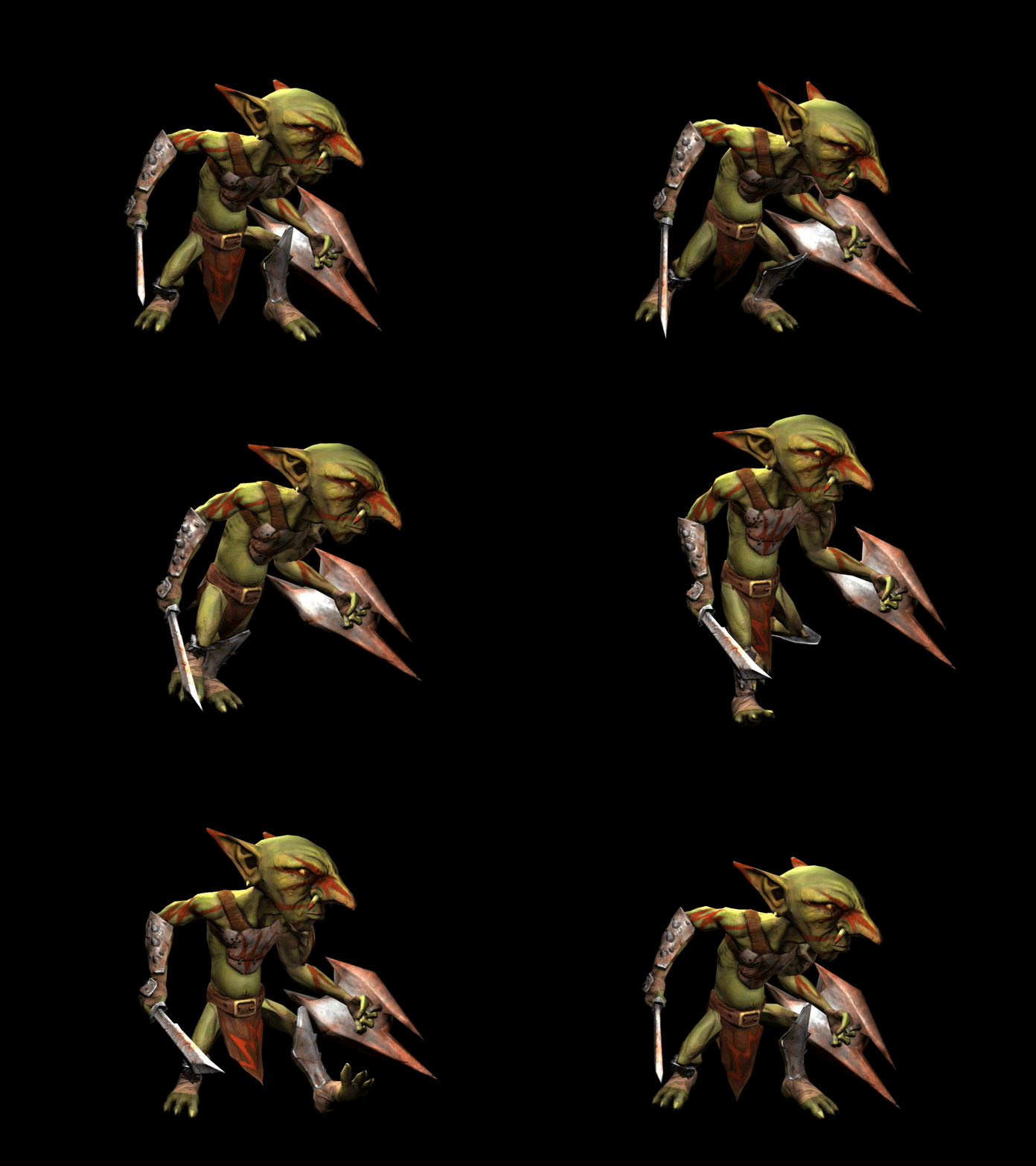
Next up will be the sword and shield, then after that a rig and some animations!
haha Talented people around here!
I'm planning on a few more cycles for this guy before I move on to something else. At least a cycle for attack, walk, run, block, and death, I'm thinking...
idle
react/alert
walk
hop!
The walk still feels stiff. The arms and legs are ok, but the torso and head could use another look. Maybe more sway and smoothing?
Personally i like the limp like walk in this case...past battles and all that.
This basicly. But i would have to see it from multiple angles to decide. Otherwise the rest of the animations looks great, no popping or skinning issues atleast. If it didnt come off in my post im pretty impressed of the character so far....but hey i got a thing for Goblins! especially green ones