The BRAWL² Tournament Challenge has been announced!
It starts May 12, and ends Oct 17. Let's see what you got!
https://polycount.com/discussion/237047/the-brawl²-tournament
It starts May 12, and ends Oct 17. Let's see what you got!
https://polycount.com/discussion/237047/the-brawl²-tournament
[Unity3D] - 1951 Ford
Hello everyone!
I've started learning 3D graphics about a year ago, and I want to become an artist.
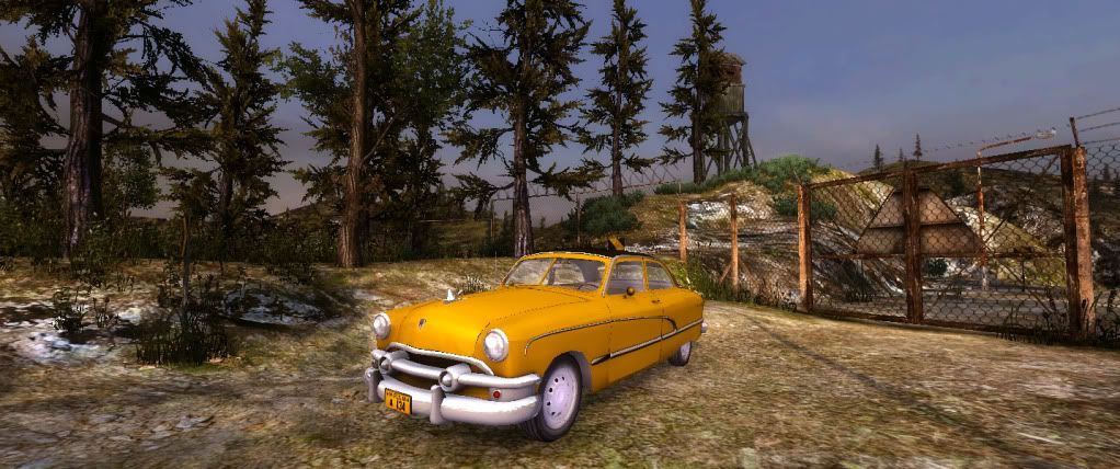
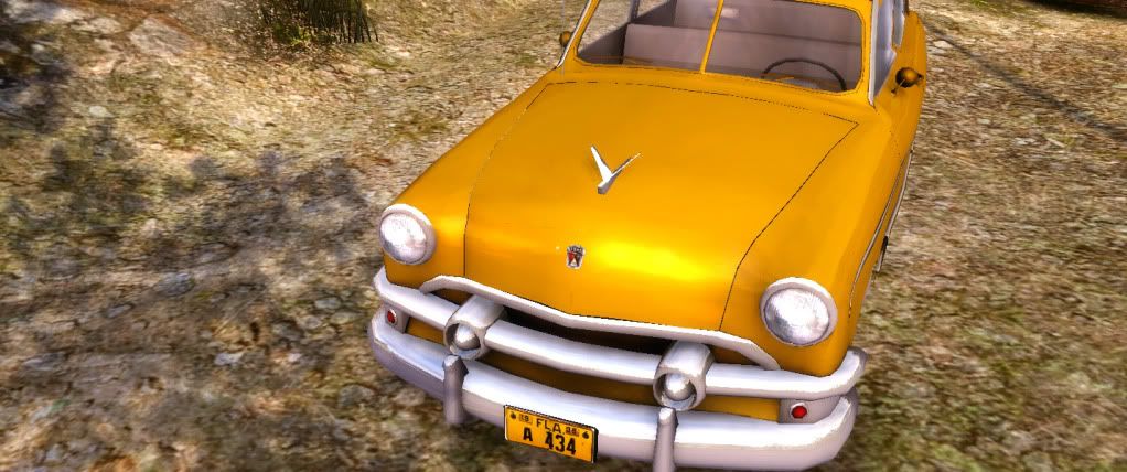
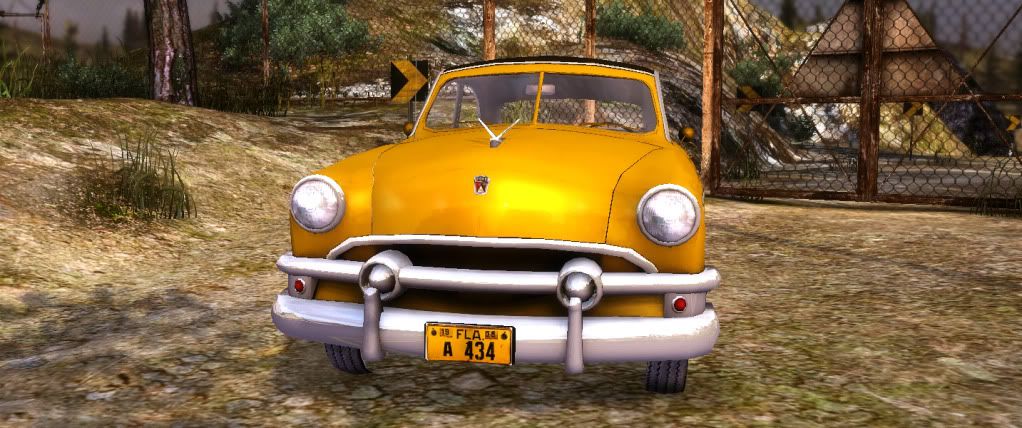
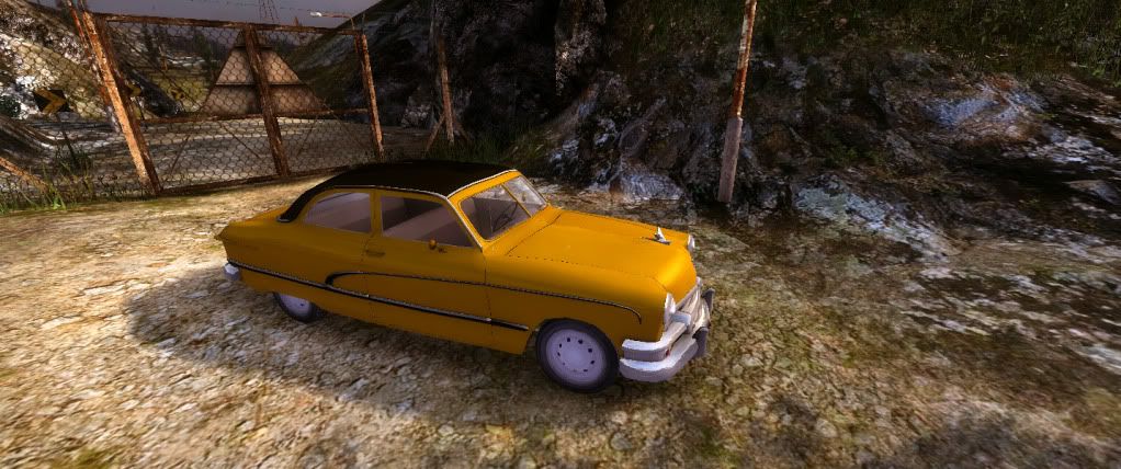
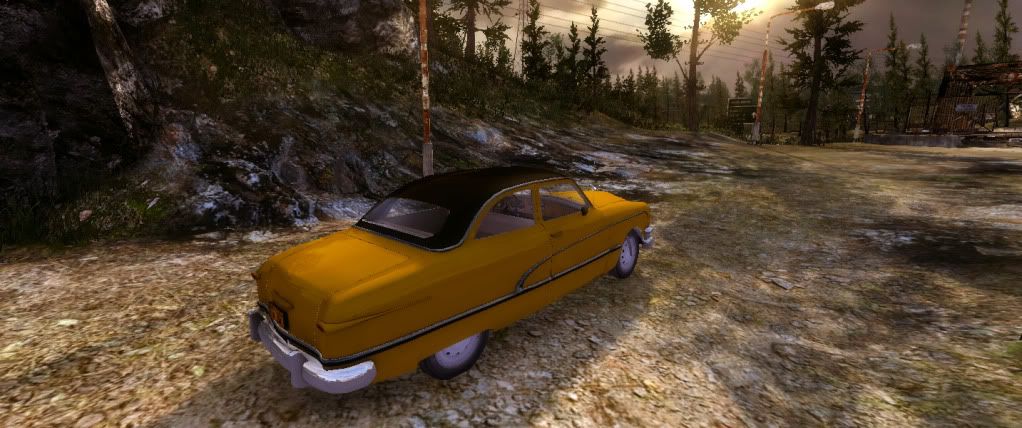
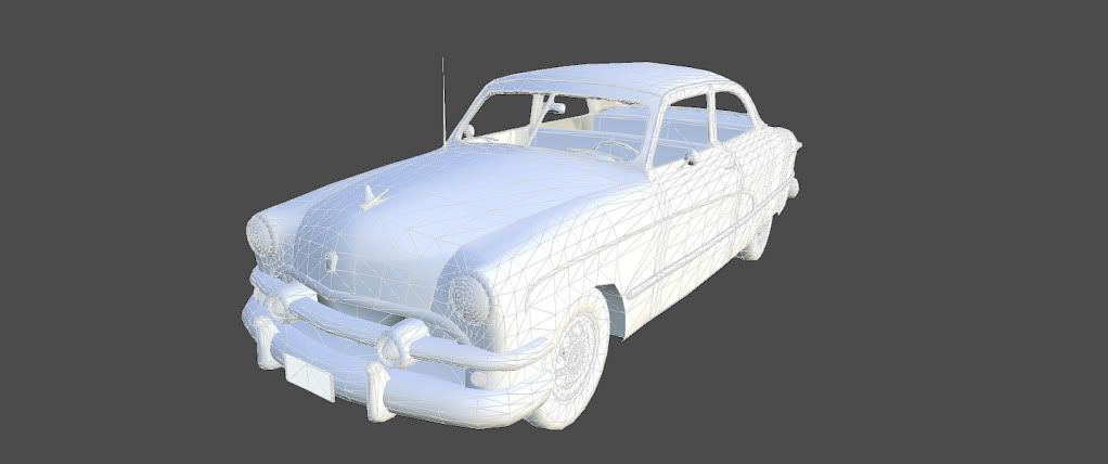
This is my latest work, a model of 1951 Ford based on some blueprints I found in the internet. Made with Blender, textured using Photoshop. I placed it inside the Unity default bootcamp scene, hoping to move it later to my own. What do you say? However, it is a WIP, so there are some glitches and undone parts.


Replies
Your model is good, however the shadows and lights on your scene are too flat.
Btw, is your scenary modular? good job on it
vikk0 Yes, it is
gsokol Yes, I have reflections. But, maybe, they are not so strong.
Few things:
Some weird shading where the wheel well meets the front door.
You might want to increase the size of the chrome trim around the windshield along the top. It's aliasing weird due to it's size. Remember, making it ultra realistic doesn't always mean it's going to look best. With small pieces it's sometimes better to change them up a bit, so they read better in engine.
The hub caps are looking a bit glowy and taking attention away from the nice little car.
The dark outline around the hood looks a bit out of place. Is that from your texture? Can we see the texture, or a close up on the wireframe of the hood?
That's it for now. Great little car, Looks really solid overall.
BTW if you have Unity web player, you can see the scene in action by following this link.
You need to fill the back of your texture with the orange color you are using. It will prevent the black from the back of your texture from showing up when you view the car from a distance. This is a mip mapping issue. (Check out the cross pattern on the hood when you zoom out from the car.)
Should also add mirror reflection materials to the side mirrors.
And about the hood. I would just combine it to the car body and bridge the two. I can actually see the ground plane under your car through the top of the hood cracks.