Brick Pillar Critique (Zbrush)
So heres a pillar i'm doing for an Cambodian style temple environment. About halfway through i started losing confidence about the way it was looking and the direction it was headed. I'm more comfortable with the way it looks now.
But I would still love some suggestions on how can i improve it. Are the details to small? too big? More or less damage? ANY help will be appreciated")
*I haven't started the top of the pillar*
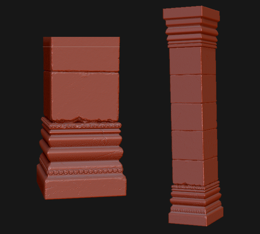
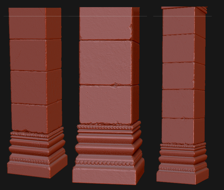
But I would still love some suggestions on how can i improve it. Are the details to small? too big? More or less damage? ANY help will be appreciated
*I haven't started the top of the pillar*
Replies
Also, try sculpting this with a different material, "Red Wax" shows the very small details that you most likely won't see when you bake it down (assuming you are baking this to a low poly, could be wrong). I prefer the grey one (matcap grey? something like that), sorry can't remember the exact name off the top of my head.
In terms of what you have done so far, it's alright. I would need to see what you are aiming to achieve for a better crit, but at the moment, the pillar seems pretty straight and flat, not a lot of damage and a basic silhouette. If this temple is run down or old, I might take the mallet brush to some of those edges to give it a more interesting silhouette.
Check this stuff out: http://www.polycount.com/forum/showpost.php?p=1387929&postcount=114
Hope this was helpful
It looks like you went straight to the micro-detail, though. You have no larger shapes in there.
I agree on it needs a more of a silhouette. I was trying to get the basic pillar down first then do what you said and take the mallet brush to it and make some different variations.
yeah i was thanking the details so far were a little too small for it, I'll try the grey metcap
As far as a reference, I'm going for something in this ballpark
kartoon, when you say 2-4 layers are you talking about the brick layers? Or the layers in the base/top of the pillar?
EDIT: nevermind, I understand what your saying