Low Poly Bunker
I've been working on this bunker for a game project me and a few other guys have been working on. No normals, no specular, 512 x 512 texture.
Sort of WIP, but I'm probably not going to get a chance to add a few more details I want to, because I've taken longer than necessary to get this done and they probably want me to move onto another asset.
Crit welcome.
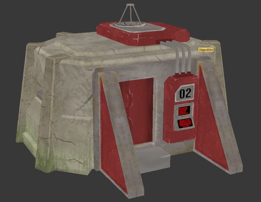
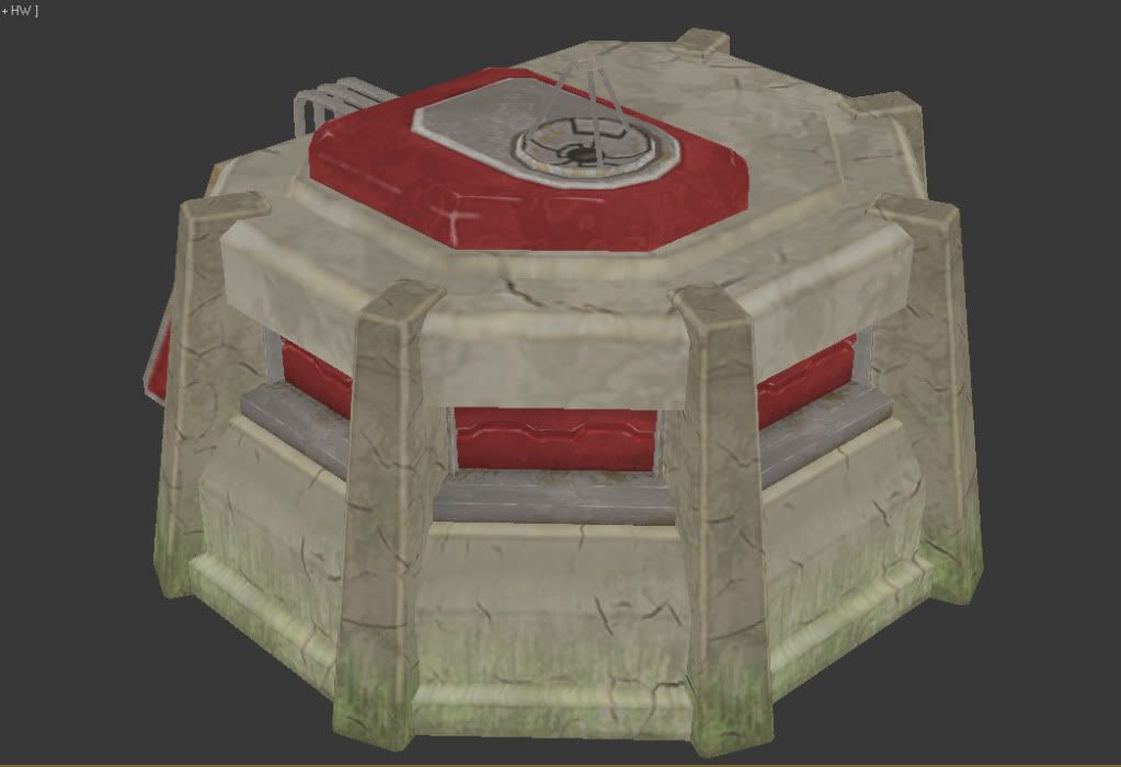
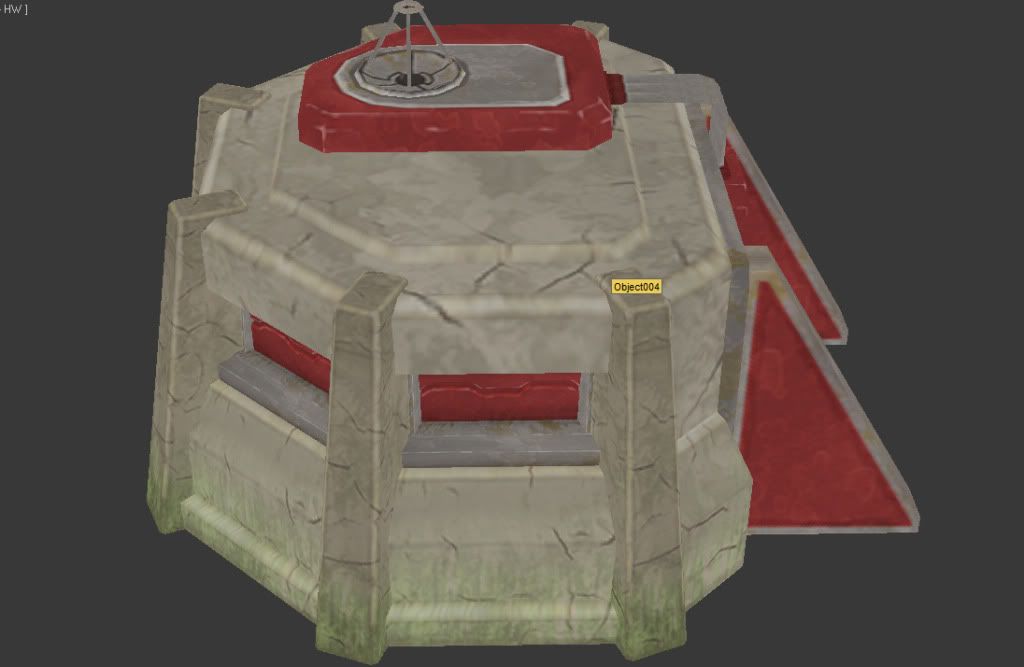
Sort of WIP, but I'm probably not going to get a chance to add a few more details I want to, because I've taken longer than necessary to get this done and they probably want me to move onto another asset.
Crit welcome.


Replies
There's a pretty big disconnect between polycount, texture density, and model detail. I think you could easily take this down to half the polycount, maybe even a quarter, without really losing detail. Are things going to be animated?
Were making a League of Legends clone.
I think the plan was to at some point have the door and hatches animate open and closed.
Any vertex which does not significantly change the silhouette should be removed. You have a TON of vertices which do not significantly change the silhouette. All those beveled edges? Don't need them. Either make the bevel bigger so they -significantly- change the silhouette, or remove them. All those edge loops? Remove them. All those slight extrusions? Flatten them.
As for your textures... Your texel density (texture stretched over polygons) is erratic. Some areas look nearly crystal clear in your screenshots, while other areas show obvious pixelization. Given the fact that you seem to be going for a self-lit art style, you need WAY more lighting information in your texture. Ambient Occlusion, and baked lighting will help a lot. You also need more contrast in your textures. Quick paintover works better than words.
UVs and Diffuse
So in short, yes. You should remove them. No one is going to notice them anyway.
EDIT: In fact, I think you could leave those large bevels in those surrounding pillars. They'd "smooth" things out a bit if you made them just a bit bigger (so that you'd actually see them when viewed from distance).
I took the bevel out of the hatches but kept the zigzagy shape, I think we still need to animate those at some point.
If I take this any farther I might have to completely redo the texture, I seem to have messed up my UV's when I was taking polys out. Thought I had preserve UVs on.
Nice work!