EDF Elite from Red Faction - Based on the Massive Black Concept (WIP)
This is a school project that I have been working on for my Asset Production class last semester - I didn't get a chance to do the Normal Mapping so I am trying to finish it.
My teacher works/worked at massive black and gave me the concept from Red Faction: Guerrilla - I believe the concept is by Jason Chan?
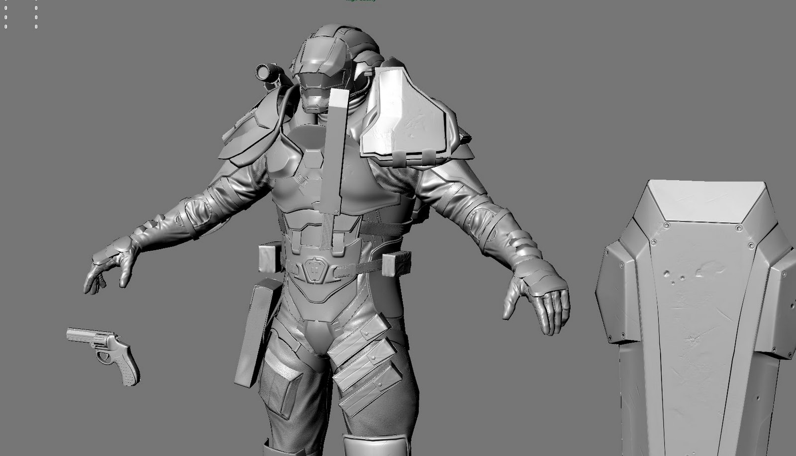
High Poly


Low Poly - Baking Normal Map - still got a few tweeks to do in the Normal Map before I start tweeking my AO and starting on Color
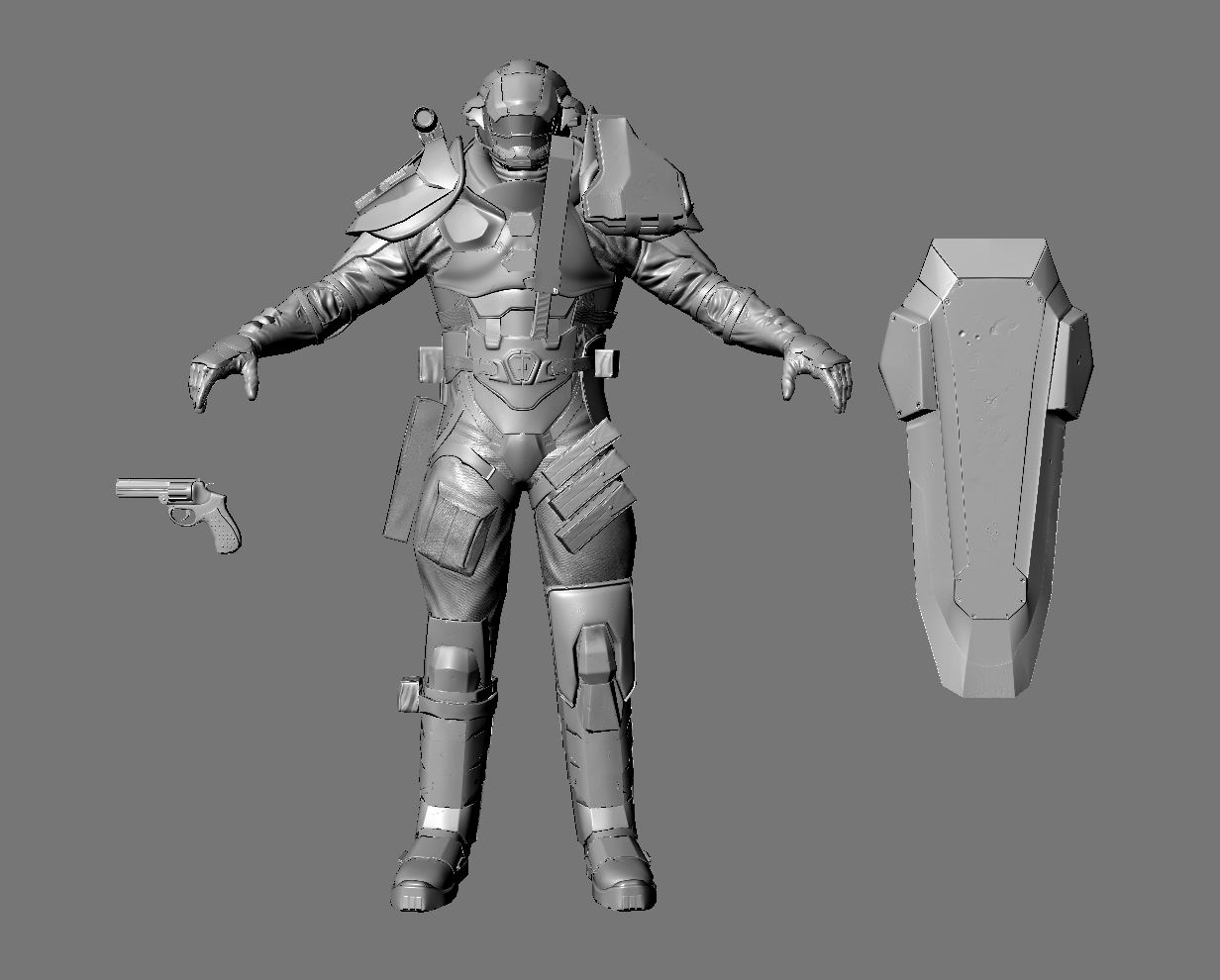
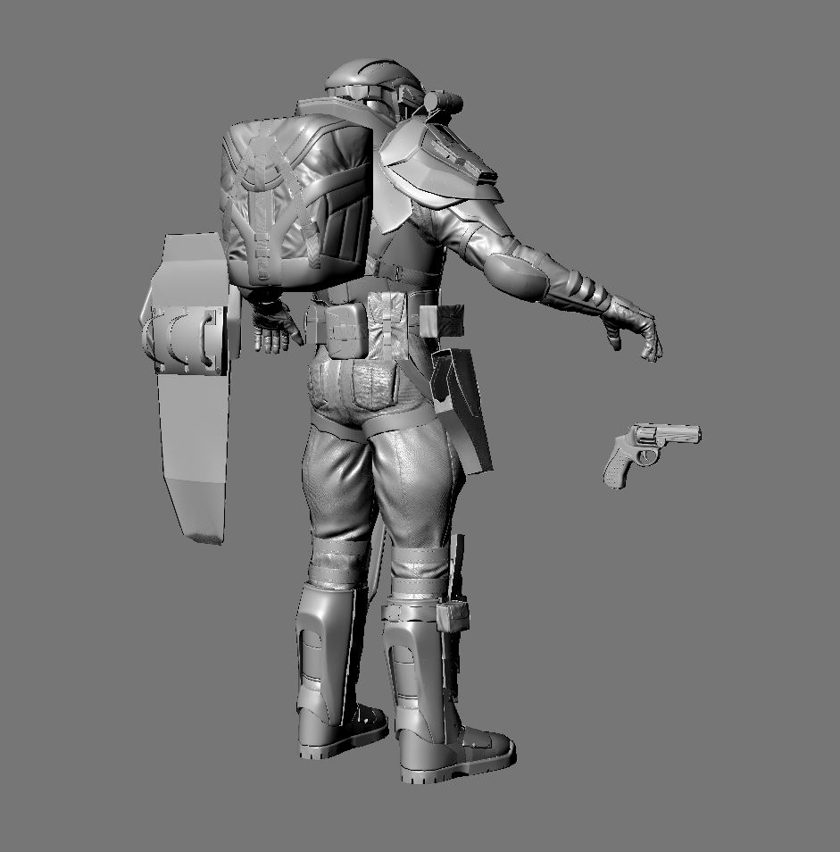
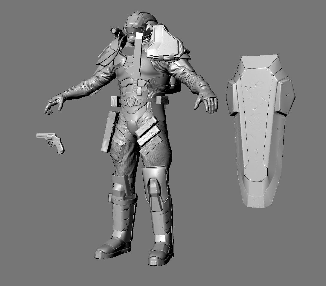
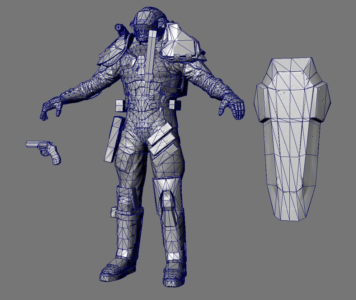
The Image was given to me by my teacher - Shon Mitchell from Massive Black - I believe the concept was drawn by Jason Chan?
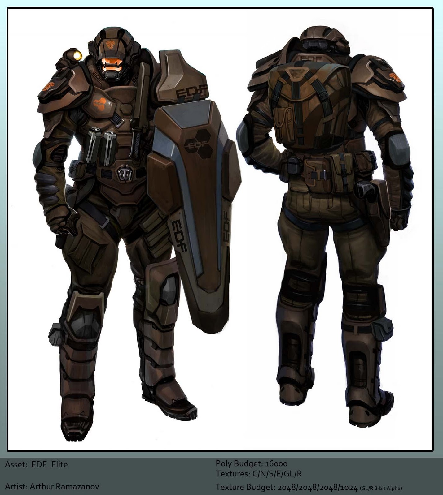
My teacher works/worked at massive black and gave me the concept from Red Faction: Guerrilla - I believe the concept is by Jason Chan?
High Poly


Low Poly - Baking Normal Map - still got a few tweeks to do in the Normal Map before I start tweeking my AO and starting on Color


The Image was given to me by my teacher - Shon Mitchell from Massive Black - I believe the concept was drawn by Jason Chan?

Replies
I'm certain that he wouldn't be using an average pistol like that.
Here is what the pistol looked like in RFG: http://redfaction.wikia.com/wiki/EDF_Pistol
SHAWNELL3D - I know right DURRRR lol...I'm sure I can throw in a grenade in a 2x1 separate map - to save on texturespace...
But your current version doesn't seem to belong to that holster either. The holster is multiple times bigger then that gun. The gun would just simply fall in, lol.
I like the main model though! Good job!
Another WIP - not done yet
Good luck man! Keep at it and it will turn out
Metal materials rely heavily on specular highlighting. If you don't yet have a spec map, get one going, and have the metals be pretty strong compared to other materials...that will give you a good start.
One of the things I am finding hard - is to get the metal to look like metal and to get the spec map to make the glass shine a bit more...-
Also still have to fix the chest portion...there's some Normal Map issues with that
Those points aside, the rest of it is really shaping up man, nice work
Callin it Quits on the texturing - Gonna rig and pose it...
can i have this model?