WoW Inspired Enviro
Hey everybody! Been working on this hand-painted enviro to show off to a local game company whose art director said would look over my work soon. I'm a bit stressed because I would like to secure a job there in the future and want to make a good impression :poly142:
Anyway I'm hoping for some good crits to take this work to the next level!
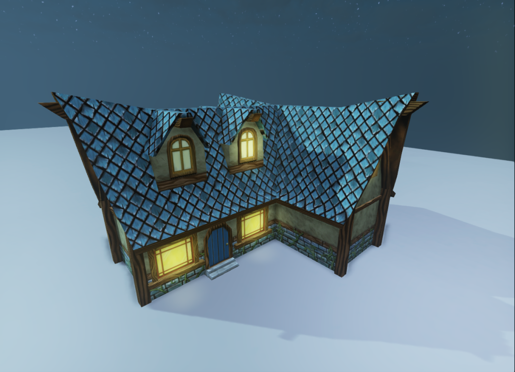
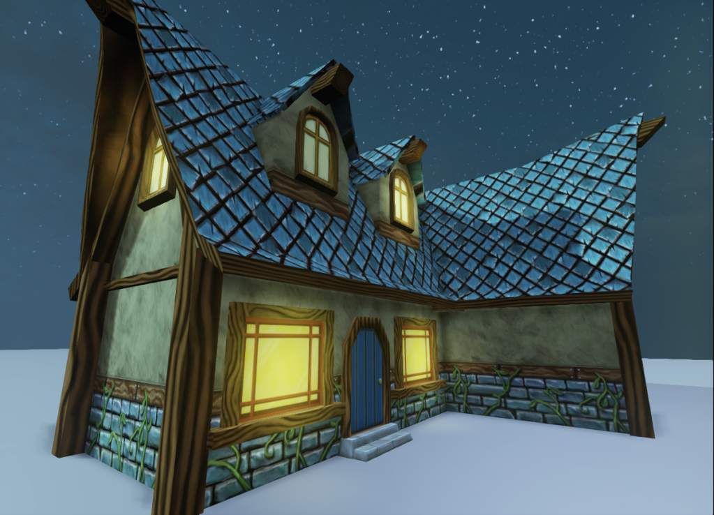
I want to continue fleshing this out into a full environemnt
Anyway I'm hoping for some good crits to take this work to the next level!


I want to continue fleshing this out into a full environemnt

Replies
I just recently started hand painting stuff myself so I won't be the best to crit, but here is what I can offer. Roof tiles typically overlap for water/debris run off, right now they don't look like that overlap it seems they just fit together. And the wood grains on the pillars seem awfully big atm.
You could add more geo too. Pulling out the bottom row of bricks to give the house some more profile.
If you're going to make it look like wow then copy wow, thats the only way youll get their style down.
Dont worry about the painting so soon honestly, get that block in lookin good!!
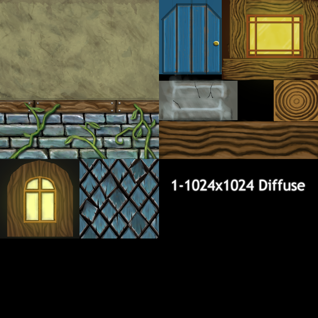
The textures feel flat and based on lines rather than shading and color to show shapes.
Edit: amd i do realise how bad some of the wood is tiling atm
Snader can you explain what you mean about the flatness of the textures more? I think I see what youre getting at but Im not sure what else to do
I think you need to start again TBH
That style carried over to WoW. Most noticeably should be the use of supports and chunky wood timbers as supports. They're overbuilt to an extreme level, you're building is built to a sensible level.
The door frame looks like one solid chunk of wood?
The roof tiles wrap over the top in a weird way. It works in WoW because the roof is flatter at the peak of the roof and the tiles align to the roof line.
Timbers and roof lines are too straight. I'm not talking about the outer silhouette of the roof but where the roof meets the walls. WoW would slope that angle or deform it slightly.
Most of the WoW assets don't have bevels but a lot of those assets are almost 10 years old... so it would help with the chunky style to go ahead and soften up some of the edges and round things out a bit.
what do you guys think of this variation of the roof?
Want to give a shoutout to my boys in the Polycount U chat, those guys have been a great source of advice and crits!
It's coming along! Keep it up!
WoW features a lot of underlighting in the texture work and also with the viewpoint of the player, you want to make sure that you make the details pop when looking from ground level up.
Another thing you could try playing with is to grab the corners of the building and just move them a bit so it's not all 90 degree corners- really push the fact it's hand built and rustic.
Hope that helps and keep up the progress!
Any feedback would be great ^^
Also scale down your grass and add more interesting terrain sculpts it looks really blobby and boring. The scene is kind of bland ATM it looks rushed.
Not sure what specs this company is going for but remember wow was made in 2004 we are in 2012 and you are using UDK. Spruce up the detail and polycount and add normals if you can. Make it the wow of 2012.