[UDK] Cyberpunk Hotel - WIP
I've been posting a few of these props in the waywo thread, but here is the environment that I've been creating them for. The premise is a skeezy hotel in a BladeRunner meets Dark City universe, with a little bit of Bioshock and The Matrix thrown in for good measure. So it used to be classy and nice, but it has been retrofitted with new tech over the years, is in disrepair, wet from the constant film noir rain and is mostly inhabited by prostitutes, drug addicts, etc. Right now most of the objects just have basic materials on them, aren't unwrapped, and may not even be the final geometry but this is where I'm at.
One thing that I'm struggling to get across is a good contrast between the deco, classy elements and the "80's version of future tech" stuff. I've got a few crt monitors/tvs thrown in there, but I need to push it further. The bed design needs some love, and the room doors will also be all clunky future tech as well. I'd like to get an atm somewhere in the entrance, and pimp out the front desk to a cooler design. Any suggestions or references for this kind of stuff would be appreciated. I've watched through bladerunner and dark city multiple times while working on this to get inspired.
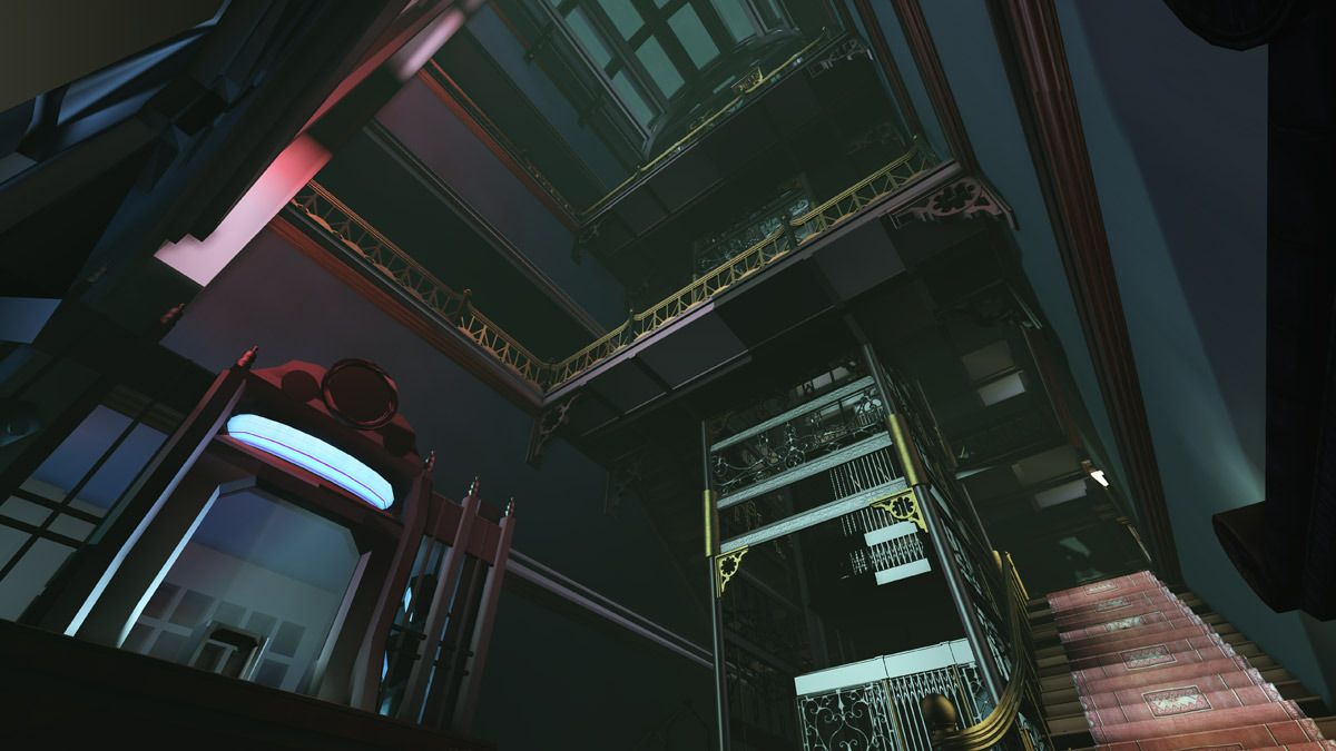
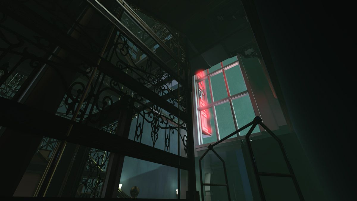
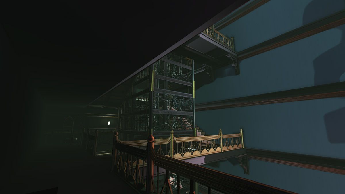
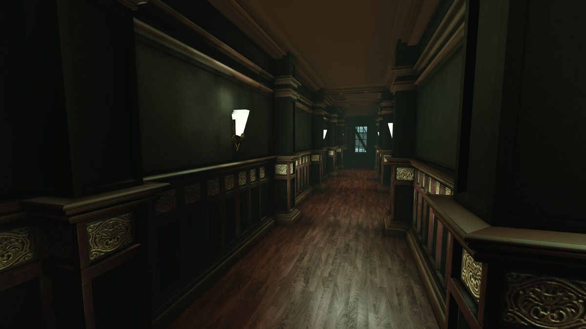
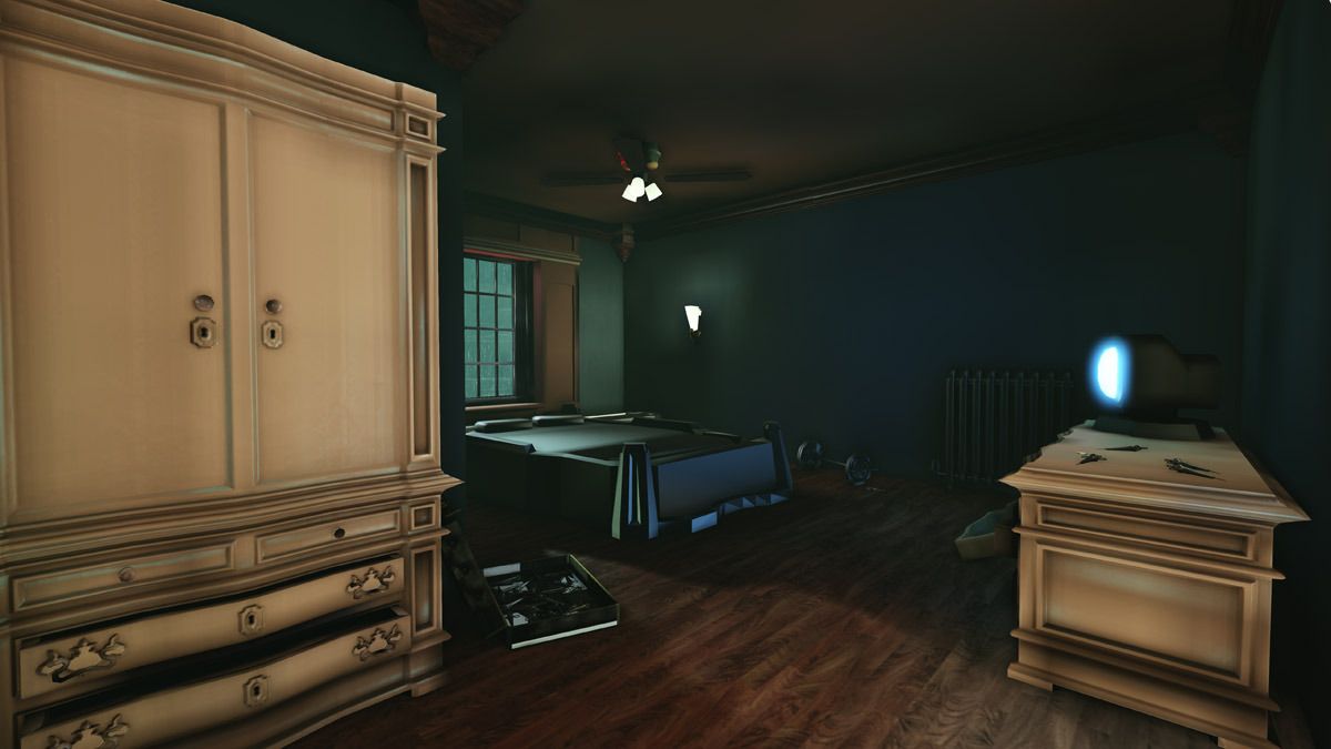
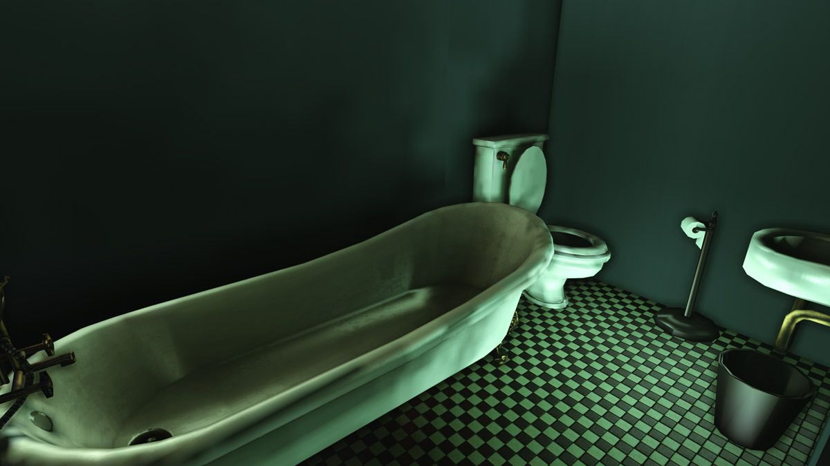
And a little bit of prop pimpin.
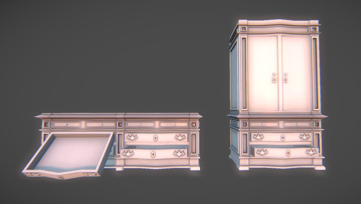
Hi Poly
Low poly (I'm considering using the dx11 tessellation to get some more depth in this, but I'm curious what y'all think.)
Thanks for stoppin' by.
One thing that I'm struggling to get across is a good contrast between the deco, classy elements and the "80's version of future tech" stuff. I've got a few crt monitors/tvs thrown in there, but I need to push it further. The bed design needs some love, and the room doors will also be all clunky future tech as well. I'd like to get an atm somewhere in the entrance, and pimp out the front desk to a cooler design. Any suggestions or references for this kind of stuff would be appreciated. I've watched through bladerunner and dark city multiple times while working on this to get inspired.


And a little bit of prop pimpin.

Hi Poly

Low poly (I'm considering using the dx11 tessellation to get some more depth in this, but I'm curious what y'all think.)

Thanks for stoppin' by.

Replies
The help with the contrast, since you already have a lot of green in there, balance it out with some more reds and push some complimentary harmony in there.
The hallway stick out because of this, with the green walls and the reddish flooring.
I am also very open to suggestions of props/clutter to add, so if there is anything you'd like to see in here, let me know.
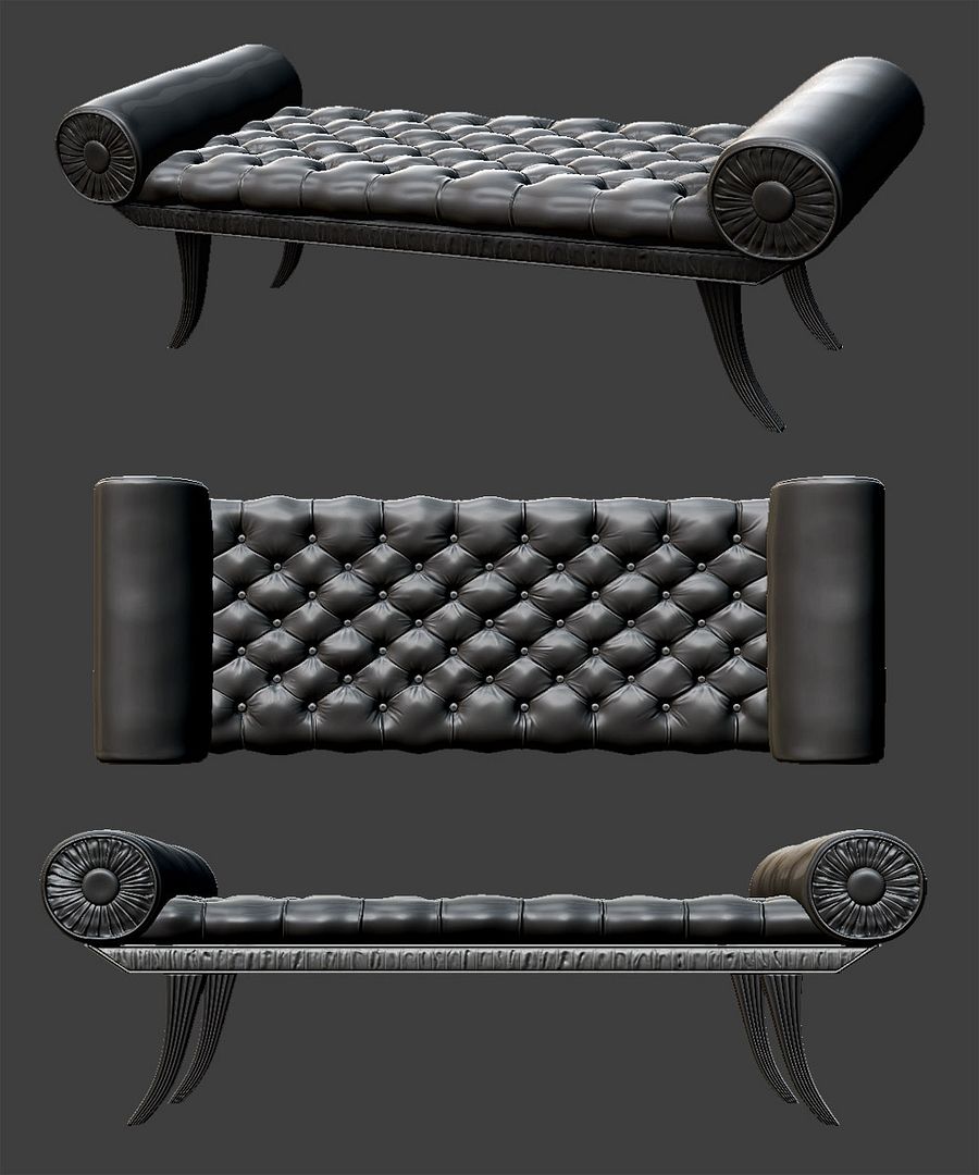
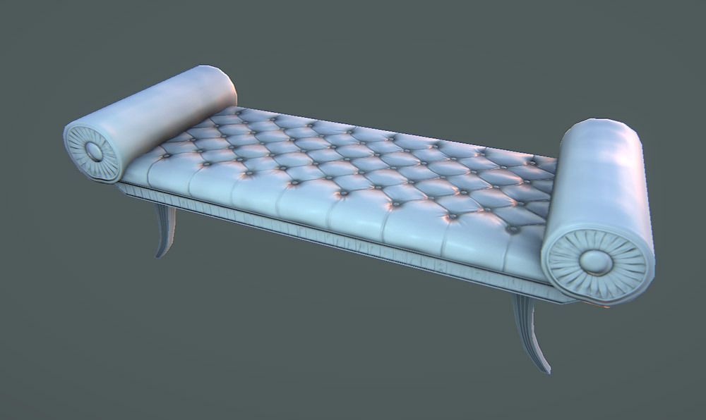
I've been working a bit trying to get the material right for the bench here. I've added a bit more detail to the bottom that I baked down from sculpting. I've also made the legs a bit larger, and brought them more towards the center to support more weight:
Are you going to have one of these turned over?
the atmosphere is great nonetheless.
Your trim in the corridor is to wide for a only decorative strip for my liking.
I see no Cyberpunk in your hotel. With Cyberpunk i connect sci-fi elements in disorder and a stench of decay and organic shapes. Like a rusty gutter with a growing cable tree. Your Hotel has a Retro look and no sci-fi elements or cyberpunk.
Maybe you can accent the retro look more by mixing modern/sci-fi elements in the retro look. Modern LED or energy economic lamps in the old sockets or a fake trim by a strip of flurocent bulbs.
In regards to the bottom of the bench, I've replaced one of the luggage carts with a bench turned on its side to keep the player from continuing up the stairs.
Although everyone seems to have a different take on the term "Cyber-Punk".
To me, Cyber-Punk is something like System Shock or Dead Space:
Sorry thread derailment; It could definitely use some form of cobbled together tech or a vista of large mega complexes in the skyline or something to really push it. Right now it's feeling very noir, which I know Dark City and Blade Runner are examples of that look but IMO it needs that sci fi push to make this cyberpunk.
As other's have said, some retro like 80s or early 90s electronics would spruce up those rooms a bit more (see Deckard's appartment in Blade Runner).
also in the bathroom the walls seem really empty, I was trying to think of what you can put in there, a few ideas...shelves, towel bar, shower curtains, badly framed paintings...broken condom dispenser..it would explain why there are so many laying (lying?) around the room :P
I really like the materials and lighting
Need MOAR UPDATES
It was pointed out to me that the area of the hinge that screws in would be on the inside of the doors there, so I reworked that area a bit. Dirty'd up the texture a bit with a bit o grime and scratches. I also went an made a proper spec map as well:
and the new beginnings of the front desk:
The amount of detail is really building up!
There are still some materials such as the metallic objects that are looking a bit too clean and CG at the moment, but it wouldn't be too hard to add a bit more surface detail and grunge.
On another note, do you have any concept art / reference for the scene as a whole that you are working from?
I've also got my demo reel up on vimeo that shows some nifty shots of the scene complete with flickery lights! https://vimeo.com/41167352