Sketchbook: Koski
Hello, my name is Isabelle, and I study Game Art at the Game Assembly in Malmö, Sweden.
I figured I should post some things here and get some critique on how I can improve, seeing as I'm a total beginner at everything to do with 3D.
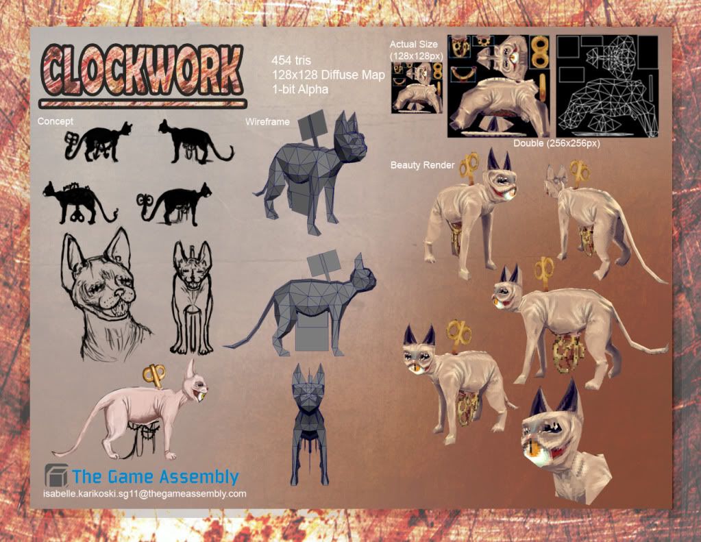
First of is an assignment for school; a low poly model with a maximum of 500 tris and a 128x128 diffuse.

Let me know what you think!
I figured I should post some things here and get some critique on how I can improve, seeing as I'm a total beginner at everything to do with 3D.
First of is an assignment for school; a low poly model with a maximum of 500 tris and a 128x128 diffuse.

Let me know what you think!
Replies
Another more low poly model I'm working on rigging for a game in school
on a serious note tho! for one of your first models you are of to a great start!
And thank you very much for the kind words!
I am... less happy with this one. Stupidly proud over my normal map, because of it being my first ever attempt at one. But the rest. Eh. I could have done better. In hindsight, I would have rather done a real existing weapon like a Barretta or, hell, a regular glock or AK. This design was honestly a little stupid.
Even so, pointers on how I could have done this better would be greatly appreciated!
aw thanks, you make me blush!
And yeah, I really want to work on the shading of the steampunk gun know that I understand how specular and gloss maps work. Probably going to play around with incandescence to make it glow and stuff. 8V
..... if I have time.
I will post more work from our current game project as it progresses.
Didn't want to waste my time doing a super-detailed concept sketch, so it's messy. Hopefully you can tell what's going on.
not much room for personal tastes, the assignment was pretty set from the beginning. So colorscheme and overall design has to stay.
Which helmet design should I go for?
I think it looks decent enough for my first human face. c:
I'm fairly pleased with this being my first human model ever. I have gotten feedback from my classmates, so I'm going to make some improvements on this when I can.
Especially improving the body mesh, redoing the specular and polishing the diffuse.
It ended up being an odd concept with a walking hotel that can travel the world on its legs, letting it's rich inhabitants see all the corners of the world.
Been a long summer and it's already almost autumn.
I thought I'd add on to here a near complete texture workover of my astronaut character earlier!
New things for this version;
The model in itself is old and very, very flawed. It has tons of holes and border edges and double faces. I opted for just fixing up the textures in this though! I've learned a lot from looking over this model again and I can see a lot of things that I would do differently if I built it today.
I also committed completely to making the textures tell you the story of the character. I wanted her to look worn and tired and beaten. Make the wound and armour make you interested in her as a character. After staring at her for so many hours, I might just actually make a character out of her, as I've actually grown fond of her ugly mug.
I wanted to render her in Marmoset Toolbag, but due to the massive problems this model has, I had to do what I could with Maya. I couldn't use my teacher's in-game shader either, since it doesn't work with Mac. So I took a crash-course in shading networks and hijacked Maya's own Surface Shader to get a modified Phong E. With some tricking, I managed to make it display my Normal Map as a Normal Map instead of being an idiot and displaying it as a Bump map. It was very informative.
I'm really happy with how much I've grown in texturing in only half a year and I hope to continue growing! I really love texturing. C:
Thanks for looking at this!
New things
Conclusion?
I love making metal.
I really enjoy it so far.
I made an asteroid. But really, it's a rock.
Fancy lighted rock.
But a rock.
(got a few things to showcase)
Fourth proper sculpt in Zbrush, our assignment was to do a model as anatomically correct as possible.
I chose a pear-shaped filippino woman with scoliosis. I'm pleased with the outcome, because anatomy really isn't my fort
Silent Hill-inspired environment, with heavy influences from Obscure and Deadly Premonition.
It's rendered in Marmoset, god I love that program now.
[ame="
really amazing!
The first work is really impressive! From 3D to all the textures and background coloring everything looks perfect!
Great job!
Um. Wow. I don't know what to say. But thank you so much for your kind words!
I'm far from an expert, but I'm really proud over how far I've come in just a year.
Thanks again!