Three9's WIP thread
Hey guys
So Sky Parlor Studios is beginning work on a new project that we'll hopefully complete soon. Since it's a start up company and everyone is just out of college except our producer, a lot of final decisions goes through him obviously. This project, however, is the first one where as lead artist, I'll be completely responsible for art style. I'm a little nervous especially since we are a start up company trying to make money, but I think I'm heading us in a good direction .
.
I've tasked the art team (3 people myself included) with using a painterly style with this project. We really want to emphasize color usage and get a vibrant, but not clashing final look. Here's what Dick and CJ came up with so far in pre-pro for concepts
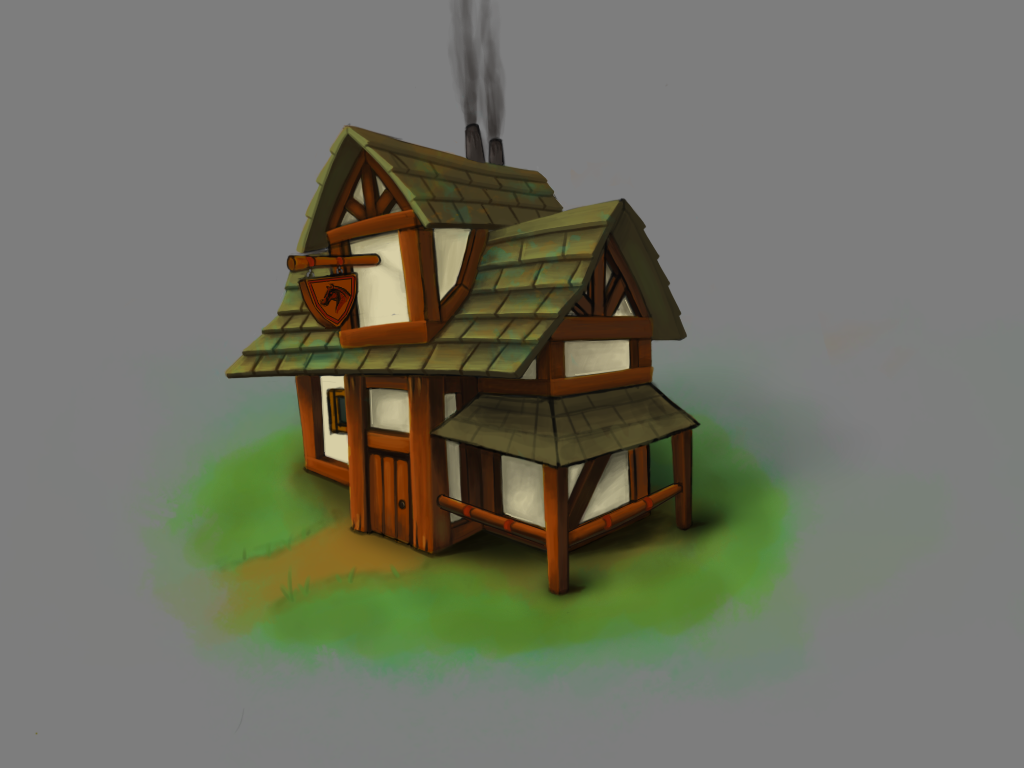
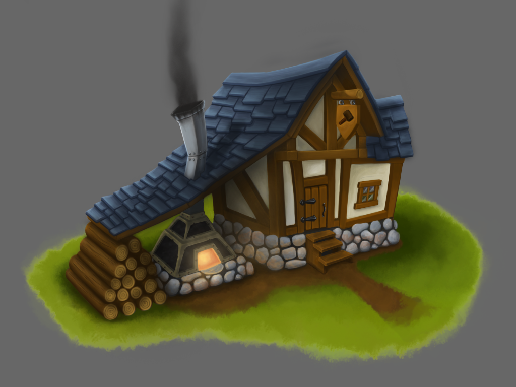
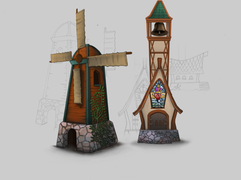
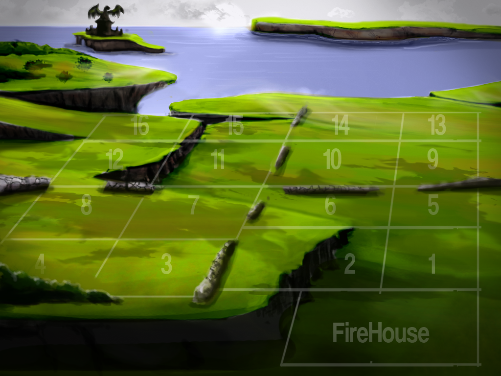
The game is going to be a re-theme of one of our current games called Fire and Dice (If you wanna check it out in the app store for either iOS or Android, it's free!). We want to make the game feel like it makes more sense and could have a story. With that, we came up with the idea of placing it in a medieval setting with dragons attacking (Skyrim amirite?) We all really loved the idea and running with the theme and the style (which seems to be kind of popular right now, so that's even better)
This week we've worked on fleshing out these concepts, and I went through and modeled low poly versions of them. So far we have 3 buildings textured to a good degree, and will get a Windmill and Blacksmith done tomorrow for our pre-production first deadline, here's what we have so far
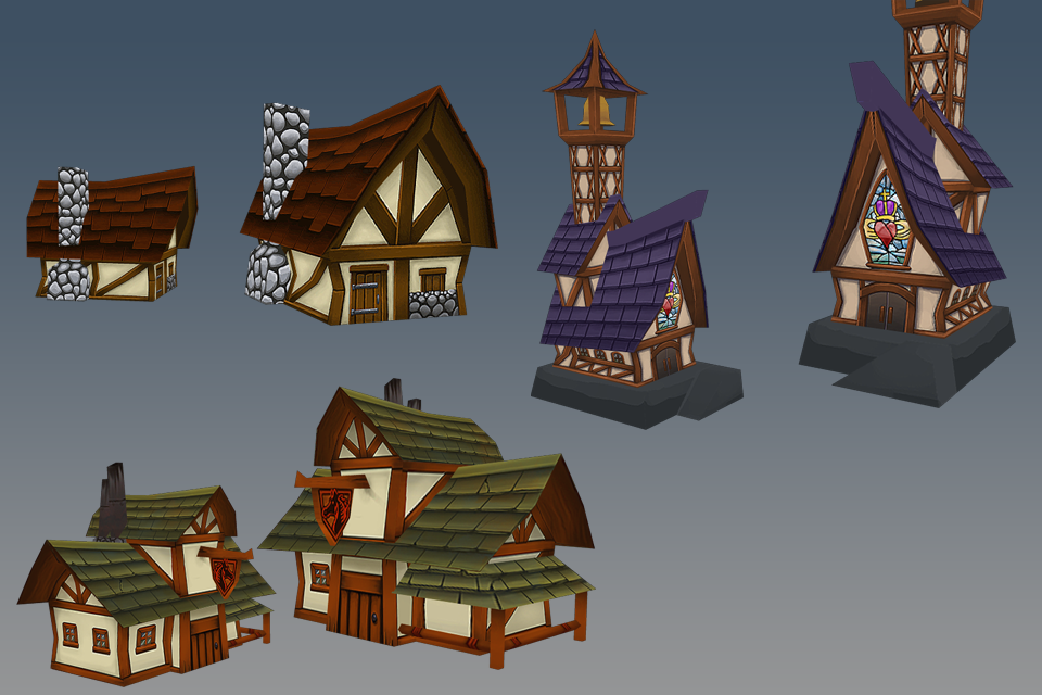
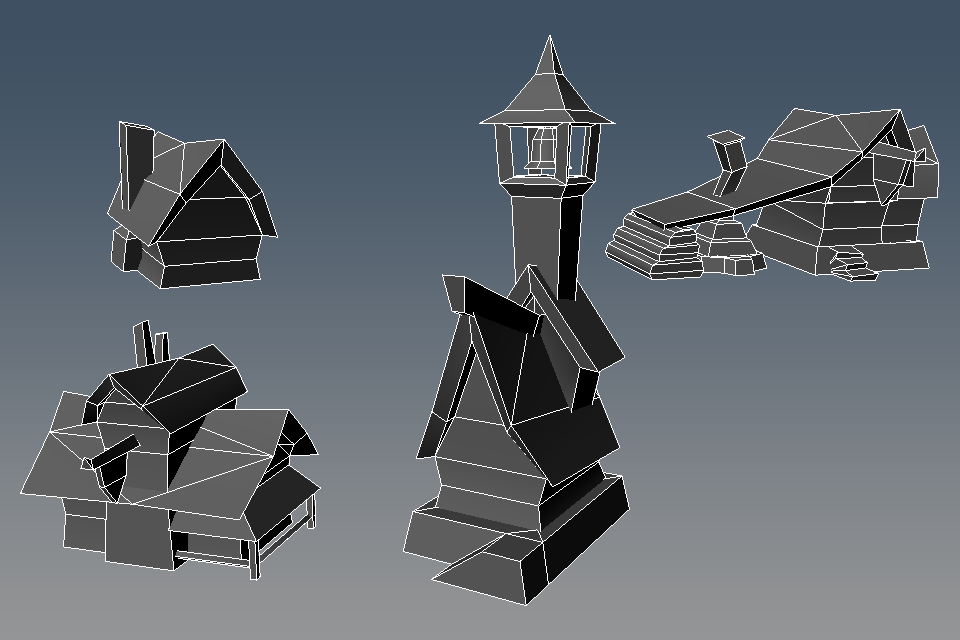
It's for a mobile environment and needs to be low. Estimating about 50-60 buildings on screen at one time (estimating for around 9k).
Cottage - 84 tris
Church - 301 tris
Blacksmith - 352 tris
Red Mare - 243 tris
Obviously unique buildings will receive a higher tri count, and generic ones like the cottage are required to be lower
I'm going to try and update this thread with art at least once a week with the exception of another update tomorrow
So what do you think? We would really love some feedback for what you see and if you can offer any suggestions it would be greatly appreciated! Thanks again guys
So Sky Parlor Studios is beginning work on a new project that we'll hopefully complete soon. Since it's a start up company and everyone is just out of college except our producer, a lot of final decisions goes through him obviously. This project, however, is the first one where as lead artist, I'll be completely responsible for art style. I'm a little nervous especially since we are a start up company trying to make money, but I think I'm heading us in a good direction
I've tasked the art team (3 people myself included) with using a painterly style with this project. We really want to emphasize color usage and get a vibrant, but not clashing final look. Here's what Dick and CJ came up with so far in pre-pro for concepts


The game is going to be a re-theme of one of our current games called Fire and Dice (If you wanna check it out in the app store for either iOS or Android, it's free!). We want to make the game feel like it makes more sense and could have a story. With that, we came up with the idea of placing it in a medieval setting with dragons attacking (Skyrim amirite?) We all really loved the idea and running with the theme and the style (which seems to be kind of popular right now, so that's even better)
This week we've worked on fleshing out these concepts, and I went through and modeled low poly versions of them. So far we have 3 buildings textured to a good degree, and will get a Windmill and Blacksmith done tomorrow for our pre-production first deadline, here's what we have so far


It's for a mobile environment and needs to be low. Estimating about 50-60 buildings on screen at one time (estimating for around 9k).
Cottage - 84 tris
Church - 301 tris
Blacksmith - 352 tris
Red Mare - 243 tris
Obviously unique buildings will receive a higher tri count, and generic ones like the cottage are required to be lower
I'm going to try and update this thread with art at least once a week with the exception of another update tomorrow
So what do you think? We would really love some feedback for what you see and if you can offer any suggestions it would be greatly appreciated! Thanks again guys
Replies
Obviously, some things like the blacksmith aren't complete lol. Tried to make a little scene to show off through renders and on the iPad to make sure things look the way we wanted. This is essentially the look and feel of the game we want to achieve in a very small setting (Obviously it's WIP and concept stage though). I'm really happy with everything the team did this week and can't wait to see it taken further
I did the church and ground, and started the roof tiles on the blacksmith
Dick did the cottage and started the windmill
and CJ did the Red Mare (green roof) and started the blacksmith aside from the roof.
I'd really love to get some feedback and see what you guys think
Also, using flat black in AO, especially for this sort of style, will really flatten out the image. Stick to subtle color in the AO and you'll start seeing some immediate improvement.
more detail can still be put into it for sure; I'd like to go back over everything and give it even more highlights and color detail for sure
Scene unlit
Blacksmith texture was also updated a little bit here
Looking forward to seeing more from you, mister.