The BRAWL² Tournament Challenge has been announced!
It starts May 12, and ends Oct 17. Let's see what you got!
https://polycount.com/discussion/237047/the-brawl²-tournament
It starts May 12, and ends Oct 17. Let's see what you got!
https://polycount.com/discussion/237047/the-brawl²-tournament
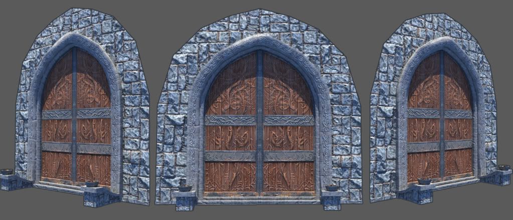
Door
With what little time I have off I have been trying to do some art. I am hoping to start this thread to keep myself making new art. Any CC is welcome.
Tris: 1044
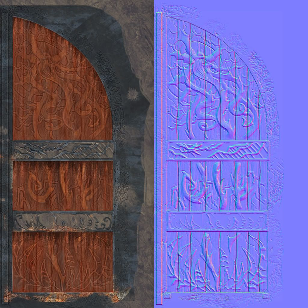
Textures: (Wall)512x512 (Trim)512x256 (Door)1024x512
Maya,PS,Zbrush,nDo2


Tris: 1044
Textures: (Wall)512x512 (Trim)512x256 (Door)1024x512
Maya,PS,Zbrush,nDo2


Replies
Adjust the color of the extruded section a little bit, and consider changing the grain direction. Right now its obvious that the wood grain does not adhere to these areas, which makes it read odd. Painting in some highlights on these would help them pop better as well.
Are you using a spec map? Maybe its that, or the lighting, but the door texture on your model looks a little washed out compared to the texture sheet. I think some better lighting and good use of spec could help with that.
The pixel density of the bricks on the outside of the door appears to be noticeably lower. If you were showing a whole building, I don't think it would look as bad, but since you are just showing a smaller section of the wall, I think it makes the transition to the arch look off.
There is a spec map being used for the high lights, but I agree I should paint in some color around the edges. For that pop.
As well the lighting. I just used a very quick lighting to make a render. Makes it look washed out.
Here is a grab from Maya that might show case it better.
I hope..
Thanks