The BRAWL² Tournament Challenge has been announced!
It starts May 12, and ends Oct 17. Let's see what you got!
https://polycount.com/discussion/237047/the-brawl²-tournament
It starts May 12, and ends Oct 17. Let's see what you got!
https://polycount.com/discussion/237047/the-brawl²-tournament
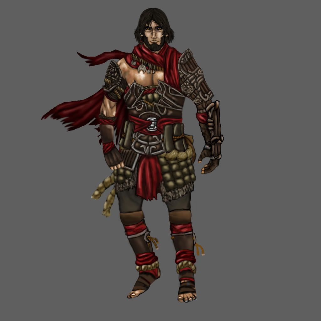
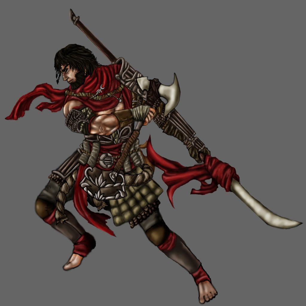
WIP character- Ishakar
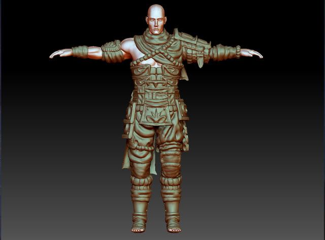
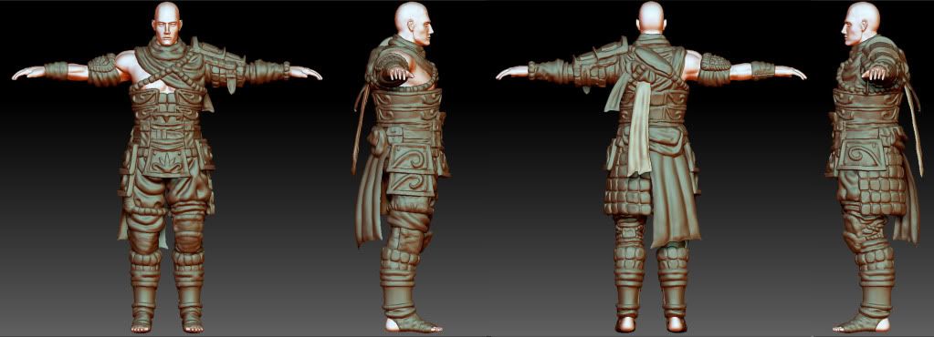
So I have been bouncing this around for a bit, a while back I made this character, and all in all I like the design, but my first attempt to model him was less then satisfactory. Now I know a lot more about character modelling and I am trying to model Ishakar again. I really think I can get a good portfolio piece out of this, but I have to really hammer in the detail. Please shower me with crits and advice on sculpting the armor and parts of the character. Thanks guys.
note: I have deviated from some things when making the sculpt but if you guys have any advice concerning that I would love the advice.
will post progress asap, thanks guys : )
note: I have deviated from some things when making the sculpt but if you guys have any advice concerning that I would love the advice.


will post progress asap, thanks guys : )

Replies
Good luck!
For the rest I think so far so good though the blocked out flourishes with that shader and tightly packed details really remind me of these Aztec statues.
I think some objects are better off just hand modeling, then trying to sculpt it in ZB or mud. Can save alot of time too!
Aside from that, some of your anatomy is a little wonky. It's hard to see his hands, but his thumbs DEFINITELY need work, and it looks like he has a case of noodle-finger. His forearm is bulging with what could be muscles, but I would double check your musculature there.
I'm afraid you might be making the cloth too thick in the sculpt? In the concept athletic proportions even with all of his layers of clothing and armor on, but in the sculpt he's super bulky - looks like he's getting ready to go to Antarctica.
essentially I took the massive ztool that made my computer chug and retopoed a base mesh and then tackled each of the little pieces. Things like the pouches I have taken into max.
I just made a first pass on textures. The normal is okay but not great, I need to go back and tweak the arm and chest as well as the face and numerous other places. The spec is really basic at this point but I am sort of realizing I don't know how to produce a really high quality spec map. As for my diffuse I did a simple paint over of my normal and threw in my ambient occlusion.
I am debating whether to stick with the color scheme of the concept or use the idiation I made. The blue and white is more reminiscent of sands of time prince of persia and pops better off the armor. At the same time the orignal color scheme reads warrior a bit more, despite being potentially muddy.
Any advice I can get concerning approaching textures or the direction of the color scheme would be awesome. Thanks guys, I really appreciate all the help!
here's so more progress on the character. I covered up some seems and got normal maps for more of his gear. He's almost done, if anything all I have do is polish textures and render the normal for his right shoulder/arm guard.