WIP Alley Way UDK Environment
Hey guys after a few fixes and added couple more props i think i need some feed back on the latest work in progress. My biggest weakness would be on lighting i am not too sure about the lighting for the environment please critique and comment thank you!
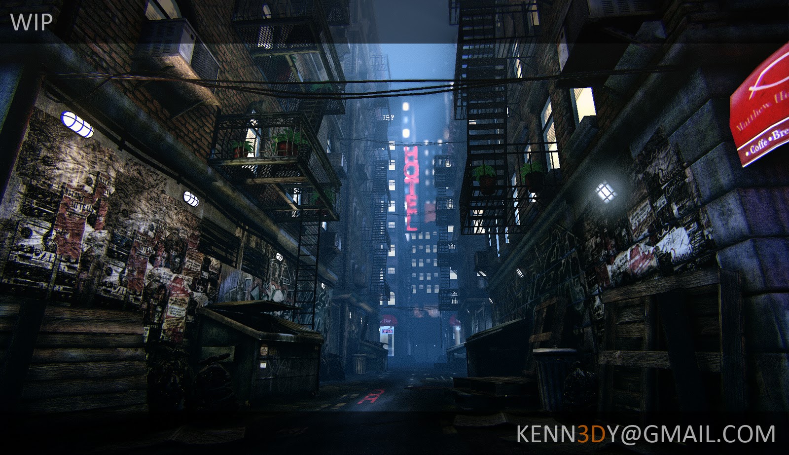
Hi guys, since it is almost to the point of completion, just a few more tweak here and there. I thought it would be wise to post an update, to get more critique and feedback. Thanks!
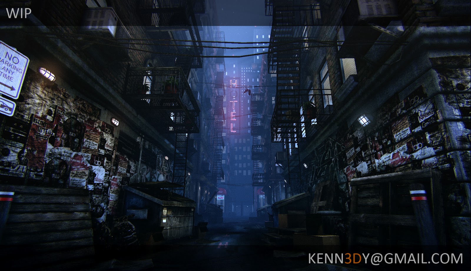
Hi guys, first off I hope everybody had a excellent New Year!! This is my second post here, after my first post on the Cigarette I've learned tons!! Hopefully I can learned a lot more with this post! This is a portfolio piece that I am currently working on in the UDK, please feel free to comment and critique (I know I need it!).
Thanks in advance")


Hi guys, since it is almost to the point of completion, just a few more tweak here and there. I thought it would be wise to post an update, to get more critique and feedback. Thanks!
Hi guys, first off I hope everybody had a excellent New Year!! This is my second post here, after my first post on the Cigarette I've learned tons!! Hopefully I can learned a lot more with this post! This is a portfolio piece that I am currently working on in the UDK, please feel free to comment and critique (I know I need it!).
Thanks in advance
Replies
Hope it helps!
Other than the lights though, I think your assets are pretty solid and coming along nicely. Keep it up!
Everything is modeled and texture seperately other then the wall and the ground pieces, they are all modular pieces.
Lighting could be tweaked a little, as KartoonHead said, building lamps are of similar hue and brightness...some variation here would sell the scene a lot more. Did you start out with the default night lighting in UDK? Either way, the blue directional hitting the buildings is a nice touch. Are you using the self illumination of the HOTEL sign for lightmass? I can't tell for sure, but it would be nice to see that pink light bounce off the buildings a little bit.
I think you could play with post process settings a little bit more. I think a distance fog and some slight depth of field could be nice, especially if you are setting it up specifically for this one shot.
I think your up front details could use a little work..they are pretty rough. The normal map on the signs/images is very obviously tiled and way overpowered. Same with the concrete barrier in the front on the right..and the garbage cans as well. Just too noisy for my tastes. Also, I would love to see more variation on the images. I know you can get away with repeating them sometimes, but with them so prevalent in the shot..you can afford to mix things up a bit here.
I like where you are going with the ground. It definitely looks wet and worn, like an alleyway should. Maybe I'm being too nitpicky here, but its pretty easy to see that it tiles.
Overall though, this is a pretty nice looking scene. I look foward to seeing what you end up with.
Hey thanks for the advice, I will change up the lights for sure, as for wall and floor texture I am having a hard time with those not to repeat any suggestions?
could def use some lighting love, perhaps try messing with the tonemapper in world post settings to get some lighter colors.
looks good.
Couple of thoughts: I think you're overdoing the posters, it seems to be a rarely visited alley, why are there so many posters hanging on the walls here where no passerby would see them? If you're going to stick with the number of posters, maybe go for a layered effect of tons of old posters stuck on top each other, peeling off etc.
If you're not afraid of integrating some alley cliches, put some graffitti on the walls and strategically place a couple of beer bottles ;-)
Oh, and in my opinion the wooden things (erm, the english name escapes me) could be more beat up. These things wander around the country for many years usually.
Personally, i think these sort of scenes could always go with a 'story' of sorts.. maybe sit down and think for a couple of minutes on what could be going on in this alley on a day to day basis.. is it a street gang's chillout spot? hobos sleep here? heroin addicts? Maybe something is going on in one of the appartments, or a silhouette is jumping from rooftop to rooftop (adding humans can drastically change the focus/point of interest though)? then add/change stuff accordingly. That's just a suggestion though. Very nice work!
Hey cptSwing those posters are place holder at the moment they will be change up for sure
I also like to see a little bit of bloom. It adds the feel of light being emitted, instead of just a back lit wall.
With regards to lighting, I think that you are heading in the right direction.
One thing you could try is maybe pushing the background slightly bluer (the fog colour I believe) and making the foreground lights a bit warmer to benefit the contrast of the scene. The wall light on the right in particular is a bit too cool I think.
You could also try increasing the foreground lighting intensity slightly too.
A good trick I find (as I keep going on about here, sorry :P) is to blur your vision and look at your image. A good composition should still read fairly interesting with spots of high and low values, instead of blending into a grey mess.
To be fair, your scene does this fairly well as it is, but increasing the overall exposure could help.
Me, literally increasing the 'Exposure' to +2 in Photoshop:
That may or may not be what you want, but I hope it helps!
Also, is there any stereoscopic effects on this? I feel like there is, but I could be making it up. If there is, would you mind telling me how? I've been thinking about adding some to a school assignment I'm working on.
I use the default camera in unreal, but I did added some Post Processing effect,Vignette and Noise Grain.
Hey man thanks for the PO, I am going to try play around with the setting in Unreal to try and give the image a little more contrast, thanks!
Easier way is to use this:
http://udn.epicgames.com/Three/ColorGrading.html#Color correction
Just import the "blanco" LUT texture into photoshop with some screenshots of your level, slap on different adjustment layers so that they are on top of the LUT and screenshot layers. Then just adjust the images so that you like them. In the end, copy merged LUT layer into a new document, save as and import into UDK, remember proper lod group setting. Then assign it to the world PP settings or to a PP volume.
Hey WOW thanks for this awesome tips!! Now i don't have to tweak the world properties's tone to get the result i want thanks a bunch!!