Cthulhu wip


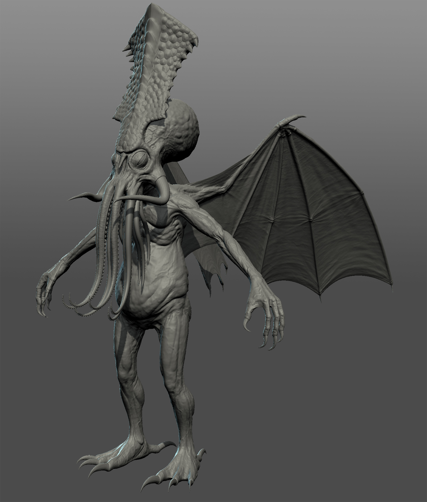
Something I’m working on in the little spare time I have. The base mesh was built in Max and sculpted up in Mudbox.
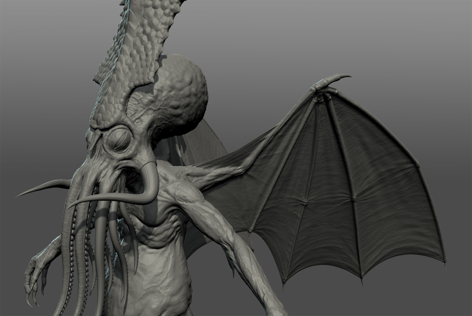
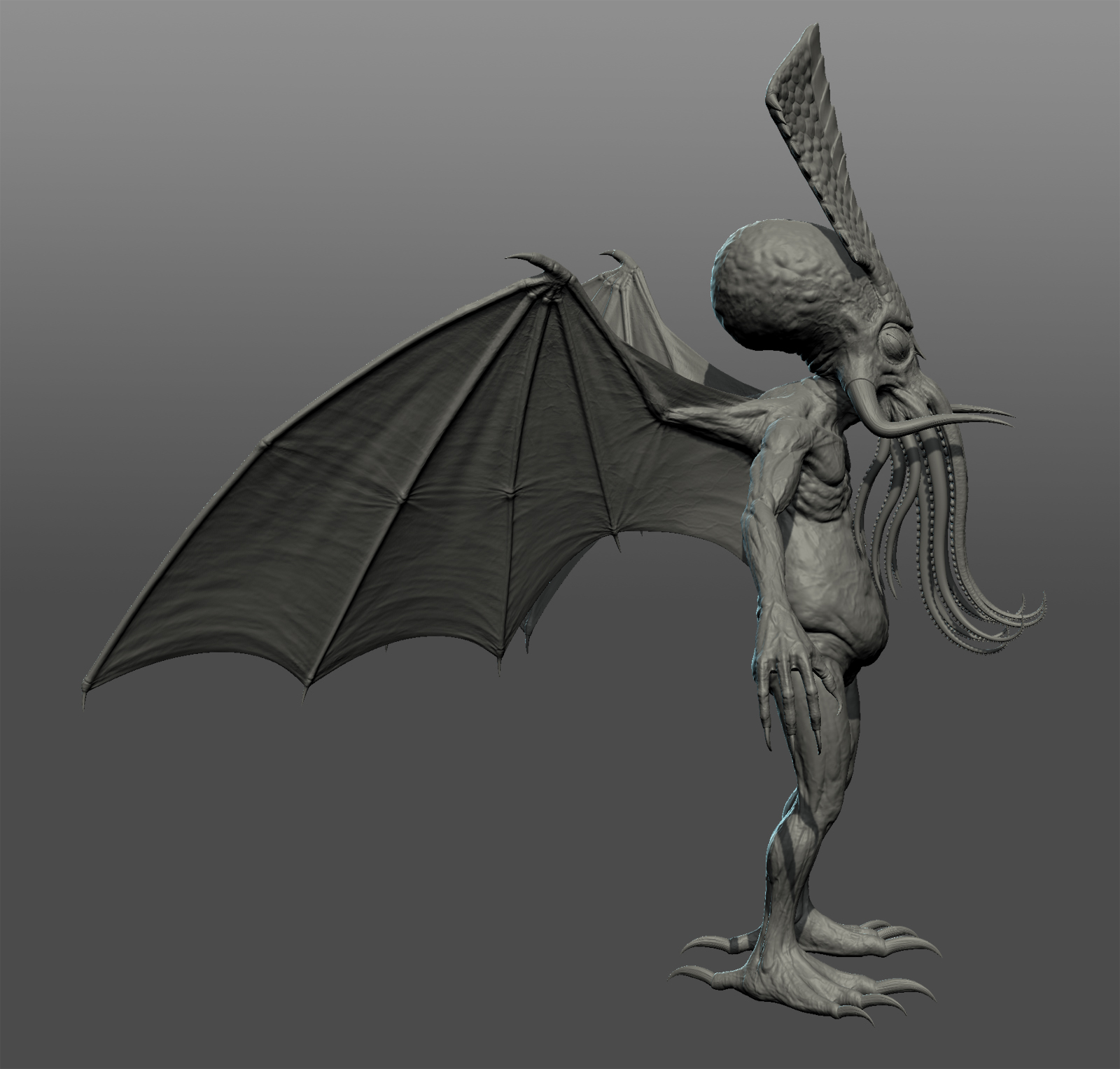
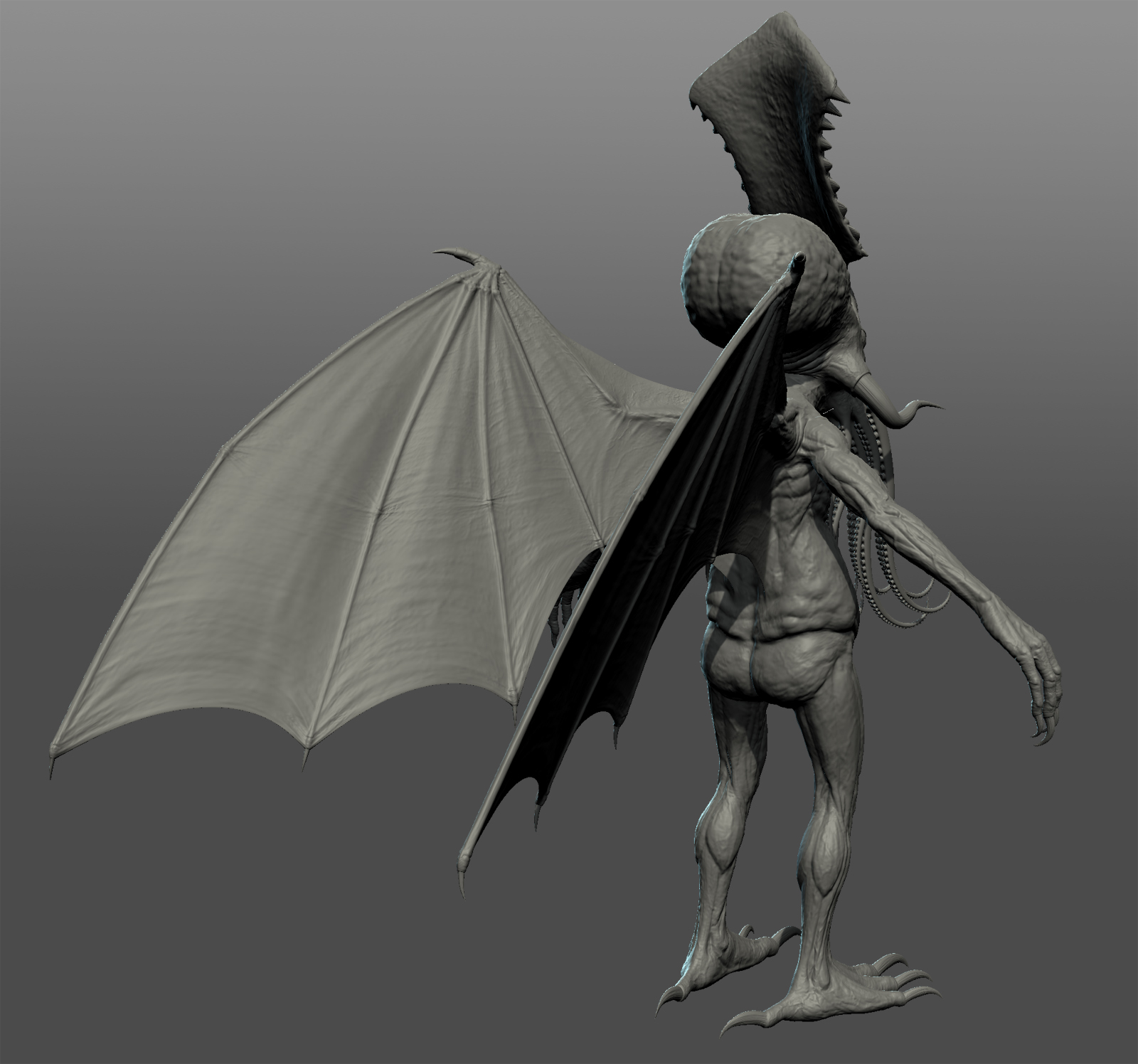
Cthulhu was described by HP Lovecraft variously as “...an octopus, a dragon, and a human caricature.... A pulpy, tentacled head surmounted a grotesque scaly body with rudimentary wings”
I added the Triceratops mantle to add a bit of prehistoric majesty.
Hopefully I’ll get time to finish him/it soon
red
Replies
The mantle merges into the skull at it's base and sits over the 'brain mass' as a sort of natural armoured shield. I'll watch that area for sure.
The look is meant to be a kind of old sinewy, wirey body with a distended belly. It's hard to make out on the shots, but the pecs actually hang a bit with the sinews/tendons of the upper arms showing through near the clavs.
Red
Are you thinking of baking this down to a low poly? You might want to exaggerate some of the surface noise and smaller details, they could get washed out if you're not careful.
Looks awesome keep it up!
Once the sculpt is finished I plan to decimate it and pose it in Max on a base ready to render.
I take the point about the scale. The camera is looking down on him to show the sculpt work. The final render will be a shot looking up at him, to give him that epic scale look.
And yes the description is 'rudimentary wings', but I made the call to give him wings that look like they could actually lift him. Funnily enough I thought rudimentary wings would make him look small and deformed rather than huge and scary.
red
Although Cthulhu is described as a beast of massive size. I think you add some stuff on him to bring out his size. Like a ship hanging from him somewhere, seagulls flying around his head, etc...
In other words, make him appear gigantic!
Looking forward on updates.
Red
red
I'll post some more shots when I get a mo. Feedback welcome as always.
Otherwise, this is shaping up pretty nice. Good work!
they are just toooo dark also, that level of blackness makes them feel un-textured.
More shots on my blog: http://redbranchblog.blogspot.co.uk/2012/07/completed-textures.html#!/2012/07/completed-textures.html
good work. but i also think the mantle looks "sticked on"...if you want to look like it's protecting its brain, maybe you should make it smaller and more curvy towards the back, so it covers more of the skull... also , making it a different colour makes it stick out even more.
I've also roughed out a base in the form of a non Euclidean style staircase to hint at this being R'lyeh. This will be sculpted up to look like stone, complete with oozing mud and seaweed. I've also put in some temporary fleeing humans.
Not sure whether to make the humas smaller, but I don't want to lose them altogether. I'd like it look look like he/it could still pick them up and squish them rather than them being so minute he/it wouldn't even notice them.
Feedback welcome as always.
But awesome textures on your Cthulhu! Something about your picture makes it feel like a toy setup. It could be that since hes so freakin' big (in the reality of this photo), some of his body should be in atmospheric perspective? Not sure what it is. This is a shot that is more complex than any of what I've done.
Evolvyn: I might add a bit of atmospheric fog, but I don't want to flatten it. And I wanted to make the DOF subtle. Could tweak for eternity.