Sketchbook: Brian Choi
Hi, my name is Brian Choi, and I'm a sophomore at USC's Interactive Media Division (as of December 2011). Springboarding off of http://www.polycount.com/forum/showthread.php?t=92716
I'm going to primarily keep this as a 3D project update and occasional 2D sketchbook. I maintain a mostly 2D one on CGHUB 2D Sketchbook.
Right now, I'm weaning myself after going through about 75% of the "Introducing Maya 2011" by Derakhshani [who is surprisingly one of the faculty members here at USC] and going to make my own character model, from beginning to hopefully rigging and some animations. At a minimum, UV mapping and textures.
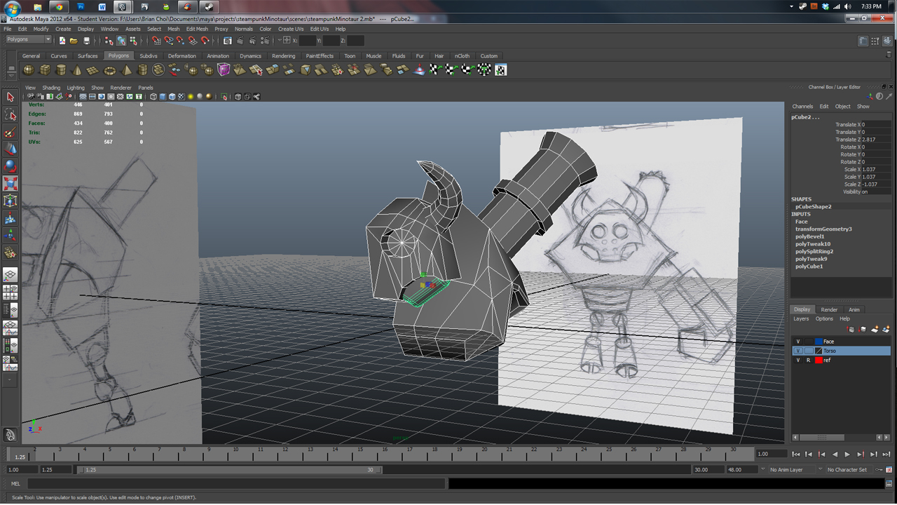
This is the Steampunk Minotaur at the moment. Gonna try to at most cap it at 10000 triangles and keep it useable for a game like Torchlight. Most likely gonna handpaint my own textures later.
If anyone has any critiques about any of the work I am doing, I will gladly gorge and masticate it with joy.


Replies
My one piece of advice for you now is to think about edge loop flow. Anywhere that will deform needs good flow of geometry so the character will keep its shape during deformation (primarily animations).
I look forward to seeing more work!
This is the Minotaur right now, and a several hour piece I've worked on recently.
At the moment, a wrench has been thrown in. A company in new York, that I sent an intern application to, is asking me to complete a whole, 3500 triangle scene, complete with lightmaps, light cones, ground reflection, and vertex coloring all in 3DSmax in two weeks, based on the theme of a port harbor area, a la that boat level in Modern Warfare 1. I am very scared. I do not know how I'm going to finish it.
I'm switching gears and jumping away from Maya and having to relearn 3DSmax as quickly as possible. I've talked to my designer friends, and in terms of assets, I'm required to make at least 2 shipping cranes, container boxes, a warehouse, and a whole or part of a cargo ship and set it all up to look like a level. My level designer friend has advised me to just make all the assets first (props, tiles) and compose them roughly, and see what happens from there. I have no experience with 3DSmax, so I am freaking out right now, so at best, I'm hoping for at least getting as far as I can and chucking something at the company's way for the art test. (This being my first ever attempt at making a comprehensive environment piece, with all the back end lighting and stuff) I'm not even too sure where there'd be a tutorial for such a situation for a low poly, game environment for an iOS FPS.
After a brunt, head on hit into 3DSmax, I've been able to pump this out, with a combination of Maya modeling and UV lay out, and then final implementation of materials in 3DSmax.
Still scared. Still questioning whether I can finish this art test of a full low-poly game environment with lights, vector coloring, and more.
Just as a cargo container, is this the appropriate detail level for a prop in an iOS FPS? (6 quad cube) [In the intention it will be spammed and repeated across the level repeatedly.]
I'm starting to freak out about joints stuff, this being my first time, making sure things will bend correctly, etc.
Critiques UBER appreciated.
As for the minotaur, I'd really suggest getting a 3 quarters view of your character and get rid of your image planes. This will really force you to use your eyes to study the character and create a good representation of the concept. Characters have the unique ability to be able to look great in the ortho views and totally terrible in the perspective view at the same time. As a general rule I try to model everything in persp and use the ortho views to check things from time to time. (Not that u don't use the orthos ever to move things, just try to view the model from several angles in persp when you do make changes.)
Also, I wouldn't suggest modeling only on half the model. It can mess with your head. :P Duplicate/mirror him while you work on one side. Then delete and re-mirror every so often.
Good luck!
Edit:
Oh, about the joints. He seems to be a mechanical character, If that's the case then just build the shapes that you would need for a robot. You won't need to worry about bending
Doing occasional mirroring, last time, it looked okay, at least for me :P
Also, this is how I'm going about doing the joints. I know looking through other tutorials (mostly involving organic humanoid characters) I'm supposed to do like two or three edge loops to allow for deformation, but is this acceptable, hiding deformation geos in ball/cylinder joints?
You want your edges to match up to give a smooth shape.
Also on a mechanical character, you wont have any deformation. Simply 2 seperate objects rotating around the same axis. So you wont need to hide the deformations at all. It would end up being wasted polygons to add 3 edges for the elbow inside the joint.
Connected the vertices in a first draft at the joints, and composed another mirror check.
Instead of mirroring every once in awhile, it can be much easier to gauge the silhouette of your object if the 2nd half is duplicated as an instance of the first. This way both sides remain identical every second of the process.
And a little illustration thing inspired by SWTOR. WIP
Started with the horns for the first ever UV texturing. God help me as I get this done.
And do you guys think I could turn this into like a psuedo-Star Wars novel cover and add more elements to make the sketch into a full portf. piece? This thing is enslaving me to continue rendering it out.
When uv mapping. Makes it very easy to tell what needs to be fixed and what is fine. Can you post a screenshot of your model with a uv checker applied?
I like the lighting on your Jedi painting. It's very strong and helps guide the eye.
The perspective on the jaw doesn't quite match the rest of his face though. Give the anatomy another pass with the filter>liquify and then clean it up. I Dig his outfit and Final Fantasy style hair :P. Keep going!
/sniffle
First, just blocking out textures, textured model
Here's a quick example of some quick ideas.... Think of functionality and how pieces might connect as they need to move.
Watch for areas on an unwrap where the checker pattern isn't uniform, it should be a nice square tile. I see that mainly on the arm guard of the robot.
You're working in Maya right?
What helps is having a short cut key to select UV patches, I set mine to Alt+CTRL+S, that way you can rapidly select a whole area and then use the unfold function. Speeds up the process a lot.
It has two functions after you select the top icon, unfold and relax, I've never got relax to work for me so I'm not sure what it does exactly, but unfold always works like a charm.
Yeah I never really found a good use for the relax. It works okay if you pin the border uvs in the tool settings but I find you don't really need it if you plan your uvs out well.
I agree with the moving of the feet forward. Even if in his final pose he will be resting on all fours. It may be easier for rigging purposes to straighten him up. (Similar to how you model a pony tail or long braid straight and then bend it after you rig it.)
it's not awe-inspiring but it's something.
Been working on a game called Tales from the Minus Lab for the past Spring Semester 2012 as a 3D level artist. Long story short, engineers were insane and made a custom built game engine and I had an incredibly fun and challenging time working in the art pipeline. (Tech Art) Engineers are your friends!
Any critiques would be GLADLY appreciated.
I'll have more of my sketch archives and recent, recent WIPS up soon. Summer allows for a LOT of time :P.
Ok, I know I'm coming out of the blue, but since this is like my first legitimate 3D sketch (I keep all my 2D stuff mostly on CGHUB)
My first attempt at doing a female bust in 3Dcoat's voxel sculpting system
Hair's crap . . . including the face . . . . but I did what I could ><
CnC if you got any.
Dark Templar Bustd
Ape
here are a couple of thumbs I've started wtih. Wanted to do a situation where Swain is practicing the spell burn from Liandry's Torment on test dummy Minions. HIlarity ensues.
Which thumbs do you think are working?
Attempted to implement Ross' and Team Awesome Horse's critiques.
Notes to self and self critique:
- That left arm is still off.
- I am definitely not confident about what hue I need to be slapping on the trees.
- going to have to deal with competing light sources from the wings and the background will become difficult.
- Still unstaisfied with the ground, but I don't think the value in the fore can be changed at alll.
- Pushing the original gold towards the cooler end of the hues was a significant step I made. Slowly gaining confidence on how to control my colors more. It's okay if the gold doesn't look EXPLICITLY yellow-orange.