Space Opera Mecha
polycounter lvl 16
So..I started this like nine months ago..and there have been long periods of time of my not touching it or only doing an hour at a time on my free time. So It's been VERY interesting seeing how differently new Erich models compared to old Erich, and have to fight with my only super crappy and inefficient way of doing things..


Since I have been staring at this big dumb thing for so long all I see is a red blob and have lost complete sight and need you guys to rip it to shreds and tell me it sucks ass so i can get a new perspective and reopen my eyes.
Concept is done by Carlo Arellano http://chainsawart.blogspot.com/search?updated-max=2008-03-17T14:59:00-07:00&max-results=50
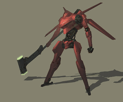
I'm torn about my texture..because I want to keep the red saturated paint job like the concept, and don't want to take away from the simplistic design and style, but I am wondering if my take is too simplistic or too close to concept. What do you guys think?
(ps. gonna start on the weapon and rigging)
Since I have been staring at this big dumb thing for so long all I see is a red blob and have lost complete sight and need you guys to rip it to shreds and tell me it sucks ass so i can get a new perspective and reopen my eyes.
Concept is done by Carlo Arellano http://chainsawart.blogspot.com/search?updated-max=2008-03-17T14:59:00-07:00&max-results=50
I'm torn about my texture..because I want to keep the red saturated paint job like the concept, and don't want to take away from the simplistic design and style, but I am wondering if my take is too simplistic or too close to concept. What do you guys think?
(ps. gonna start on the weapon and rigging)
Replies
I think rigging and lighting should bring a lot, the pose you have at the moment really detracts from the shapes of the mecha, having a strong pose like in the concept art will help a lot, and more dramatic lighting will as well.
Since your red sections kind of look like metal, or metallic paint at least, it'd be nice if you added some color to your specular, you'd be able to recapture some of the orange-ish tinting that's present on the highlights of the concept.
Maybe there are somethings with the global proportions that are a bit off, I feel maybe the pelvis area is a tad too large compared to the torso, and maybe the legs are too far apart from each other.