Home 3D Art Showcase & Critiques

Cardboard Box!

Exciting Title hey guys!

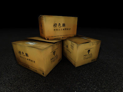
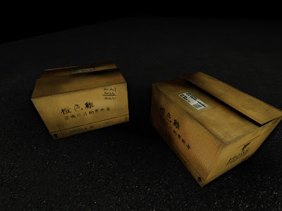
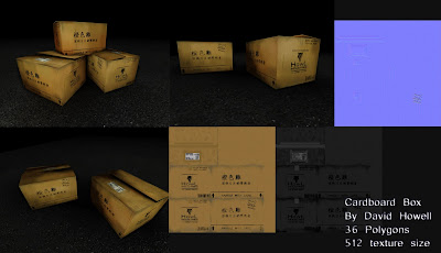
I've just made this cardboard box model for a sci fi (Blade Runner) level for my 3rd year university project. I'm pleased with how it's turned out and thought I'd post it up here to get some thoughts from you guys on it. It's a hand painted texture, 36 polygons and took about 3 hours to make.
Highres_Screenshot_00018.jpg
Highres_Screenshot_00019.jpg
cardboardbox.jpg
I'd love to know what you guys think, any improvements that could be made, etc?

Replies

  • CandyStripes05
    Options
    Offline / Send Message
    CandyStripes05 polycounter lvl 9
    bigger images : )
    and what is it rendered in?
  • PogoP
    Options
    Offline / Send Message
    PogoP polycounter lvl 10
    It's just a box! It looks good enough as it is. I wouldn't spend any more time on it, there's only so much you can do with a box ;D
  • BanishedFox
    Options
    Offline / Send Message
    bigger images : )
    and what is it rendered in?

    Haha sorry xD I rendered it in UDK under just a normal light and lightmass settings.

    Highres_Screenshot_00018.jpg

    Highres_Screenshot_00019.jpg

    cardboardbox.jpg
  • BanishedFox
    Options
    Offline / Send Message
    PogoP wrote: »
    It's just a box! It looks good enough as it is. I wouldn't spend any more time on it, there's only so much you can do with a box ;D

    haha yeah I know what you mean :D I'm not really looking to do anything else on it, but I was a bit worried that maybe a 512 texture is too big for just a box in a current generation game?
  • Tetsuo
    Options
    Offline / Send Message
    Seeing as it's a degree project I don't think it really matters, sure you could reduce it to a 256 but if there are no budgets then why not?

    For a cardboard box, it looks good. I mean if I had to be really picky it would be the yellowness of the texture, I'd probably tone it down a bit and make it a less saturated brown colour, similar to actual cardboard. However, I guess it all depends on what style your going for.

    As someone else said, I'd look at moving on from it onto the rest of your scene. Great work!

    The only other things I'd mention is that the 'hand written' text on the top right corner of the box looks like it's been mirrored and is written backwards. Though I can't tell properly from the size.
  • jordan.kocon
    Options
    Offline / Send Message
    jordan.kocon polycounter lvl 6
    The box's crashing through each other seems pretty sloppy. I like the texture, but think it could use more dirt. Though that's just a preference :)
  • Striff
    Options
    Offline / Send Message
    Striff polycounter lvl 18
    It looks to me like your edge normals are messed up. It almost looks like they are soft edges. If you used Maya I have had a problem exporting from Maya directly into UDK...it will mess my edge normals up. I go from Maya ---> 3ds max then throw an auto smooth on the object to get it to look right.
Sign In or Register to comment.