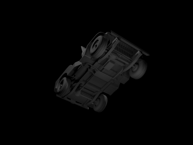
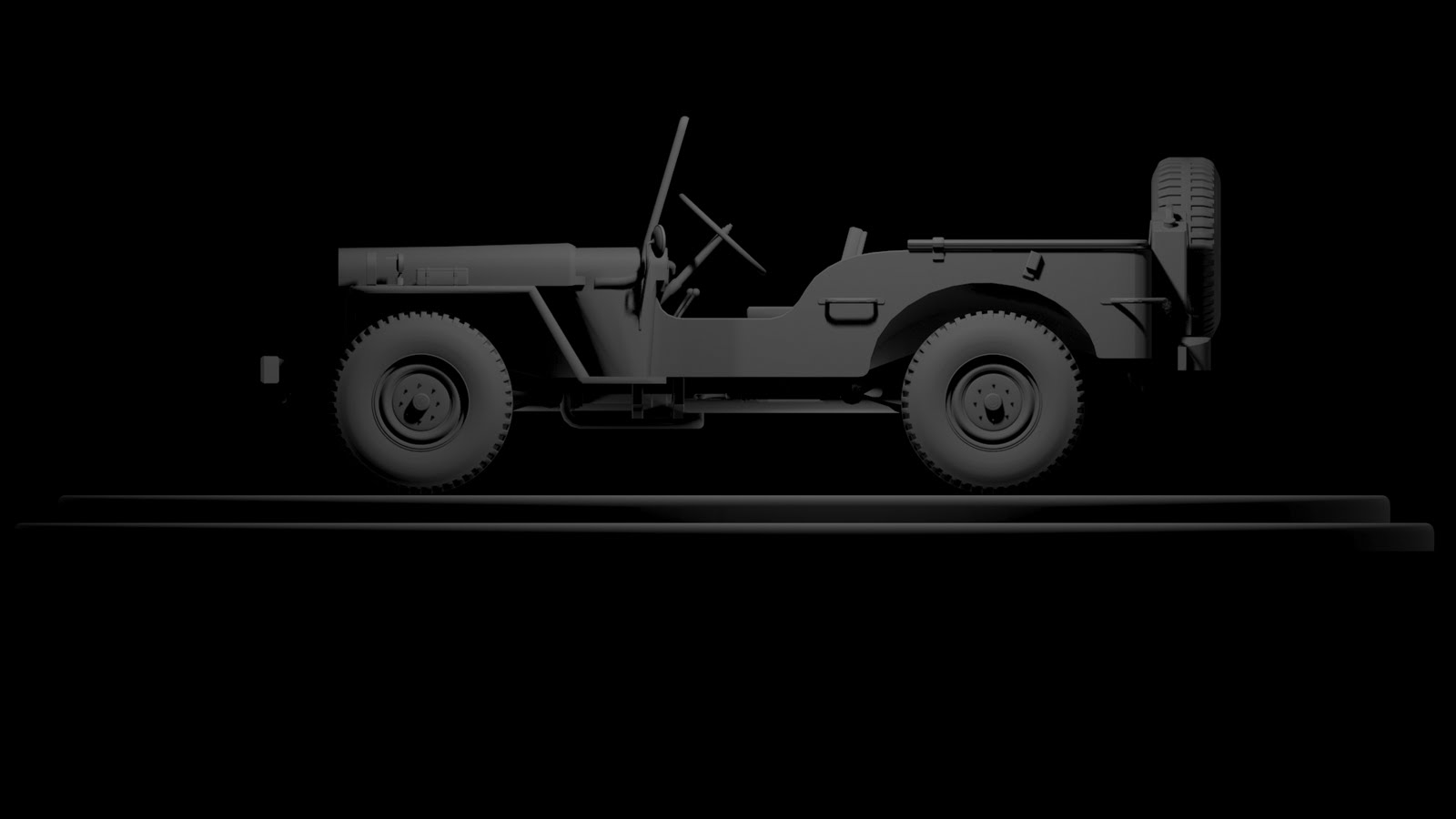
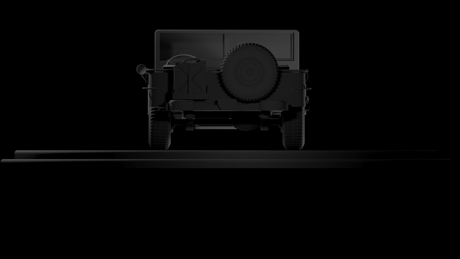
I have posted up any work of my own. Recent graduate looking for work and all that jazz I seem to have a lot of Ideas for projects for self development but as this project is the furthest I thought I'd slap this up on here to see what the general working and prospective working community feel about it. have a gander and tell me what you think. It's based on WW2 Willy Jeep using reference images I have found as reference to build this up so far. I'm looking to hit the current gen marker with this build so any points and tips to get it up to that point would be appreciated. I'm not going to post up the full working process from box to where it is now but if you want to look more at it check out my blog (www.dna87.blogspot.com). Here is where the Jeep at and hope you enjoy! The model is on about 25k polys atm as in the scene I have hidden the high poly wheel I have made for normal mapping.
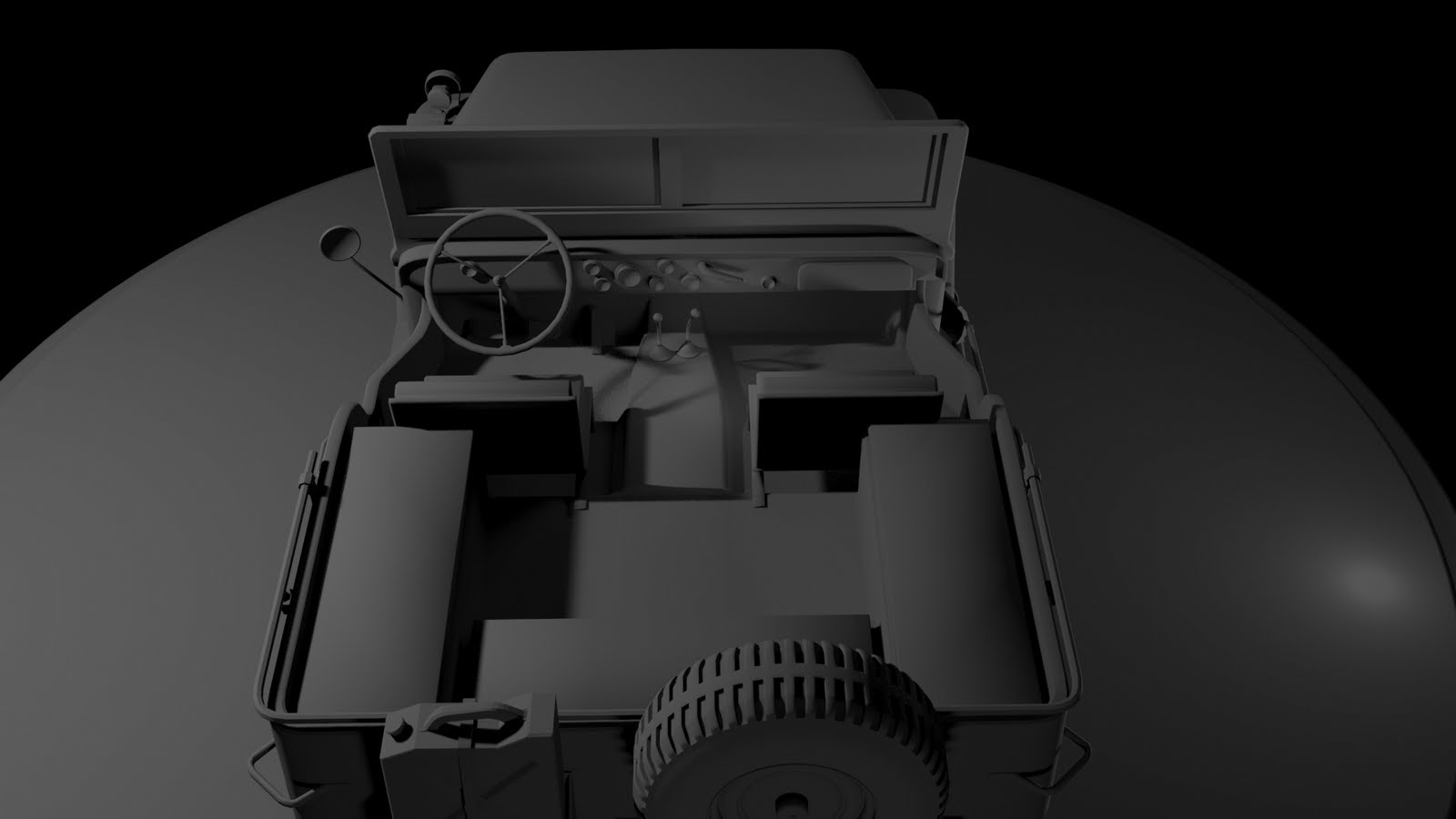
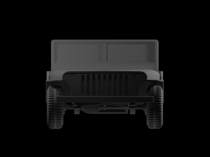
Wow uhmm, I can tell at a first glance, but the proportions for your jeep are way off. It's much too wide.
I even thought you images were distorted, but the wheels are still round so unfortunately that's not it. I really recommend you find some blueprints, compare ref again, etc...
Ooh I made one of these jeeps a while back Looking at it I would agree with Xoliul, the jeep seems too wide and too flat. Also you have the bulk of the main shapes there but you are missing many smaller details. I know there are a few slight variations on this vehicle so it might help to post up some of your refs
Yeah I see what you mean about the fatness issues with my jeep =P I think that was down to the screen I was using as it was a 1600 x 1200 native screen. So ill work on correcting that as well as the Fat tire Issues. Here are some ref images I used in my modelling process.
I think your "fatness" problem comes from how your refs are set up in the viewport. Looks like the front and top ones are stretched, which if you were modelling of those explains why the model itself looks stretched.
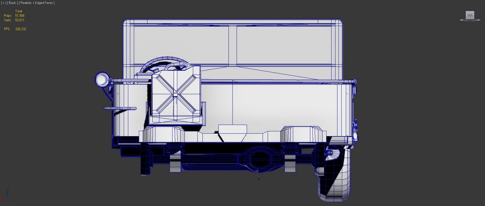
Here is a quick image of the new changed front proportions. Clearly a massive mistake on my part so sucking it up and carrying on. I'm about to start with unwrapping so I can export to Z Brush to add smaller details. Any thought before that happens?
Still looks a bit fat I would say, you should make a more even polygon flow if you are taking this into zbrush and that would be your highpoly mesh, so there is no need to unwrap that.
Unless I am misunderstanding what your about to do here
well to be honest I thought (blame my lack of experience here) I needed to unwrap my model properly to make use of UVW space before I bashed it into ZBrush as a base model to sub divide up. To be honest I'm still trying to find a work flow that fits me properly. My University lecturers weren't very good at teaching us anything of use so everything I do is self taught. I would normally keep it inside 3Ds Max and build the high poly version in there then Project one onto the other but though I would take a different work pattern to get better or different results.
You don't need zbrush. Period. You can get faster, sharper, better details with something like NDo. I just tried it myself, adding things like mud and dents can be done easily without the big hassle of using zbrush.
Just focus a bit on getting those proportions right, because it's still clearly off compared to your refpics. Just try finding the actual measurment on this thing, and check if you model matches those proportions. And don't get thrown off by parts that stick out a bit.
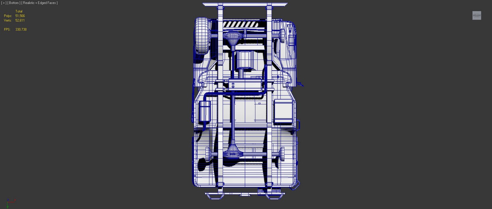
Taking on board what Xoliul said I decided to keep to what I know and work on that. I reworked some of the proportions of the model till I was happy and I will make up the normals in NDo or Xnormal after I have textured stuff up. I thought I would post to show where I am so far with that. I'm looking at really working into a run down look as if well used and abandoned. I don't want to go too over the top with rusting but I'm still working on the stylistic feel. I've been concentrating on the underneath so far and I recognise that there are a few changes to be done ie leaf spring colour need balancing with the rest of the model and base colour of under carriage needs changing but im looking for opinions of what people think for constructive feed back.
The skid plate in the middle has diagonal scratches, shouldn't they be forward to back?
The suspension is actually straps of metal stacked together, it would probably be better to straighten them out on the UV layout for two reasons.
1) They'll pack better.
2) You can more easily draw straight lines on them without having to worry about aliasing or curved lines.
Being the undercarriage, and not always being seen I'm not sure it deserves so much unique texture space. There are a lot of pieces with very similar textures. Stacking and repeating some of these textures would allow you to increase the over all pixel density without having to increase the size of the material.
Careful with the amount of damage. There is a point where rust, scratches, dents and dings just blends together to make noisy vomit, you're not there yet but you're getting close.
Most of the time its best if damage is a very light dessert, not all 7 courses.
By this I mean you would have some pretty large sections that are untouched, punctuated by a little damage/detail.
Take this mech for example, if you clear off some of the noisy detail it looks a lot better.
It's easy to fall into a trap where you have too much damage so none of it stands out and it all blends together so you throw more damage on top and the problem just compounds.
Another thing to keep in mind is that if you're creating this jeep as if it was in the time period it was used, then it's going ot be fairly new without much damage, they had just been manufactured and shipped over. Most of the ref you find today will be those same vehicles +50 years and probably a few restorations. So while we might look at a foot locker an ammo crate or a jeep and see a lot of age, that wasn't the case back then.
Other than that its looking pretty good, nice work!
Thanks for all the good advice Mark. whilst doing the topside texturing I kept some of your advice in mind. I didn't want to go too far over the top but still wanted to keep to my over all theme of used and abandoned Jeep. Here is where it is at the moment
The wheels still need a good look at to get the colouring right. I have played around with them but haven't quite succeeded with them yet. I put in a mask layer for the windows to screen some dirt and add opacity to them. I have added some writing and reg plate numbering to start bringing the finer details into the jeep. The underneath has had a few changed but its almost exactly the same. I will post up another image once I have done some significant changes to the model where I could have some deliberation as to its progress.
Replies
I even thought you images were distorted, but the wheels are still round so unfortunately that's not it. I really recommend you find some blueprints, compare ref again, etc...
Unfortunately, your willy jeep as the proportion of a humvee.
The Willy jeep is not that large and is higher.
Bit hard to tell in your renders, but the tire thread is wrong also.
It<s supposed to be "rounder" like this :
http://www.thelongolivedrabline.com/images/uploads/Product-332-firestone-military-tire-large_1_-large.jpg
and the threads are placed like this : (forget the . I couldn<t put spaces :P)
---...
...---
---...
...---
while yours are like this :
--- ---
--- ---
--- ---
Good luck!
Yeah I see what you mean about the fatness issues with my jeep =P I think that was down to the screen I was using as it was a 1600 x 1200 native screen. So ill work on correcting that as well as the Fat tire Issues. Here are some ref images I used in my modelling process.
Here is a quick image of the new changed front proportions. Clearly a massive mistake on my part so sucking it up and carrying on. I'm about to start with unwrapping so I can export to Z Brush to add smaller details. Any thought before that happens?
Unless I am misunderstanding what your about to do here
http://www.max3d.pl/forum/showthread.php?t=80190
Just focus a bit on getting those proportions right, because it's still clearly off compared to your refpics. Just try finding the actual measurment on this thing, and check if you model matches those proportions. And don't get thrown off by parts that stick out a bit.
Thanks DNA
The skid plate in the middle has diagonal scratches, shouldn't they be forward to back?
The suspension is actually straps of metal stacked together, it would probably be better to straighten them out on the UV layout for two reasons.
1) They'll pack better.
2) You can more easily draw straight lines on them without having to worry about aliasing or curved lines.
Being the undercarriage, and not always being seen I'm not sure it deserves so much unique texture space. There are a lot of pieces with very similar textures. Stacking and repeating some of these textures would allow you to increase the over all pixel density without having to increase the size of the material.
Careful with the amount of damage. There is a point where rust, scratches, dents and dings just blends together to make noisy vomit, you're not there yet but you're getting close.
Most of the time its best if damage is a very light dessert, not all 7 courses.
By this I mean you would have some pretty large sections that are untouched, punctuated by a little damage/detail.
Take this mech for example, if you clear off some of the noisy detail it looks a lot better.
It's easy to fall into a trap where you have too much damage so none of it stands out and it all blends together so you throw more damage on top and the problem just compounds.
Another thing to keep in mind is that if you're creating this jeep as if it was in the time period it was used, then it's going ot be fairly new without much damage, they had just been manufactured and shipped over. Most of the ref you find today will be those same vehicles +50 years and probably a few restorations. So while we might look at a foot locker an ammo crate or a jeep and see a lot of age, that wasn't the case back then.
Other than that its looking pretty good, nice work!
The wheels still need a good look at to get the colouring right. I have played around with them but haven't quite succeeded with them yet. I put in a mask layer for the windows to screen some dirt and add opacity to them. I have added some writing and reg plate numbering to start bringing the finer details into the jeep. The underneath has had a few changed but its almost exactly the same. I will post up another image once I have done some significant changes to the model where I could have some deliberation as to its progress.