My old Darth vader....
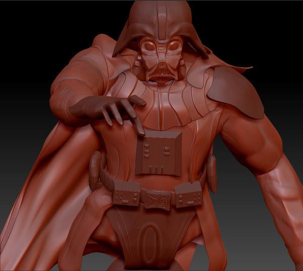
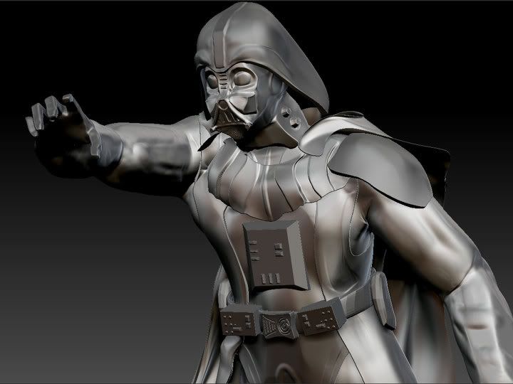
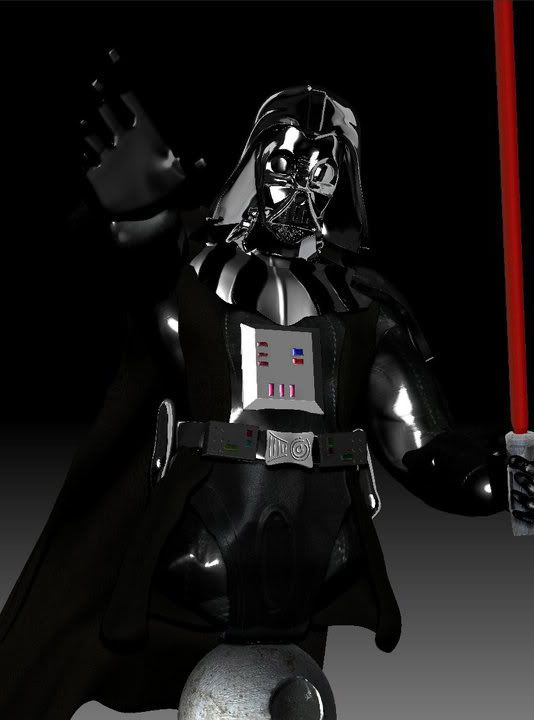
This is a model of Darth Vader i did, a year ago in zbrush 3.5
I want to remodel with my new Zbrush4R2, using the new features
I need some feedback, any helpful comment will be greatly appreciated

http://i1101.photobucket.com/albums/g421/lonewolfgarou/59420_436780167117_730212117_5034238_4543375_n.jpg
The background, in the final render is not mine it was a school project it not for any commercial purposes.
I want to remodel with my new Zbrush4R2, using the new features
I need some feedback, any helpful comment will be greatly appreciated


http://i1101.photobucket.com/albums/g421/lonewolfgarou/59420_436780167117_730212117_5034238_4543375_n.jpg
The background, in the final render is not mine it was a school project it not for any commercial purposes.
Replies
One thing that's bothering me is the helmet.. it seems to be sitting on about the right place in the sculpts, but in the final render it's way too high. We never see that much of his.. uh, forehead.
Also his fingers look square and the death star looks pretty half-assed. Looks like a dented rock to be honest.
Maybe you should consider concentrating on modeling first. Right now there are to many flaws to point out... Forget the details, take a longer look at proportions, compare with original. Try to achieve maximum likeliness with overall shape. Rinse-repeat.
Then proceed with detail, rendering, composition.