UDK Sloth Scene
Hello!
This scene was inspired by the sloth room in the movie se7en. It's still a work in progress, but at this point, I'm looking for feedback for improvement! So any feedback would be greatly appreciated.
Thanks!!
gamerbetty21
[ame="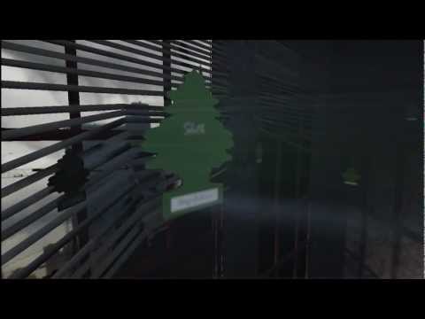 https://www.youtube.com/watch?v=5viOhcr3rqc"]UDK Sloth Scene - YouTube[/ame]
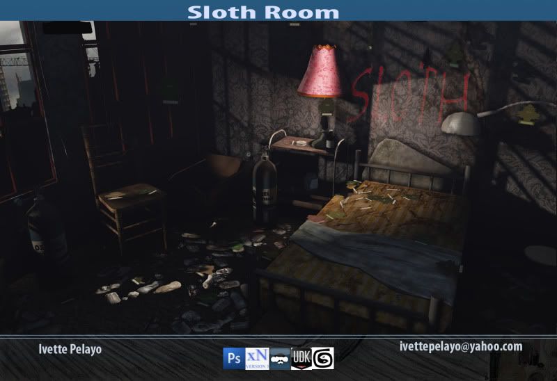
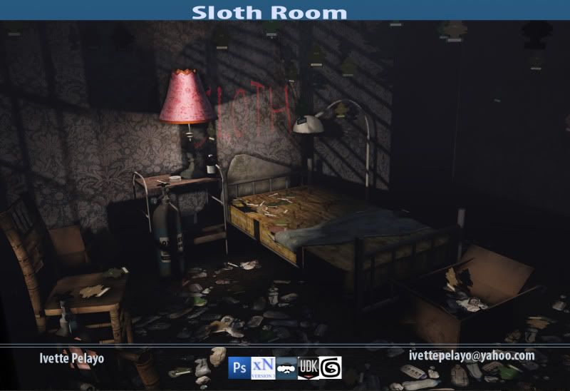
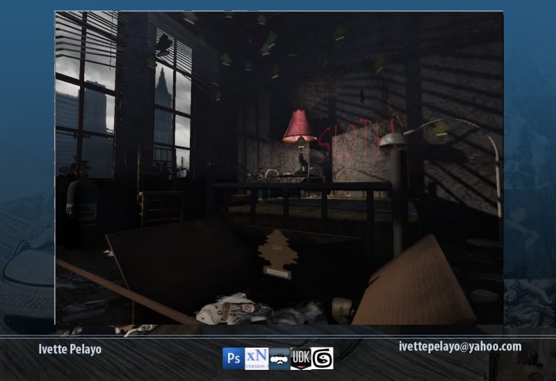
This scene was inspired by the sloth room in the movie se7en. It's still a work in progress, but at this point, I'm looking for feedback for improvement! So any feedback would be greatly appreciated.
Thanks!!
gamerbetty21
[ame="
 https://www.youtube.com/watch?v=5viOhcr3rqc"]UDK Sloth Scene - YouTube[/ame]


Replies
I like the atmosphere, I think it was nicely captured. LOL @ air fresheners.
Very cool scene.
The air fresheners, windows, skybox, basic modeling all seem to be good to go-
The "sloth" text on the wall appears to be glowing, as if its additive. you might want to look at your shader setup and shoot for more more of a multiply effect to make it look more like blood. Also, this text is kind of the center piece in my mind. Right now it looks like a font. You should strive for a lettering quality, that has a disturbing aspect, like someone actually smeared it on there. drips are always awesome. make em say ewwww
the trash is nice, but the way its distribution comes off weird. generally junk collects, up against things, and under stuff. The space where one would walk would be more likely to be void of debris.
The oxygen tanks seem a bit too fat, and look more like some sort of canister full of something flamable.
The lamp shade, becomes the focal point due to its bold choice of pink. Next to the red glowing letters its a little distracting to what we as the audience *should* be pulled into, (hideous bloody crime scene) desaturating/darkening the lamp would probably help the scene heiarchy.
It might be cool to blood up the bed a bit too, you figure the dude was basically decomposing there for a year :P
The lighting is confusing. I'm guessing the pink lamp, and the windows are your light sources. If this is the case, why is the scene (particularly the lamp) so heavily top lit?
Try playing with some warm/cool color combos. Ex: the lamp could be casting a dominant warm color, and the windows, a cooler, more subdued value.
Lastly,
I`d say you could try your hand and better matteral definition. Everything seems as though its made of the same carboard/matte looking material. Metal should have some sort of nod to the fact that its metal in its material via environment maps and spec. Varierty in surface types adds live to a scene.