[MUTANT] Greco-Roman Wrestling, Dproeder
First Work Posted on Polycount!
Beauty Shot 1:

Beauty Shot 2:
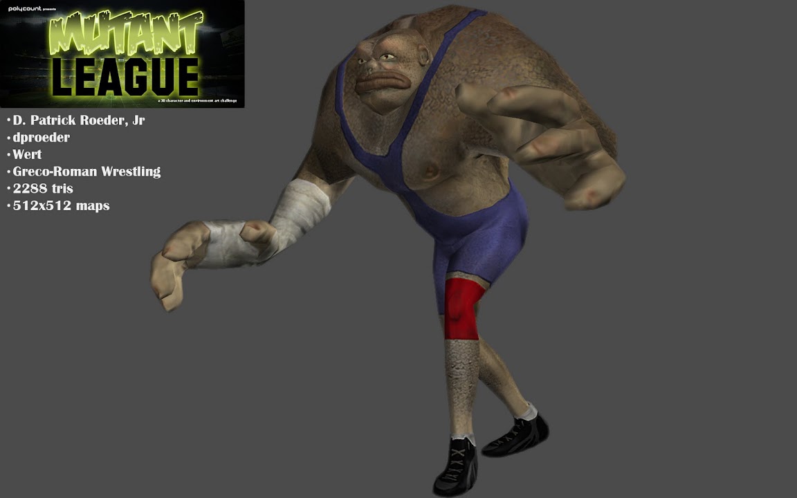
Spec Image:
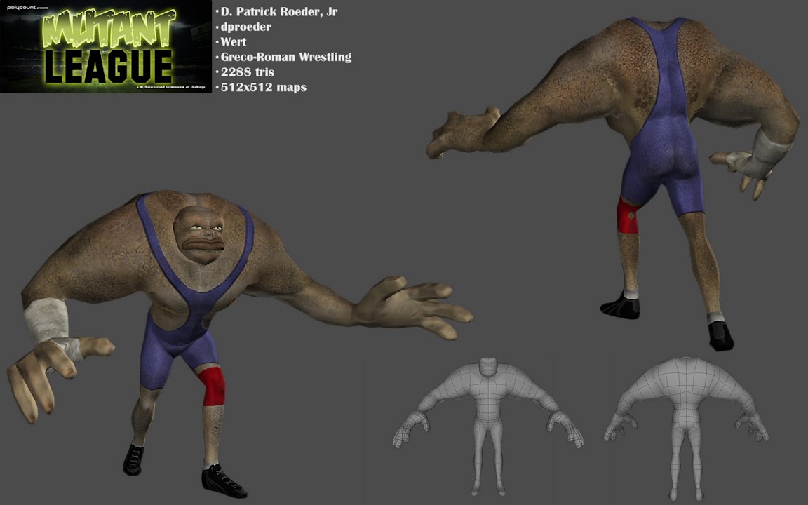
Texture Example:
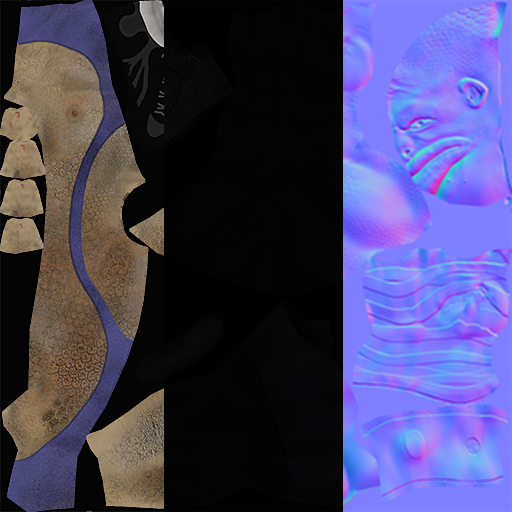
For Those Wondering what Greco-Roman Wrestling is:
This style of wrestling forbids holds below the waist which is the major difference between itself and freestyle wrestling, the other form of wrestling at
the Olympics. This restriction results in an emphasis on throws, since a wrestler cannot use trips to take an opponent to the ground or avoid throws by hooking or grabbing their opponent's leg. Arm drags, bear hugs, and headlocks found in Freestyle have greater prominence in Greco-Roman and throws especially known as a suplex are used, in which the offensive wrestler lifts his opponent in a high arch while falling backward on his own neck to a bridge in order to bring his opponent's shoulders down to the mat.
Wrestling has been very close to me. My dad was a Coach for 27 years, and I wrestled (after he retired) for 6 years eventually becoming an All-State champion my last year.
My favorite Olympic moment:
[ame="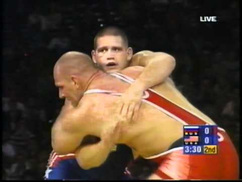 https://www.youtube.com/watch?v=9MI7KuGb48E&feature=related"]Kareline Alexandre (RUS) vs Gardner Rulon (USA) - Youtube Link[/ame]
I have a few goals in this contest:
Get back into Zbrush after months of Game Engine work and writing my Thesis Paper.
Improve my understanding of male anatomy.
Get back into an environment of critique and iteration.
Compare my technique with other professionals and students.
So without further posturing....
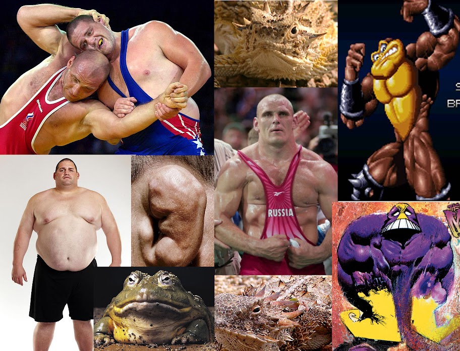
Design Reference:
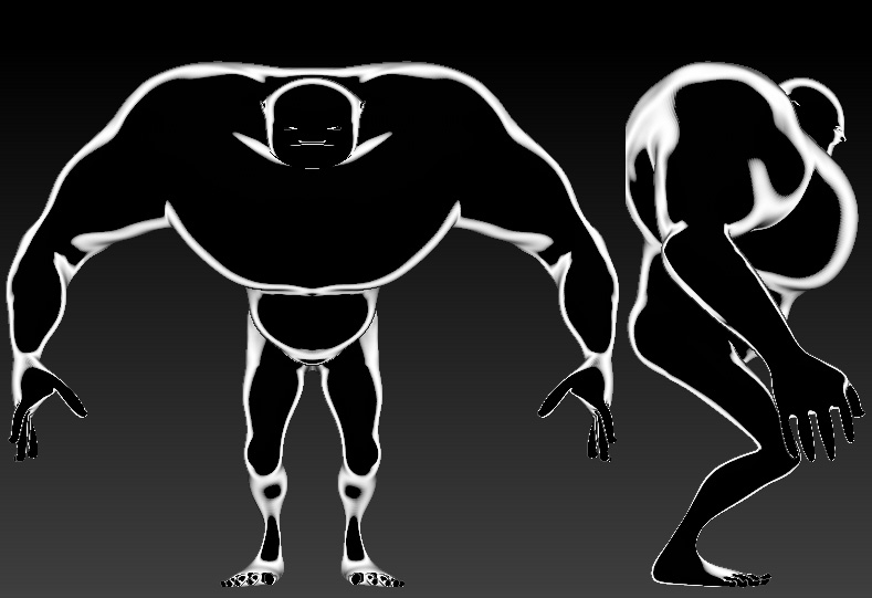
Proportion Silhouette:
Paint Over:
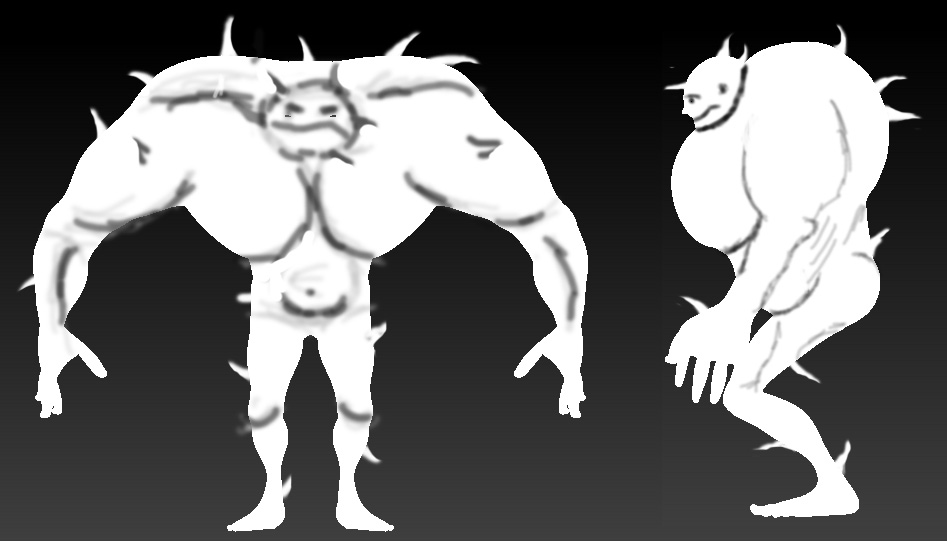
I'm not really Digging the Side Profile of the model. I like the shortness of the legs from the front, but having him squat lengthens them. Going to do away with that, and have the figure just stand tall. I can rig or pose him to squat later.
Beauty Shot 1:

Beauty Shot 2:

Spec Image:

Texture Example:

For Those Wondering what Greco-Roman Wrestling is:
This style of wrestling forbids holds below the waist which is the major difference between itself and freestyle wrestling, the other form of wrestling at
the Olympics. This restriction results in an emphasis on throws, since a wrestler cannot use trips to take an opponent to the ground or avoid throws by hooking or grabbing their opponent's leg. Arm drags, bear hugs, and headlocks found in Freestyle have greater prominence in Greco-Roman and throws especially known as a suplex are used, in which the offensive wrestler lifts his opponent in a high arch while falling backward on his own neck to a bridge in order to bring his opponent's shoulders down to the mat.
Wrestling has been very close to me. My dad was a Coach for 27 years, and I wrestled (after he retired) for 6 years eventually becoming an All-State champion my last year.
My favorite Olympic moment:
[ame="
 https://www.youtube.com/watch?v=9MI7KuGb48E&feature=related"]Kareline Alexandre (RUS) vs Gardner Rulon (USA) - Youtube Link[/ame]
I have a few goals in this contest:
Get back into Zbrush after months of Game Engine work and writing my Thesis Paper.
Improve my understanding of male anatomy.
Get back into an environment of critique and iteration.
Compare my technique with other professionals and students.
So without further posturing....
Design Reference:

Proportion Silhouette:

Paint Over:

I'm not really Digging the Side Profile of the model. I like the shortness of the legs from the front, but having him squat lengthens them. Going to do away with that, and have the figure just stand tall. I can rig or pose him to squat later.
Replies
I still have to sculpt fine detail in, and I am debating whether or not to still give him spikes like the horny toad. If I did that, I would need to just be able to insert spikes sharing the same UV space. The insertion seams would be a little tricky to handle that way.
This is just a test bake though. My low poly model is around 1800 tris.
I am having a huge problem getting the clothes and accessories onto my low poly model at the moment. All my accessories are separate subtools.
I usually just decimate my high poly sculpts with polypaint details and import the decimated model into topogun for normal, AO, and color baking. With the clothes laying on top of the model, it is bringing up inconsistent bakes. I know why.
I have decimated and combined all the subtools for the Body, Singlet/Leotard, Bandages, and Kneepad into one subtool. I have exported this combined and decimated subtool into Topogun. When I bake though I get this image:
The problem is that using the basic settings, the Bake Cage does not know to ignore the skin under the bandages, kneepad, and singlet. It is projecting from both inside and outside the cage.
To workaround this, I created a custom Bake Projection Cage using the body at 3 SubD levels. I made sure this cage completely encompass all parts of the model and that it doesn't intersect itself. I planned to project only from the inside of the cage so the projection rays know only to capture the visible details. Topogun freezes every time I try to bake though.
How do you guys work around this. In other words, How do you all Bake normals and polypaint color to a low poly mesh with multiple subtools laying atop one another.
I have plenty of theories and I am trying to work though them, but I wanted to share my problem with the forum.
When I bake normal maps I use Max.
What I can tell you is your uv layout above is very inefficient. Are those temp uvs or final?
The floating geometry is the problem with topogun. I've tried using custom cages in the program, but no luck. The projections are bugged. What I will have to do is create several projections with the projection cage at various sizes around the mesh. Then mix and match where it works and where it doesn't. After this character is done, I am seriously going to consider a new workflow. I should have something in a few hours.
Got the Maps Transfered. Need to clean up the finger normals, get him into a game engine, and pose.
Do not render your character against solid black if your shadows are black.
This is only ok if you're trying to put a certain mood in your pic, but it's not ok when you're showing models off for crits or portfolio t-poses.
Try a neutral gray.
Skankerzero- Thank you for the suggestion. For my pimping shots, I do go with the grey. I was just in a rush to get my progress out to the community for feedback. Guess I need to take more time in my presentation, even for quick screenshots.
All in all, I am satisfied with some areas of the work, and others I feel like I could use some more practice. Can only get better right?
I feel the same way
Thanks Achillesian! First Rave Review I've received on the forums!