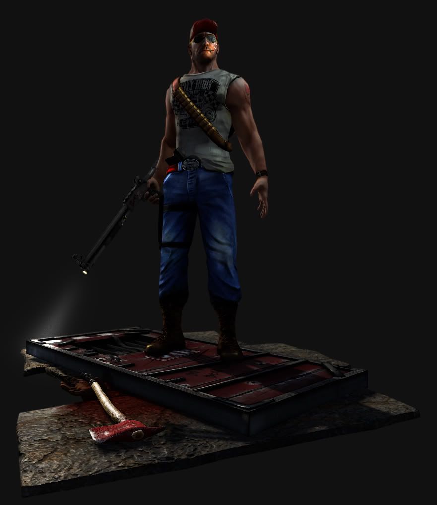
Hi guys haven't posted anything in a while so thought I would jump back on the wagon with this guy. Still a few things to touch up but crits very welcome.
Good, a brighter image would have been better though. Looks like you've got most things under control here. Some things to keep in mind for next time, no need to fix these if you feel that it would be to much work;
- Use more reference material and follow them more precisely. It's not just the anatomy of the characters body, the clothes' wrinkles and stuff needs to look more natural too. If you look at some photos of jeans wearing people you will see that clothes don't fold the way you've sculpted on your character. It looks like you've been following some ref images but not followed them all the way.
- I would also advice using the same color theme on the clothes overall. Right now the jeans are very colorful, almost cartoony, while the hat is something that fits the L4D environment better.
- Other than that I recommend putting your character in a more natural pose. Once again look for some reference images.
I don't like the blue colour of his pants, it's too bright. Try making it a bit more of an "earthy" blue. Lighter, darker, just get away from the right hand side of the colour picker. Also try rendering/screengrabbing it with more light on, it's too dark right now.
love L4D so deff respect the choice, need more lights and different camera angles to see whats really going on... as for the props etc, nice work on the door and axe, would like to see some blood on the blade of the axe considering there is an arm there : ) maybe even a tiny pool of blood from the drips?
biggest problem i have with it woulde be the floor you have.. hard to tell why its in the shape its in etc
Thanks for the comments guys, I dont have time to resculpt his jeans folds but i'll get a repose done and sort out those odds and ends you guys mentioned. Thanks again, watch this space!
Hey all touched a few things, still not happy with a few things like the hand on the base and the angle of the gun. Any suggestions about the base slabs would be good, I kind of through that in without much thought. Need to add some more spec top the knife sheath on his leg as well.
Replies
- Use more reference material and follow them more precisely. It's not just the anatomy of the characters body, the clothes' wrinkles and stuff needs to look more natural too. If you look at some photos of jeans wearing people you will see that clothes don't fold the way you've sculpted on your character. It looks like you've been following some ref images but not followed them all the way.
- I would also advice using the same color theme on the clothes overall. Right now the jeans are very colorful, almost cartoony, while the hat is something that fits the L4D environment better.
- Other than that I recommend putting your character in a more natural pose. Once again look for some reference images.
My only crit is that the shape of the chest around the collar bone looks to pushed out, but I haven't studied too much anatomy, so I could be wrong.
Nice work!
The color of the pants is very saturated. This guy seems on the gruff side and probably wouldn't be seen wearing something that bright.
His thumb seems disjointed and maybe a little too beefy. It may just be the lighting though.
That's pretty much it, hope it helps!
biggest problem i have with it woulde be the floor you have.. hard to tell why its in the shape its in etc
T.