Elf chick -- Rendered in THREE dimensions
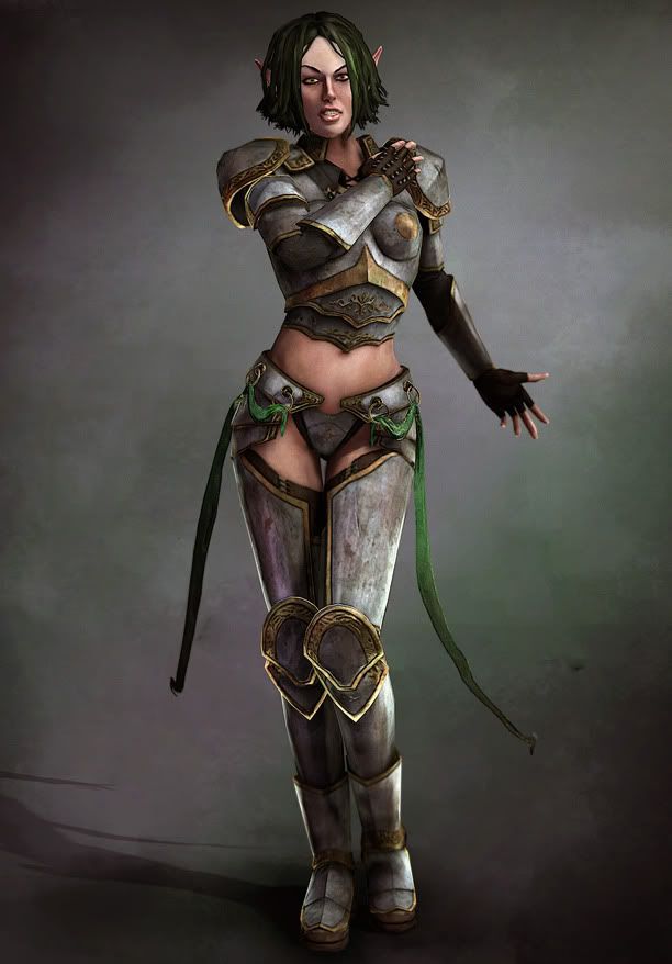
EDIT: Here's the most recent update for this:
Started work on my next character, figured I'd post up every step of the way on here to maximize my feedback and maximize the awesome.
This is based on a concept by Brian Menze, who is pretty awesome.
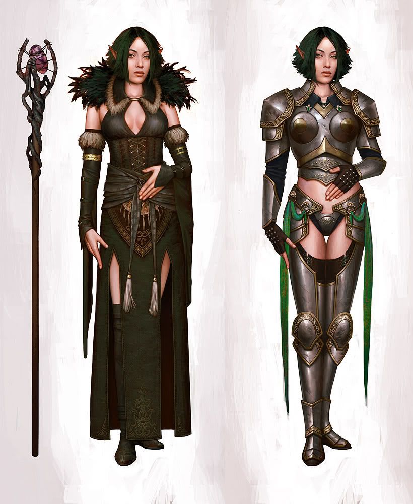
I want to do the outfit on the right to practice some more hard-surface stuff, but I'd like to do the one on the left too. Or would that be too much on my plate? I dunno.
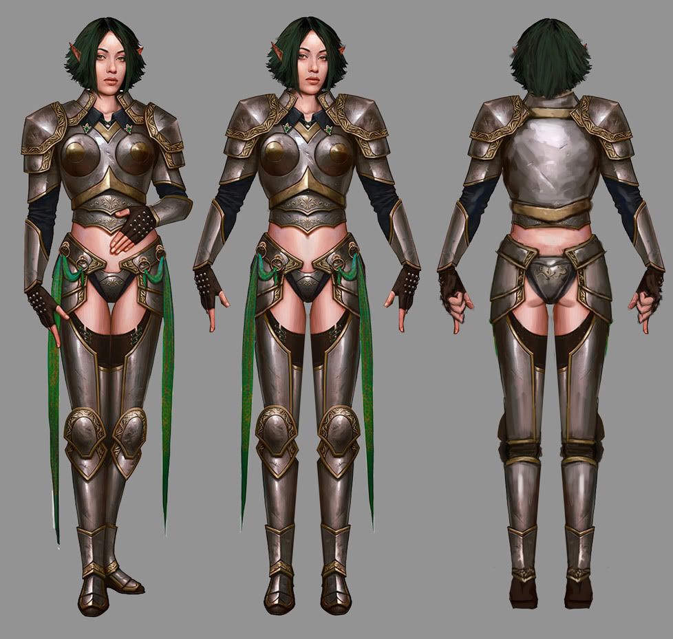
Anyway, I chopped up his concept and made this:
And so far, here's my work on the model. Basically just roughed in anatomy and proportions at this point.
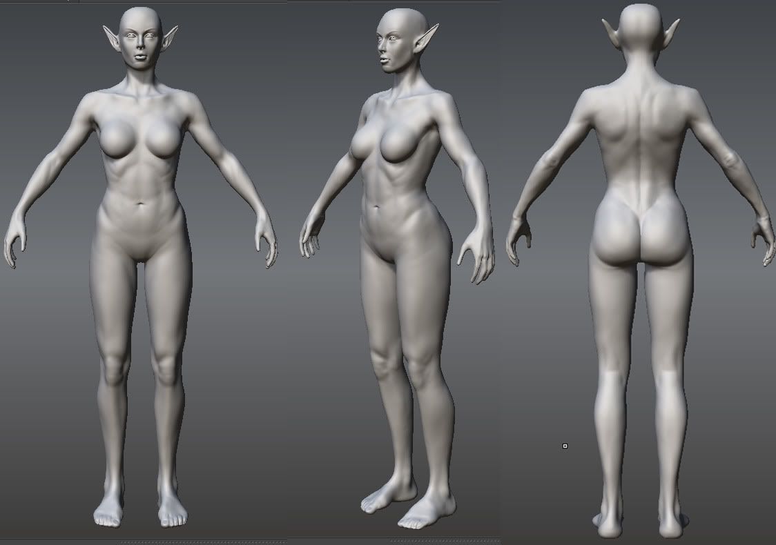
Critique away!


Started work on my next character, figured I'd post up every step of the way on here to maximize my feedback and maximize the awesome.
This is based on a concept by Brian Menze, who is pretty awesome.

I want to do the outfit on the right to practice some more hard-surface stuff, but I'd like to do the one on the left too. Or would that be too much on my plate? I dunno.
Anyway, I chopped up his concept and made this:

And so far, here's my work on the model. Basically just roughed in anatomy and proportions at this point.

Critique away!
Replies
Like I said, looking good - the only things that I take note of, even given my terribly amateurish anatomy knowledge, is that the scapular seems a bit round and blobby, and the clavicle is too protruded/pronounced - maybe a little more subtlety could help it.
Keep it up yo!
A melding of the two would definetly be interesting.
I did a lame layer copying paint over.. but I honestly think that the design would greatly benefit from the fusion of the two.
http://imageshack.us/f/408/0aelfchickbybrenze.jpg/
( Polycount's attachment manager isn't working for me even with a 1k / 200 kb pic
I'm not that trained/experienced in ZBrush and anatomy but the sculpt looks good to me!
Looking forward to this one !
I'll definitely fix 'dem ankles and stuff, and probably do another pass on the whole thing before moving on.
Consensus seems to be for the left one or both - and I agree, I like the left concept best too, so I guess.. I'll do both!
Hmm, that does look pretty cool. I still think I'll do both outfits in their entirety, but I could experiment with combining them after the fact too.
We need to go deeper
Elfception
critique away
I'm definitely going to go back and tighten up the face, hands, and mid section, since those are the parts we'll actually be seeing, but since the rest of it will be covered in armor, this is probably about as far as I'll take it. Unless there are any glaring problems pointed out, of course.
I'm thinking ahead a bit and I'm not too sure how to proceed in regards to doing both the outfits. Here are my ideas:
Go ahead and do a low-poly and texture for the naked body, and then have two separate meshes and textures that could be swapped out over the same body with the different costumes. But, i think this would be a lot of wasted polygons since not that much bare skin is showing, and also it seems like a pain to rig and not end up with a lot of clipping.
My other idea would be to still have 3 textures, body and armor, body and robes, and face+hair. basically there would be two models that reference the same face texture.Does this sound better? Or do you guys have any better ideas?
I've also switched over to Zbrush because I get better performance, it's working out pretty well. Is there a way to get bigger screenshots than what you can prnt scrn?
Anyway nice work so far, looking forward to seeing more!
She is bulking up more than I would have liked. I'll still go back and fix this some here and there. Part of what's doing it is the legs - they were much longer in the concept, but when I sculpted out the base anatomy it looked a bit ridiculous. But now with the armor on, she definitely needs the longer legs.
Anyway, update:
I'm probably being a bit heavy handed with damaging the armor, which should still appear mostly smooth - but I've found when using zbrush I really need to exaggerate to get any details to show up in the normals.
And some more work on the face.. still in progress
More on the face:
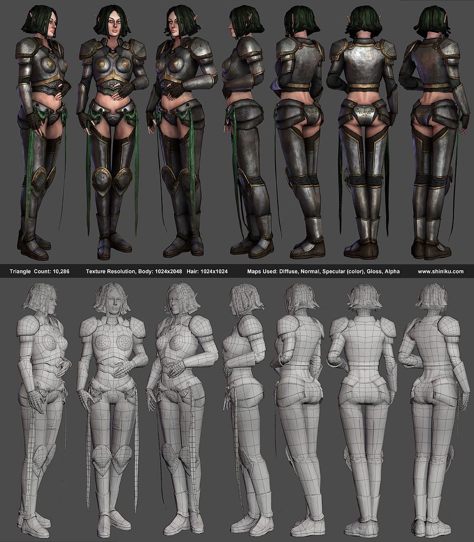
More on the low-poly:
But uh, now I've got some serious questions. I'm having problems with the hair, it's always the hardest part for me on a character. I reference a lot of other people's work and work flows, but I can't seem to replicate it. And when it comes to replicating this hair style, while staying relatively low-poly, I just don't even know where to start.
I started with something though I will probably start over. I'm trying to prevent the geometry that will have the alpha maps from inter-penetrating, as I've heard that is important. But it's really difficult, especially when trying to achieve this kind of hairstyle I think.
If anyone with any ideas or expertise on the subject could point me in the right direction, or just fill me in with more info about this sort of thing (like how important it is to avoid interpenetration) I'd truly appreciate it.
Other than that, good work! Looking forward to more
Anyway, I like what you've done so far, keep it up!
About the yes.. yeah, I've noticed she was looking a bit 'surprised', was planning on just fixing that once it's rigged, though I get what you're saying, definitely would have made more sense in terms of texture quality if I had left the eyelids shut more.
As far as the hair goes, I've made some progress but I'm still hoping for some wisdom so I haven't really nailed anything down yet. i decided to keep the hair on a separate texture sheet, that way being stuck on the hair won't slow down the rest of my progress.
Here's the low-poly with normals baked, and the normal map. The bake is pretty rough, lots of tweaks need to be made, lots of little errors to fix.
As for the model, the top of the shoes seem a bit weird from the front view. Is it supposed to be jagged like that, or is that a seam or normal map problem?
Made more progress on the texture, but still got a lot of work to go on it. Also started on the hair, but obviously nowhere near done. Feedback welcome:
I know she's looking a bit old, and definitely surprised. Trying to work on that.
Also, someone gave me a critique and I wanted you guys to weigh in on it. The critique was that the breast-cone things just looked weird, shaped wrong, breast wouldn't fit comfortably in there, and also the way the tip of the collar was hitting the breast armor was creating a tangent and looked weird. I agreed with this, and even thought these things myself while creating it, but I was just trying to stick to the concept because it was done by a pro. But, if it does look wrong I guess I should try to fix it. So, in the next picture first we see the model how it is now, and then the picture below some quick and dirty edits based on that feedback.
So what do you think is better? Or can you think of better ways to address this feedback? Also, I'm trying to edit this without having to redo my UVS or go back and edit my highpoly and re-bake, although if I have to do that, I will.
Did some rigging on her. Still gotta fix a few weird places, and also make it looks less like her hair's falling out.
I dig the textures really, but also think there is a problem with hair.
Eyes are still too close to eachother.
Good work overall. :thumbup:
@Uncle
Thanks!
Haha, yeah, the outfit is highly impractical. I mostly picked this concept because it would give me practice in some areas I wasn't so strong in.. and to that end it's worked out great, although I do seem to get a lot of comments about how ridiculous the armor is, I'll definitely pick something more believable next time.
@TeriyakiStyle
Thanks a lot, very helpful feedback! I tried to apply some of what I saw in your paint over, although it's pretty subtle. I think your feedback will definitely help me when I go to create my next character as well.
Alright, some next screenshots, plus texture flats.
And here's a final presentation shot, with some photoshop post work done
There are things I could fix, but I think I'll call this one a wrap for now. Thanks a lot to everyone who has critiqued/helped along the way. This model was a great learning process for me, and I think my next model will show a lot of progress thanks to what I've learned.
She may be too realistic to have such blatantly absurd clothing.