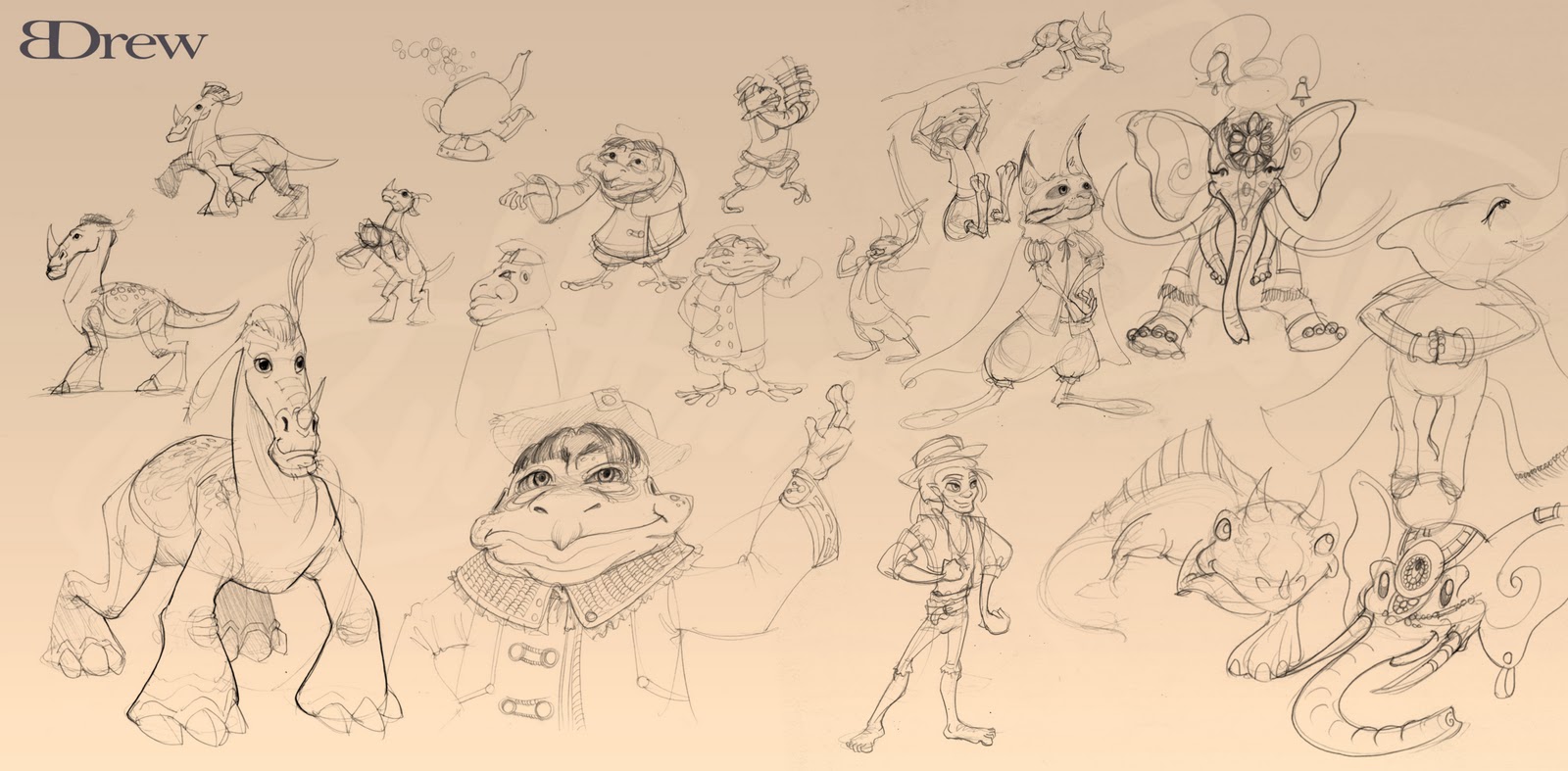
Sketchbook: Brittany Drew
Hello everyone!
I've visited the site numbers of times finding the collective work wonderful and inspirational. So I have finally decided to join!
A little bit about myself, I'm Brittany Drew, a recent graduate of the Media Arts and Animation program at the Art Institute of Pittsburgh.
Back in September I made the leap to move out to LA, which has been great, I am still seeking work with the slumbering holiday state studios seem to be in, but hoping to land my first job soon. I love movies and games, so I would love to work for either animation, effects house or game studio. So long as I get to create art for some awesome stuff.
I do texturing and 3D modeling as well as illustration. I model in either Maya or Max, can texture in Photoshop, Zbrush and Mari.
I've attended SIGGRAPH for the first time this past year, which was amazing, and recently went to CTN Animation Expo. It was great to get some advice in person from so many artists.
My work, I would appreciate any critiques or advice. Thanks!
Reel:
http://vimeo.com/27463256
Website:
http://www.brittanydrew.com
Blog:
http://brittanydrewapicture.blogspot.com
3D sampling:


Replies
I'm really not a fan of the site at all. It's hard to navigate (have to click back to art before i can go to any section, yet there are separate sections for a demo reel and contact and about,) the images load slow and are tiny, and I can't tell what i'm going to be looking at from the thumbnails. I also have no idea from thes ite what your focus or specialization is -- there are four separate sections for primarily 2d art, but it sorta looks like you want to be a 3d artist?
Compact it, clean it up, and pick works that better represent you to show up front. http://www.jonjones.com/2005/10/07/your-portfolio-repels-jobs/
@SupRore I definitely plan on updating/redesigning my website. I've recieved a quite a few critiques similar to yours. Biggest being it does not show my specialization. Thanks for the link!
So here's another update. A model I'm currently working on, of the many others I'm working on to revamp my portfolio.
The content is also posted on my blog.
Based of a concept by Clio Chiang
If I had to critique the website, I'd say it's strenuous to read the words on each banner as they are written sideways. I do like the art style of the site very much though!
So I made a Squarespace to redo my website, it's still in progress, but how is it now? Easier to navigate and see everything I hope!
http://brittanydrew.squarespace.com/
Critiques would be awesome, this is a more high poly based character.
More images can be found on my blog:
http://brittanydrewapicture.blogspot.com/2011/12/ted-rabbit.html
Modeled in Maya, textured in Mari, rendered with Mental Ray in Maya
Loving the colors and texture of the Ted character. Is there a link to his original design and your texture maps? I found the diffuse map, but I'd really like to see the normals too.
@Hammed, good point on the cloth specular colors and various I've been paying more attention to that now. It's amazing how much the slightest details and additions to texture maps improve so much.
Thanks Dylan!! I hope you are doing well.
He actually has only:
color, bump, spec, spec color
He's a more high poly based character, but I got the fur and other various details through a bump
I can post them if you would like to see!
also the youtube and vimeo links on your site are broken, just to let ya know
Awesome work! I really like Ted
Yeah I can rig and animate too in Max and Maya, but good point, I'll have to figure out if I can embed the video as a photo or something like that to go to after the still.
Oh so they are broken links, eep thanks! I have both vimeo and youtube, so gotta fix that!
Based off Keith Thompson's Messenger Room from Scott Westerfeld's Leviathan series, loved the books.
http://www.keiththompsonart.com/pages/messengerroom.html
I'll definitely be out and about LA drawing!!
http://www.sketchcrawl.com/