[WIP] Trap Room
Hey all,
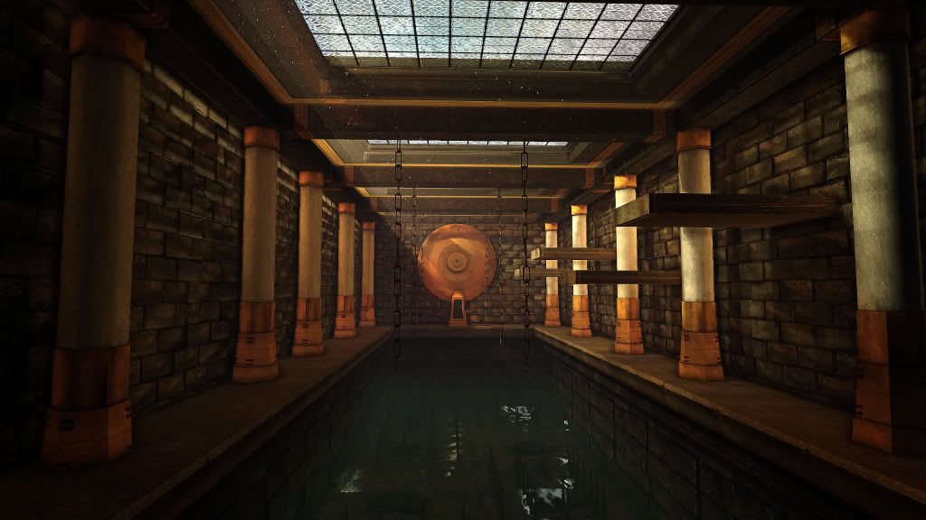
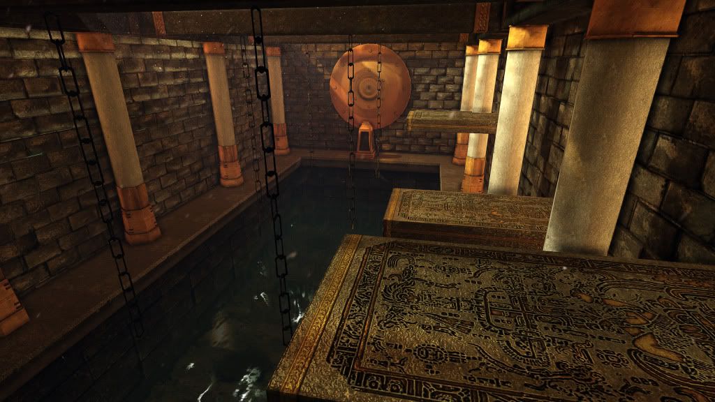
I posted in the What are you working on thread and got some great suggestions on there, so I decided to make a thread and get some more suggestions , and comments on my Trap Room. What should I add, or take out ,or fix?
Here are a few screenshots of it in the UDK:


I'm looking forward to more comments and suggestions from you guys Thanks!
I posted in the What are you working on thread and got some great suggestions on there, so I decided to make a thread and get some more suggestions , and comments on my Trap Room. What should I add, or take out ,or fix?
Here are a few screenshots of it in the UDK:


I'm looking forward to more comments and suggestions from you guys

Replies
Maybe changing the composition could help, you need to have something visually interesting at the end, right now it's nothing really interesting.
I dunno, play around a little bit with more interesting shapes, more interesting details
Challenge yourself even more
and you both are right. I am probably gonna look around (nice reference chris) get some possible ideas for composition. I'll play around with that and see what realistic trap I can get as Snader has a good point as well
Crits:
With a scene this enclosed you could probably beef up the poly count.
It has a lot of straight lines, 20 or 30 extra polys on a cube isn't going to make any engine cry but if used correctly will add a lot of character.
The chains could be a bit thicker to help them stand out. Maybe stagger them bit so they aren't so uniform? Same with the spikes, I agree about them not really being noticeable.
Supports for the ledges? Right now they seem to be defying gravity a bit too much, those have to be heavy. Do they move in and out of the wall? Maybe some decorative trim around the slot where they slide in and out? If not some kind of decorative wall mount might be in order anyway.
I think the pillars are too low res geometry wise and you should up-res them a few more poly to round them out and flesh out the details will be worth it. Right now they're very close to mobile spec? They also have some smoothing and shading problems that need to be worked out.