Vol'jin - WoW Fan model
Hey folks:]
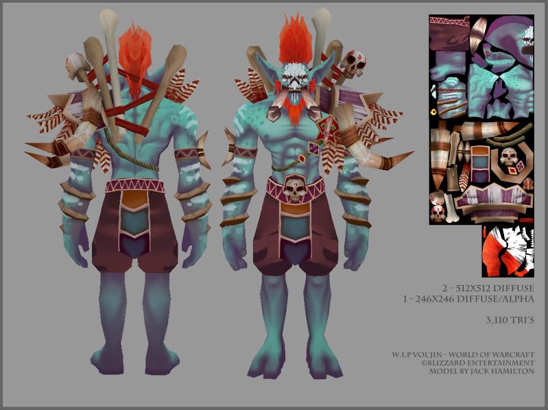
Since the recent expansion of World of Warcraft (Cataclysm), there have been a few model upgrades for the leaders of the different races.
Not all have been updated however onein particular being the Troll leader, Vol'jin. So as a fan of the Troll's I wanted to make a unique model in a way thats fitting to the Warcraft universe.
Although it's nearly finished, it's a model I'd really like to nail. Texture-wise I'd like to get people's thought's. And if there is anything in particular you could recommend I watch out for on the next model then by all means let me know:]
Note: The shorts and legs are yet to be fully textured.
I've made the poly count similar to that of the Orc leaders unique model which is just over 3k.
*EDIT*
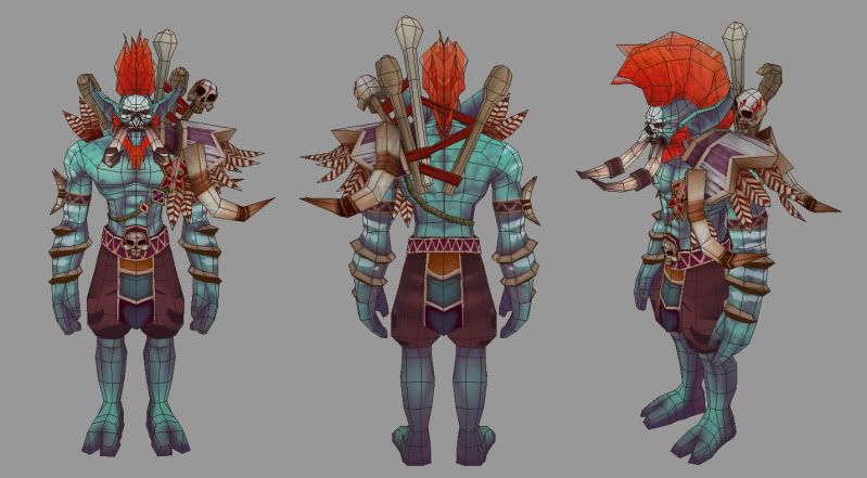
1. Changed images, made larger. 2. Added Wireframe image.
So I think with this even I have really found numerous flaws with the texture.
- Is the colour pallet messy?
- Texture to busy/messy?
- Is the armour texture too dull?
- The face, too plain?
- Unwrapping is a major issue for me, I find it really hard to nail.
P.S Sorry for the late update, bad Troll:I Sorry 'bout that.
Since the recent expansion of World of Warcraft (Cataclysm), there have been a few model upgrades for the leaders of the different races.
Not all have been updated however onein particular being the Troll leader, Vol'jin. So as a fan of the Troll's I wanted to make a unique model in a way thats fitting to the Warcraft universe.
Although it's nearly finished, it's a model I'd really like to nail. Texture-wise I'd like to get people's thought's. And if there is anything in particular you could recommend I watch out for on the next model then by all means let me know:]
Note: The shorts and legs are yet to be fully textured.
I've made the poly count similar to that of the Orc leaders unique model which is just over 3k.
*EDIT*
1. Changed images, made larger. 2. Added Wireframe image.
So I think with this even I have really found numerous flaws with the texture.
- Is the colour pallet messy?
- Texture to busy/messy?
- Is the armour texture too dull?
- The face, too plain?
- Unwrapping is a major issue for me, I find it really hard to nail.
P.S Sorry for the late update, bad Troll:I Sorry 'bout that.
Replies
honestly, 1024 minimum in size, and dont throw in 4-8 renders per image, do one or two. Show off your work and let us see him!
Also, posting your flats would really be a good idea to get the BEST feedback (No ones going to steal your texture, without the model it's useless...you can watermark it if you'd like, but I don't see a reason to).
I'd also like to see him in a more, lively pose. That soldier stiff pose is kinda boring to look at and it takes away from the essence of the character. Have him more relaxed with arms at like a 45 degree angle and elbows bent a little. Judging by the side pose, with all that gear on him there is noooo way he wouldn't fall forward. Lean his chest back
Can't wait to see it!
So with that said, I'll get the layout fixed tomorrow (bed now:P) and I'd love to hear what you have to say!
As for the pose, I have yet to rig him, he would in fact be my first rig so im not sure how quick that will happen. But it's definitely on my to do list with this guy:]
Appreciate the enthusiasm!
Really cool model though and nice to see you on here
jsargent, hey thanks! Feet wise do you mean texture blocky or poly blocky? And glad to be here, after leaving uni I've been a little out of the loop in terms of modelling communities!
-Texture on the pants. The folds look really weird and don't match the quality of the surrounding textures at all
-Toenails. He needs some
-Beard, where it joins the face is a very stark line. If you were to paint a more organic join onto the face I think it would improve the look a lot.
The texture feels like it needs a lot of love but most of those critiques have been mentioned. I'd recommend checking out the model viewers on wowhead or thottbot or somewhere to see how their textures.
Can't wait to see the finished piece!
This tut might help a little, it's from 3Dmotive
http://www.3dmotive.com/training/photoshop/hand-painted-weapon-texturing/?fp
Gannon - Wires, sure thing. I'll get them up in a sec:]
jsargent - Good call, I'll have a play with contrast and I think i'll revisit the armour, perhaps too much of that cream colour? Whiten the feathers a bit more to separate them from armour colourings? And thanks for the tut. Bookmarked:]
- Since the face is the focal point of your character it would be good to have it more saturated and brighter than the rest of the body.
- You're asking if the face is too plain, I think you need to show some better close-ups so we can judge better. From what I can see now the white paint on the face has entirely replaced all the rest of the shading in those areas. Even if something is painted it will still have the same highlights and forms of the skin under it.
- The entire character should have a consistent amount of details. Some areas are detailed, other parts are not(the bones for instance). Take a look at your model and see what parts that are lacking in details compared to the rest.
- The pants should have more realistic wrinkles and folds. Look at some ref-images. Never mirror your uv's for both parts on clothes since they always look different, especially on pants.
- Speaking of uv's; If you're gonna have parts on top of your mesh then it's good to put those parts of your mesh(body) in a different uv shell so that you can paint shadows in those areas. I guess engines like marmoset toolbag can fix that but it looks strange at the moment with no shadows being cast from the shoulder armor, bones and stuff.
- Your textures are generally lacking highlights. I too usually have problems with this so I understand why this has happened.
- He's missing some toe-nails.
- For your next model I would recommend looking at more anatomy pictures so you can nail the body better. It's very important, even on cartoony/comic-booky characters.
Cool model overall!