The BRAWL² Tournament Challenge has been announced!
It starts May 12, and ends Oct 17. Let's see what you got!
https://polycount.com/discussion/237047/the-brawl²-tournament
It starts May 12, and ends Oct 17. Let's see what you got!
https://polycount.com/discussion/237047/the-brawl²-tournament


Replies
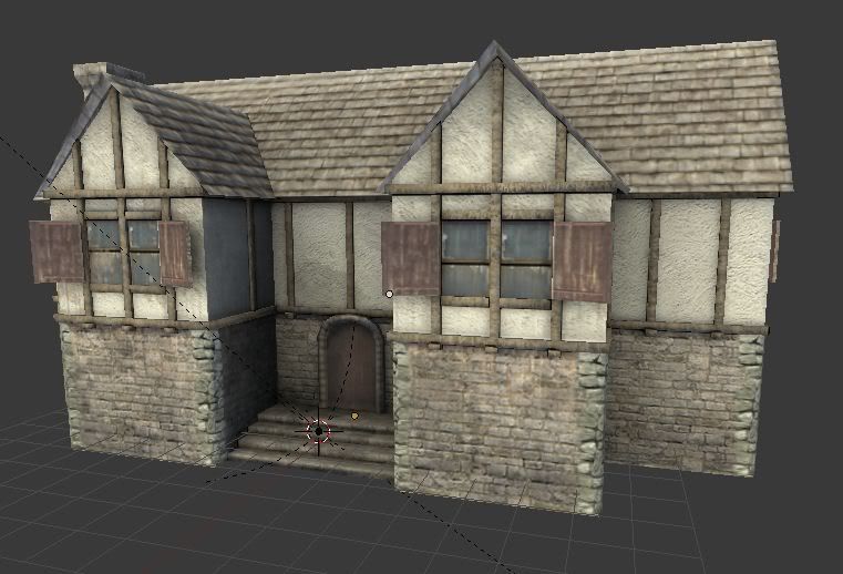
- The windows and door appear to be out-of-proportion with one-another, maybe it's just the orientation of the shot but it looks to me like the windows are either too big or the door's too small.
- The corners of your house look a bit odd as there's no indication in the texture map that there's about to be a 90-degree corner and it doesn't sell very well. It might be an idea to add large wooden support beams or something on the corners to break it up, as you would use to cover seams in modular buildings.
- The roof is awfully flat. Try adding geometry to it based on the texture.
- Your scene's lighting is very flat, your textures and geometry would be much easier to interpret if you had some light sources and shadows.
- Extending on the previous point, do your textures have specular or normal maps applied? If SO then they're likely not popping your geometry due to the lack of a directional light source, if NOT then I'd say the next step with your textures is to give them a bit of definition using said maps; I can see something like CrazyBump or nDo2 working wonders on your roofing and stone textures.
Hope some of that helps!
- even uv space: the shutters for the windows look blurry compared to the wall, they're a focal point so I'd give em a bit more res.
- the windows look like the same material as the wood, just blue. Maybe a bit of spec or an env map?
- the grain in the white surface is maybe slightly big. Could be totally wrong here though.
- I really like the stone work, maybe break it up a bit with some variation, damage etc? Asymmetry is a good thing IMO.
Keep it up!
thanks for your feed back everyone.
And i made the corners look much nicer by adding a plane shaped into a corner piece with a brick and alpha texture on it,I somewhat fixed the shutters,and i added a normal map.
and this is a low poly asset for a game im helping create,so theres no need for lighting setups or anything advance.just a model with some textures.
finally,the updated image.here ya go,tell me what you think.