My first and second demo reel
polycounter lvl 5
[ame="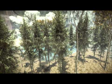 https://www.youtube.com/watch?v=iZ04m89lYn4&feature=mfu_in_order&list=UL"]Demo Reel #1[/ame]
[ame="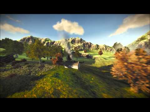 https://www.youtube.com/watch?v=rEt1gAnYgVQ"]Demo Reel #2[/ame]
https://www.youtube.com/watch?v=iZ04m89lYn4&feature=mfu_in_order&list=UL"]Demo Reel #1[/ame][ame="
https://www.youtube.com/watch?v=rEt1gAnYgVQ"]Demo Reel #2[/ame]
Replies
0:20 - The smoke coming from the chimneys are literally just spawning clouds. It would be nice to have a steady flow
0:37 - I think those trees look great, but we don't need to fly right through the with the camera, and especially not in a pace where a branch of one tree sticks straight through another.
2:16 - Same thing with the cloud of smoke. It materializes out of nowhere, and at an uncanny rate.
2:18 - 2:22 - You have some mad texture stretching going on here. You don't necessarily have to remake the texture, but I'd move the camera so that we don't see it.
2:32 - The brick on the inside of the castle wall is stretched twice as much as the stone brick/blocks on the castle. Maybe a nit pick, but it's noticeable.
2:56 - The flags here with the white background looks like you forgot to mask off something in the alpha. I'd change the color or lose them. They're also very rigid. The texture behind the castle is VERY stretched (at a couple of other points too, but most notably here).
3:03 - You can cover up the edge of the mesh that you're panning that texture through with water spray/mist to make it look more natural. Same thing for the top where the water actually falls over the edge of the rock.
Loving the atmosphere of the environments, it really draws you in, congrats
These scenes are far too big for your ability to fill them in a meaningful way. The scale isnt impressive at this point because the tiling is really noticeable, in both texture and assets. Your lighting is generally nice and the camera moves through the tree branches is nice (except when it keeps going through trunks of trees which really ruins it).
These worlds need more attention to detail instead of just scale. I'll use the castle as an example.
Your shapes that you modeled out need to become more noticeable and intentionally designed. many many shapes are lost because of the tiling texture. Look at this castle for example
There are clear design choices being made to break up the shapes and make interesting silhouettes. But those shapes becomes more noticeable because of the framing elements which are different colours or values (the windows, top sections, crenelations). Now even in this example the tiling brick gets a bit heavy, but its softened a bit by the less detail heavy crenelations and windows. Those give our eyes a spot to stop and rest. As well any of the dark sections they're getting from ambient occlusion and general lighting give us that same rest for our eyes. Since you're really only using dynamic lights and 1 tiling texture for everything we've got no where to rest and take in larger shapes. In contrast your castle is much more akin to this.
There are details there, but they're lost in the tiling of the texture and generic shape. Hard to find silhouettes only make the matter worse.
You've got a great sense of atmosphere for the most part in both of these videos, but none of it holds up to close viewing or higher resolutions. You should focus on a much MUCH smaller scene and try to get those details right. Working at this scale, and at this quality will not help you get a job on the majority of fantasy projects unless you're looking for work on something like the recently released Game of Thrones game, or flight sim type games.
Hope any of that helps.